
Abstract
A few simple steps can streamline data file analysis and help you make the most of each recording. This white paper covers 10 tips and techniques that come in useful to power quality professionals in the field.
1. Use the right Current range
All modern PMI CTs offer adjustable current ranges: the iron-core TLARs are 20A or 200A (defaults to 200A), and the Flex CTs are 100A, 1000A, and 5000A (defaults to 1000A) full scale. The TLARs on the 20A range are best for monitoring the 5A secondary of metering CTs, and the 200A range is useful for residential or light commercial applications. The Flex CTs are sized for any residential, commercial, or industrial application, where actual load current is measured (as opposed to metering CT secondaries).
If you’re monitoring 5A nominal metering CTs, pick the lowest current range available – 20A on the TLARs, or 100A on the Flex CTs. If you only have Flex CTs in this situation, one trick to improve on the 100A range is to wrap multiple turns of the Flex CT around the secondary conductor. Even one extra turn doubles the resolution, and you can sometimes get 3 or 4 turns around the conductor. With 4 turns, the 100A range becomes a 25A range, and the resolution starts to approach that of the TLAR.
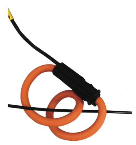
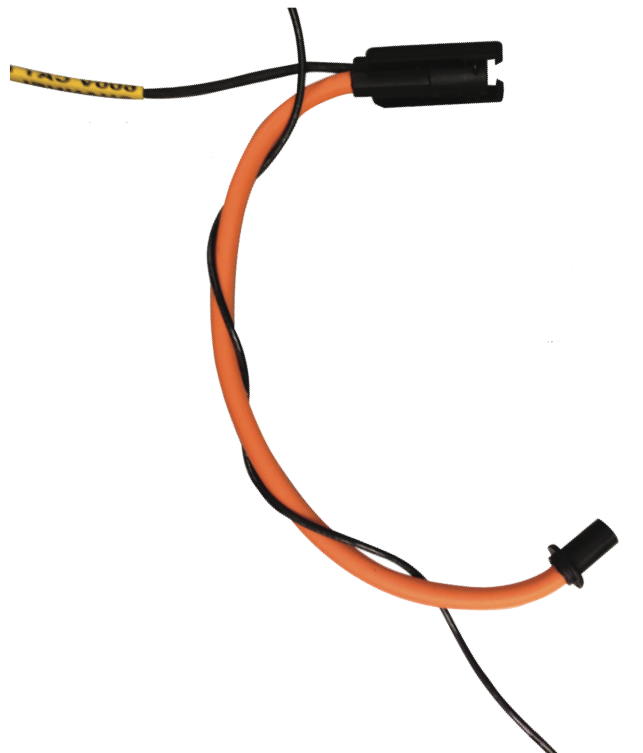
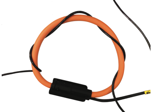
For safety reasons, it’s usually important to not break the wire in a monitoring CT secondary. Fortunately, 5A CT secondaries are often 10 AWG or smaller, and there’s a trick for getting multiple turns around it with Flex CTs. Don’t wrap the Flex CT around the wire as in Figure 1– that exceeds the bending radius of the CT, puts extra stress on the connector, and only gets you only two turns with a 12” CT. Instead, straighten the Flex CT, place it adjacent to the conductor, and wrap it around lengthwise (Figure 2). Figure 3 shows four turns around a wire with a 12” CT, with no extra stress at all.
For other applications, pick a range somewhat above the maximum “nominal” load current, to catch peak inrush and motor-start currents. For example, if the steady- state current is 150A, the 1000A range may be a better choice if the loads are likely to have high inrush values.
Neutral current is often lower than the phase currents, and ground currents are usually much lower still. Multiple turns can be used on just the neutral or ground current input, to help boost the resolution, if the current range is high due to the phase currents.
If multiple turns are used, don’t forget to adjust the current scale factors in ProVision to compensate. This is stored with the data file, and is adjusted after the file has been downloaded in ProVision.
2. Don’t Forget Histograms and Daily Profiles
The cycle histograms and daily profiles are important, but often forgotten record types. Both have these important advantages:
- They’re always enabled
- They always cover the entire recording session – no running out of memory, etc.
- Lots of measurement types: for RMS voltage, current, real, reactive and apparent power, phase angle, power factor, displacement power factor, and voltage and current THD
- No configurations or settings to adjust
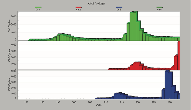
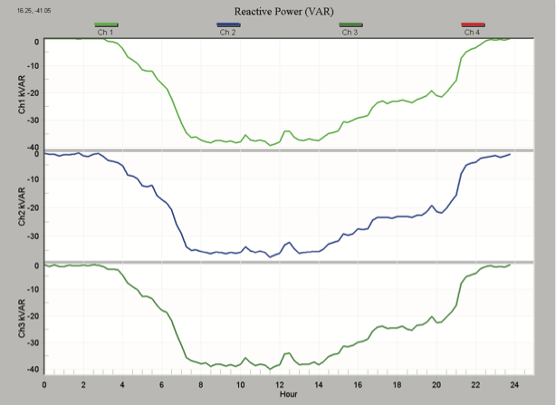
They’re especially useful in situations where unexpected information is needed. For example, in a voltage sag investigation, often only RMS voltage and current stripcharts are recorded, to save on stripchart memory (or allow increased interval resolution). If you’d later like to look at THD levels, or power factor in that recording, the cycle histograms and daily profiles have it. Whitepapers 81 and 93 have more information on using histograms and profiles, respectively. With some care, it’s even possible to estimate sag duration and other timing information from cycle histogram data (see whitepaper #88). Figures 4 and 5 show typical histogram and daily profile graphs.
3. Use Initialization Templates
At least a third of all the files we see at PMI have the default stripchart settings enabled. Much of the time, just the initial “Basic” settings screen is used to adjust the number of channels, current range, and stripchart interval. Although the defaults are a reasonable starting point, it’s worth fine tuning these to get the most out of a recording.
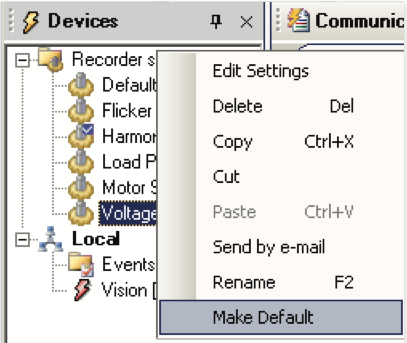
The best of both worlds is to create a few settings templates in ProVision for common situations (e.g. flicker, harmonics, load profiling, voltage sags, etc.). Leave the circuit type (wye, delta, etc.) and current rangealone – they will be individually set for each recording, but the stripchart settings, waveform capture, etc. can all be preset for common applications. To use a template, right-click on it and select “Make Default” (Figure 6). Then right-click on the recorder in the Devices panel (or choose Recorder, Initialize in the menu), and the template you just selected as default will pop up, with the Basic screen shown. Adjust the current range and circuit type, and click Finish to send it to the recorder. With this process, you can stick with the Basic screen, but get full use of pre-made templates. These templates can be shared with others to insure everyone’s using consistent settings.
4. Get the Most Out of Waveform Capture
Waveform capture is one of the most powerful record types in the PQ arsenal. With raw waveform data, just about anything else can be computed, and there are many features in ProVision to help with the analysis.
First, it’s useful to make sure there are waveforms at all. Often no waveforms at all are triggered during a recording. While that’s good from a PQ perspective, it’s very handy to have at least a few reference waveforms for each recording. To insure this, turn on periodic waveform capture in the waveform setup. Even one every 12 or 24 hours is very useful, and doesn’t take up much recorder memory.
Here are some uses for waveform capture beyond just base waveform analysis:
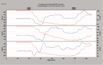
- Use RMS capture for sag analysis (Figure 7): select Graph, Waveform Capture, RMS Capture to view waveforms with a sliding RMS window applied. Very useful for sag analysis (see WP78 for more)
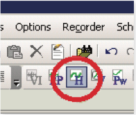
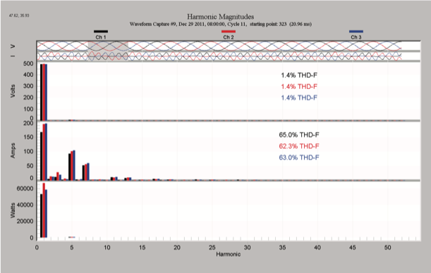
- With a waveform on-screen, click on the Harmonics toolbar button (Figure 8) to see an instant harmonic analysis of a selected region in the waveform – Figure 9 (see WP73 for more)
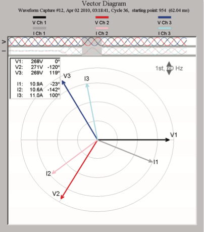
- Click on the Vector toolbar button (Figure 10) for a vector analysis (Figure 11). You can slide the grey selection box to see how the vectors change with time during the event, or click on the harmonic number to see the vectors for any harmonic
- Use the “I” hotkey to toggle between line-line and line-neutral views – easy way to switch from wye to delta view
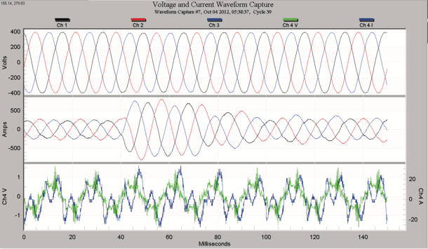
- Use the “3” hotkey to switch to 3 phase graphing – where the 3 voltages are graphed together, instead of each voltage channel graphed with its current channel. This view is especially useful for 3 phase rectifier feeds, where the peak voltage envelope is important (Figure 12).
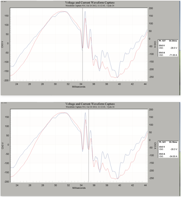
- Use the point table to estimate ring frequency – the start and endpoints of a ringing event can be read off the point table, and the frequency calculated as 1/ period. The point line is shown at the negative peak of a single period of the ring waveform, at 34.24ms and 35.15ms (Figures 13 and 14). The difference, 0.92ms, results in frequency of 1/0.92e-3 = 1087 Hz. This is a system resonant frequency, likely caused by a local power factor capacitor and connected loads.
5. Edit the Report Header
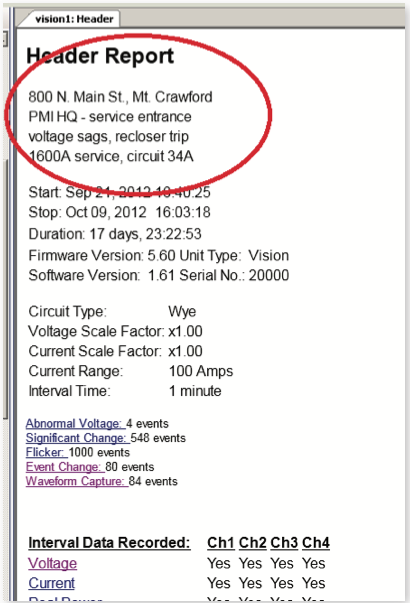
The report header allows adding four lines of text to the beginning of the report. Although it seems like a simple step, and overkill for a quickie recording, putting useful information here can pay off in the future. Add a street address or asset number (e.g. transformer or meter ID), along with just a few words to describe the issue and you’ll have a data file that’s useful years later (Figure 15) The header text can be initialized into the recorder, and then is downloaded with the rest of the recorder, or can be added later. Once you’ve accumulated several years worth of files, having information in the header pays off by giving some context and location to the data that otherwise would be forgotten. Without that, the data is essentially throw-away information after the initial use.
6. Manage Data File Locations
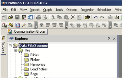
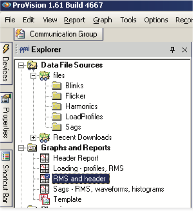
ProVision includes an Explorer panel that gives a Windows Explorer-like view of data files. The default setup includes a single folder called “Recent Downloads”, and is where newly downloaded files are stored. The exact location on your file system depends on the version of Windows (XP, Vista, Win7, etc.), but is often deep in the Windows system. Instead of keeping all files there, create a few new folders, and use descriptive names. These can be named by location (e.g. substation, circuit, etc.), by problem type (voltage sags, harmonics, etc.), or any other pattern that’s useful long-term. Reserve one location for new files, and after each file is analyzed, drag and drop it to the long-term folder. ProVision allows you to drag/drop within the Explorer panel, so it’s very easy to do. Ideally, the new locations (except for the one for new files) are on network drives, so they’re sharable with others, and backed up by your IT department. To add a new location, create the folder with Windows Explorer, then in ProVision right-click on Data File Sources in the Explorer panel, and select “Add Watcher”. Create a few new folders on a network drive with descriptive names, add them to the explorer panel, and use them for long-term storage to get the full use of each recording as shown in Figure 16.
7. Maximize Screen Space
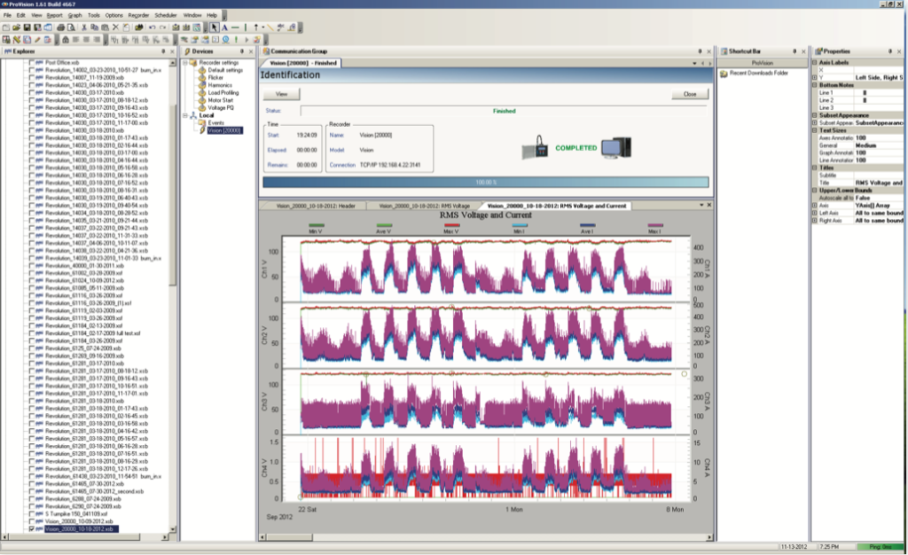
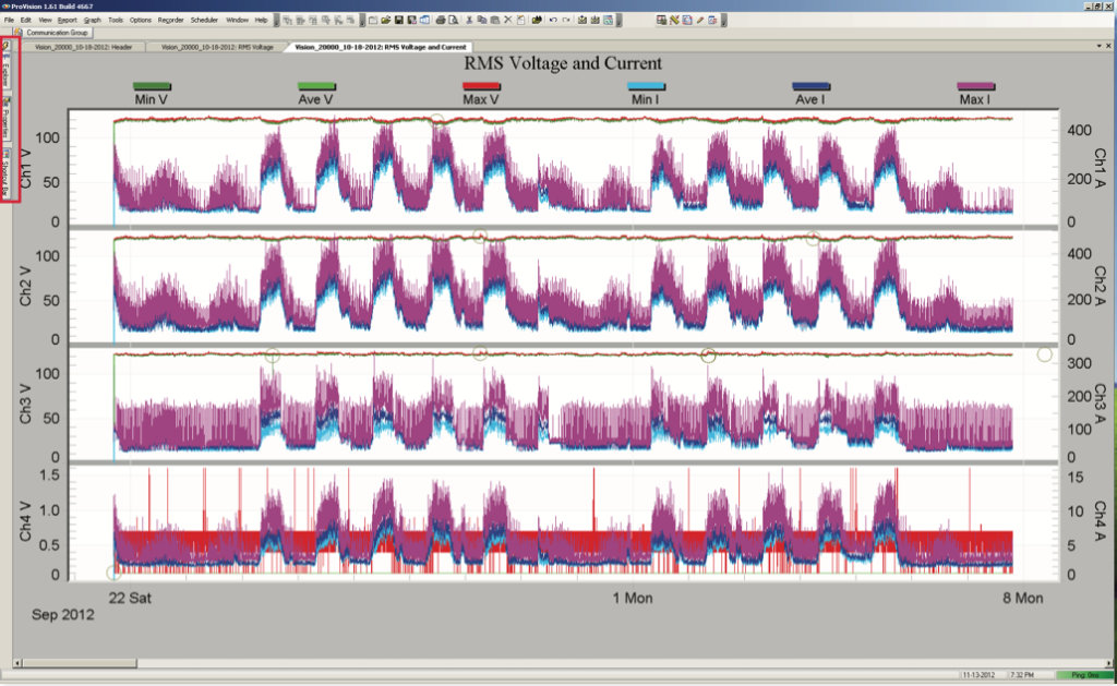
Making full use of the available screen space makes analyzing data much easier. With today’s wide-screen monitors, which provide a very large horizontal view, but shorter vertical view than in the past, configuring ProVision for visibility is even more important. Compare Figures 17 and 18 for an example. To maximize the graph workspace, these tweaks have been applied to the ProVision default layout:
- All panels (Explorer, Devices, Properties, and Shortcuts) have been unpinned, and docked to the left side. Each will automatically rollout if the mouse hovers or clicks on them.
- Toolbars have been moved to the same level as the menu, minimizing the total toolbar height.
- Communications Panel has been unpinned – it will automatically roll out if needed. This is unpinned by default, but if it comes pinned, be sure to unpin it.
8. Increase Efficiency with Toolbars and Custom Views
If you’re using the same graphs and reports repeatedly, create a custom toolbar button and/or view. When I examine a file, I always start with the report header, and the RMS voltage and current graph. To avoid choosing Graph, RMS Interval, RMS Voltage and Current dozens of times each day, I added a toolbar button to make it a one-click operation (Figure 19). Note that all toolbar buttons have been kept on a single line for maximum screen real estate. Clicking “RMS Voltage and Current” on the toolbar instantly launches that graph. TDD graph, and Voltage histogram report have been added as well.
I also have a new “default view”. Instead of loading just the Header report, the RMS Voltage and Current stripchart is also loaded when I open or double-click on a file. I’ve got a couple more custom views for load profiles (loads RMS graph, two daily profiles) and sags (RMS graph, histograms, and list of waveforms), Figure 20. Simply clicking on the view loads the graphs and reports at once, already arranged the way I saved them.

9. Stay Current on Software/Firmware Versions
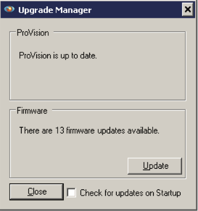
New features, updates, and under-the-hood improvements are released frequently in both ProVision and recorder firmware. Starting with ProVision 1.60, ProVision will automatically check for new firmware and software versions at startup; this can also be checked manually under Help > Check for Updates (Figure 21). Don’t miss out on new features like Revolution waveshape triggering, TDD graphs, etc. or “rediscover” bugs that were fixed long ago.
10. Know the Most Useful Shortcut Keys
There are many “hidden” shortcuts in ProVision. Some of the more obscure, but very useful ones:
- “<” and “>” on the RMS Voltage and Current stripchart graph. < makes the current y-axis scaling smaller (which makes the traces bigger on the graph), and > does the opposite. If the current traces are very “spiky”, they can cover the voltage traces, making it difficult to see what’s going on. Press > once or twice to shrink the current traces, then when you’re oriented, zoomed in, etc. press < to restore the scaling. This is very handy, but difficult to convey on paper – try it to see how it works! You don’t have to use the Shift key – simply press the < or > keyboard buttons.
- “T” – turns on Point Table with stripcharts and waveform capture – allows viewing of raw point data on the graphs. Once enabled, use the arrow keys or the mouse to move the point line.
- “B” – brings up manual scaling dialog
- For waveform capture, “I” and “3” toggle line-line and 3-phase mode, respectively – see above for more
- “J”, “K” – decrease or increase trace line thickness – good for printing.
- “U”, “Z” – undo one or all zoom levels, respectively for stripcharts – also works in Canvass!
- “R” – launch report of all graphed data
Conclusion
Many of these tips and ideas have come from the field – our best ideas often do. If you’ve got a shortcut method of analyzing a file, improving your workflow, or getting the most from your data, we’d love to hear it.