Abstract
Merlin™ is an AI-assisted analysis suite built for PQ Canvass. Instead of manually stepping through dozens of waveforms and days of trend data, Merlin™ reviews an entire recording and presents the key findings in a single, organized view. It highlights the most important power quality issues, shows how they relate to familiar standards (ANSI C84.1, IEEE 1453, IEEE 1668), and points the user to the waveforms and time intervals that matter most.
Merlin™ is designed for practicing power quality engineers. It does not replace detailed engineering judgment or traditional analysis tools; instead, it acts as an assistant that accelerates the early stages of an investigation. By automatically sorting events by severity, identifying patterns in stripchart data, and drafting clear reports, Merlin™ allows engineers to spend less time searching for problems and more time solving them.
Intro
Modern power quality investigations often begin with a challenge: there is simply too much data. A single recording may contain hundreds of triggered events and weeks of trend data across many channels. PQ Canvass already provides powerful tools for viewing, measuring, and reporting on this information, but the first question is usually the hardest: Where should I start?
Merlin™ addresses this problem by adding an intelligent overview layer on top of existing PQ Canvass features. After a Merlin™ analysis is run on a recording, it presents a concise power quality summary, a ranked list of dominant issues, and quick links into the underlying waveforms and stripcharts. Engineers still have access to all familiar graphs and reports, but they no longer need to manually sift through every event to find the critical few.
Because Merlin™ is integrated into PQ Canvass, it follows the same general workflow users already know. Recordings are stored and managed in the usual way; Merlin™ simply adds new views and reports that can be opened from the same recording summary. This keeps the learning curve low while providing a significant reduction in the time needed to understand what happened in a complex recording.
Where Merlin™ Lives in PQ Canvass
Merlin™ is accessed from within a specific recording in PQ Canvass. After opening a recording from the Recordings window, an additional Overview tab appears alongside the existing Recording and Info views. This Overview tab is the main entry point for Merlin™ analysis.
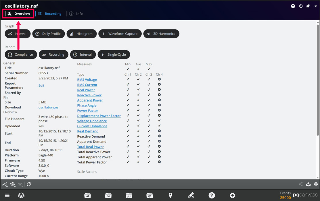
The Overview screen is organized into a set of cards:
- Power Quality Report — a high-level summary of the recording, including the top issues and an overall severity indication.
- Compliance — quick indicators showing how the recording compares to industry standards, such as ANSI C84.1, IEEE 1453, and IEEE 1668
- Focus Areas — links into more detailed reports for disturbances such as sags, swells, flicker, harmonics, and imbalance.
- Waveforms and Stripcharts — shortcuts to the waveform and stripchart analysis views that Merlin™ creates, which provide more detailed breakdowns of captured events and trend data.
From the user’s perspective, Merlin™ behaves like an additional analysis layer on the recording. It does not change the underlying data, and it does not replace existing tools such as traditional reports or investigations. Instead, it provides a guided path through the data, helping the engineer move quickly from a high-level summary to specific events, time ranges, and graphs inside PQ Canvass.
Starting an Analysis
To use Merlin™ on a recording, the user begins in the same way as any other PQ Canvass workflow:
- Open the Recordings window from the Dock and select a recording from the list.
- Once the recording summary is displayed, click the Overview tab to open the Merlin™ main screen.
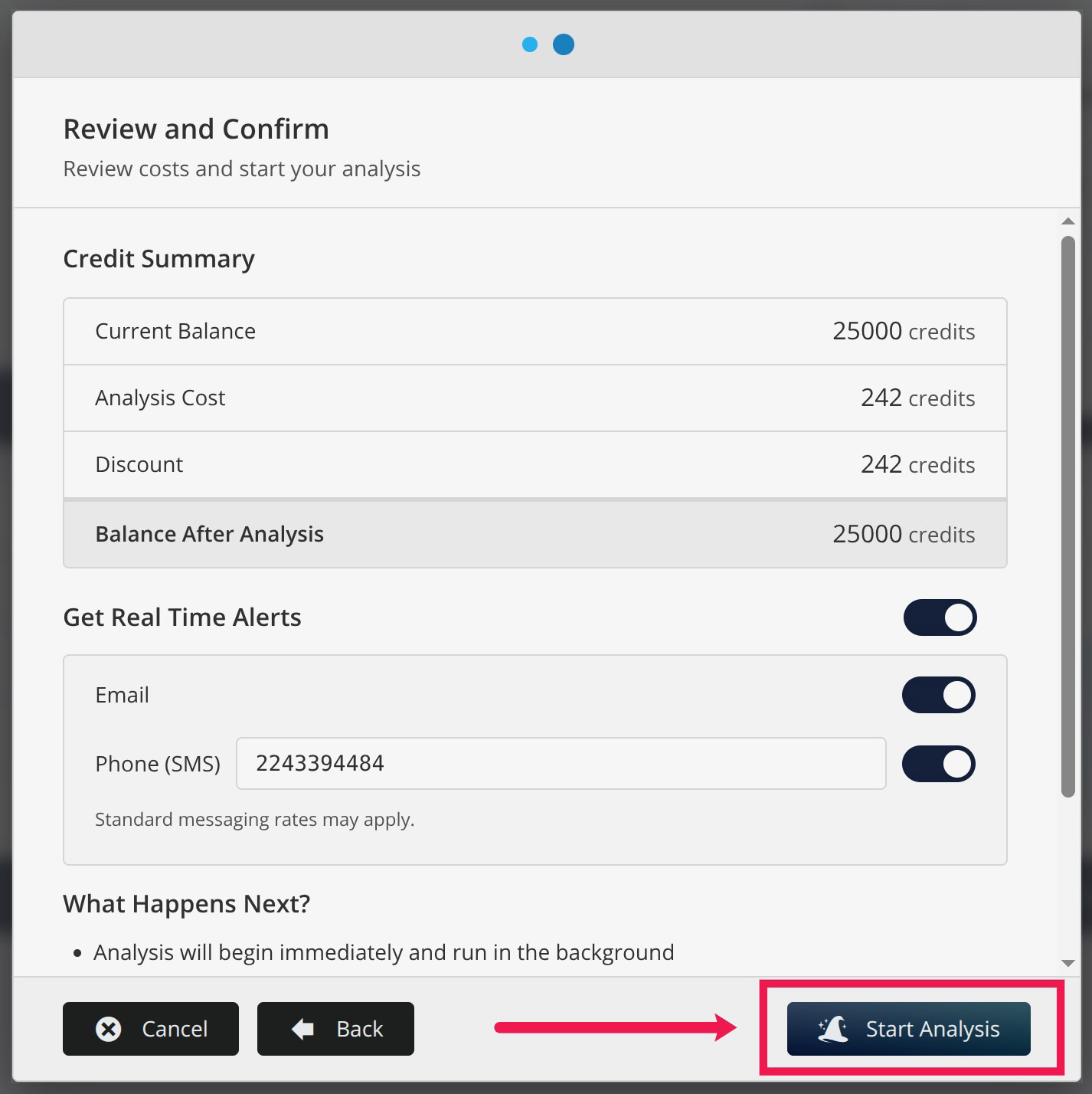
PQ Canvass will display a confirmation dialog before the analysis begins. This screen may show information such as the analysis cost (in credits) and a brief explanation of what Merlin™ will do with the recording. After the user confirms, the analysis starts and runs in the background.
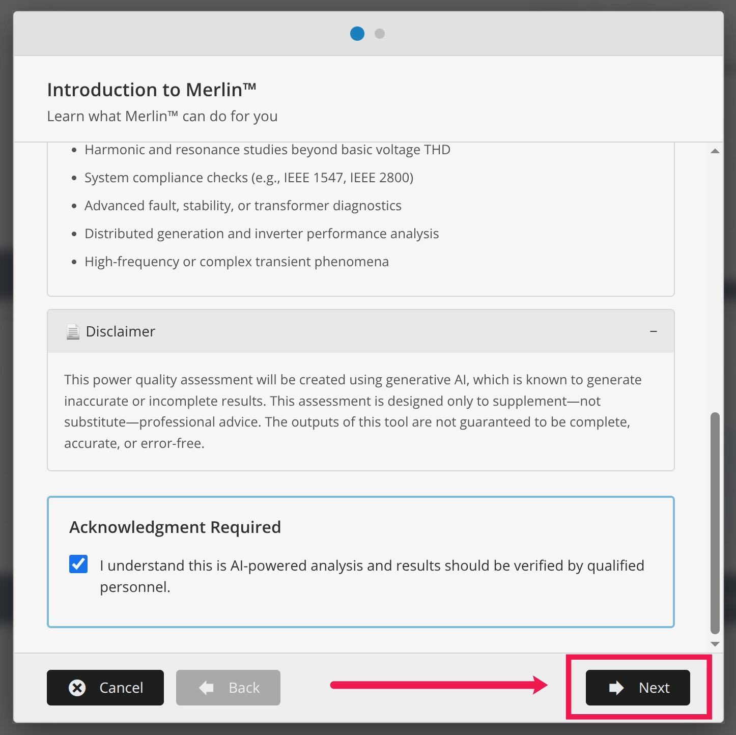
While Merlin™ is working, the Overview screen shows that the analysis is in progress. Users are free to navigate to other views within PQ Canvass while the analysis runs; the recording data and standard tools remain available. Users may also completely navigate away from PQ Canvass during analysis or even close the PQ Canvass tab in their browsers as all analysis is occurring outside of the browser. If selected, the user will receive an email and/or SMS message alerting them that the analysis is complete at which time they can return to PQ Canvass to review the analysis.
When the analysis is complete, the Overview cards become active. The Power Quality Report populates with the main findings, the Compliance indicators update, and the Waveforms and Stripcharts cards can be clicked to open their respective detailed views. At this point, the engineer can move directly into interpreting the results, using the summaries that Merlin™ generates as a roadmap and the existing PQ Canvass graphs as the primary verification tools.
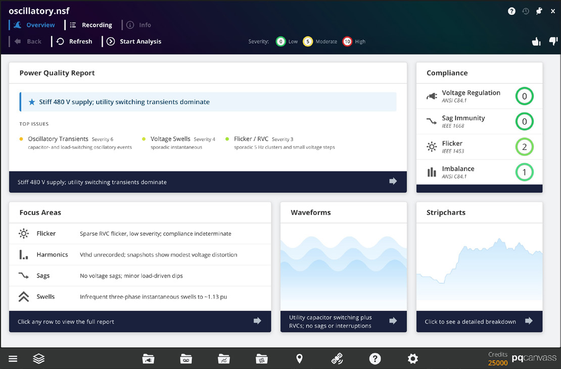
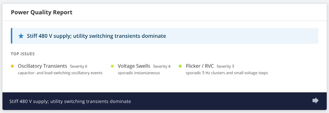
Power Quality Report
The Power Quality Report card is a main summary of a recording. After an analysis is complete, this card displays a short headline describing the dominant behavior in the data, along with a list of top issues. Each issue includes a name and a short descriptor, for example:
- Loose neutral – mirrored V1/V2 excursions
- Transient – impulsive or oscillatory transient clusters
- Flicker – discrete flicker events over the monitoring period
Clicking the Power Quality Report card opens a detailed recording-level report. This report is written in plain language and is intended to answer a simple question: “What is going on in this recording?”
Some features of the report include:
- A short executive summary describing the overall voltage quality
- A discussion of the most important disturbances (for example, imbalance with harmonics and occasional transients)
- Commentary on how often these disturbances occur and whether they appear to be utility-side or customer-side issues
- A concise list of observations and suggested next steps for investigation
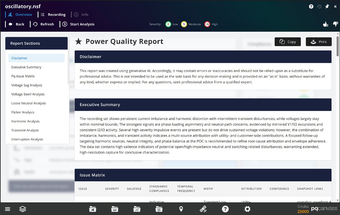
This top-level report does not change any data in PQ Canvass and does not replace formal standards reports. Instead, it gives the engineer a starting point: a clear statement of the dominant issues, plus enough context to decide which graphs and intervals to examine first.
PQ Issue Matrix
As part of the recording-level report, Merlin™ presents a PQ Issue Matrix that summarizes the main power quality disturbances in a single table. Each row corresponds to a familiar issue category—such as voltage sags, voltage swells, transients, flicker, harmonics, voltage regulation, voltage imbalance, loose neutral, interruptions, or rapid voltage changes (RVCs). The columns describe how each issue appears in the recording and provide quick links back to representative graphs and captures.
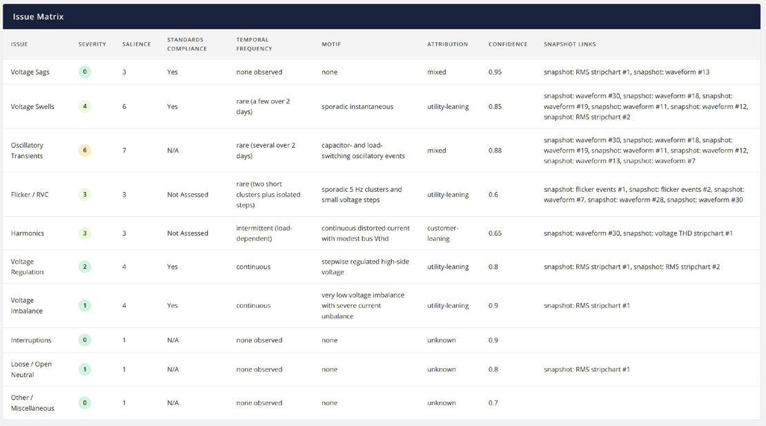
The Severity column uses the same 0–10 scale shown elsewhere in Merlin™, indicating how technically severe the behavior is within the dataset. Salience describes how central that issue is to the overall “story” of the recording; a disturbance may be present but not particularly important, or it may be the dominant feature driving most of the observed behavior.
Standards Compliance gives a concise statement of how the observed behavior compares to the relevant voltage standards—for example, “Yes,” “Indicative Yes,” “Not Assessed,” or “N/A”—without replacing a full standards report. Temporal Frequency describes how often the issue occurs (none observed, infrequent, continuous, very infrequent bursts, and so on), while the Motif column provides a short technical description of the pattern, such as “isolated three-phase instantaneous swells with oscillatory transients” or “near-zero Pst with sparse 3–5% rapid voltage changes.”
The Attribution and Confidence columns help guide follow-up work. Attribution indicates whether the behavior appears more consistent with utility-side, customer-side, or mixed influences, and Confidence expresses how strongly Merlin™ supports that interpretation. Finally, Snapshot links provide direct references to specific waveforms and stripchart analyses that best illustrate each issue. From the engineer’s perspective, the PQ Issue Matrix acts as an index: it condenses findings from Merlin™ into a single view and makes it easy to jump from a high-level description of a problem to the exact graphs that show it in the data.
Compliance Snapshot
The Compliance card provides a quick screening view of how the recording compares to several common voltage-related standards. After an analysis, the card shows a status indicator for each of the following items:
- Voltage Regulation – ANSI C84.1
- Sag Immunity – IEEE 1668
- Flicker – IEEE 1453
- Imbalance – ANSI C84.1
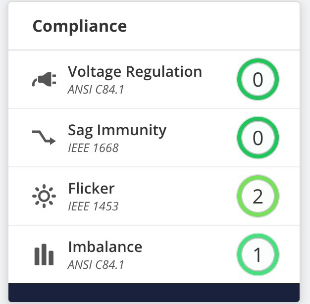
Each row displays a simple indicator, allowing the user to see at a glance whether Merlin™ observed any potential concerns with respect to that particular standard. The intent is not to provide a full, clause-by-clause compliance report, but to highlight whether the recording appears generally consistent with these limits or whether it shows behavior that warrants closer review.
For example, Merlin™ may indicate that voltage regulation under ANSI C84.1 appears acceptable while flagging possible flicker concerns relative to IEEE 1453. In practice, this lets an engineer know whether a formal standards report is necessary.
Focus Areas
Below the Power Quality Report, the Focus Areas card lists several major classes of power quality disturbances. They include:
- Flicker
- Harmonics
- Sags
- Swells
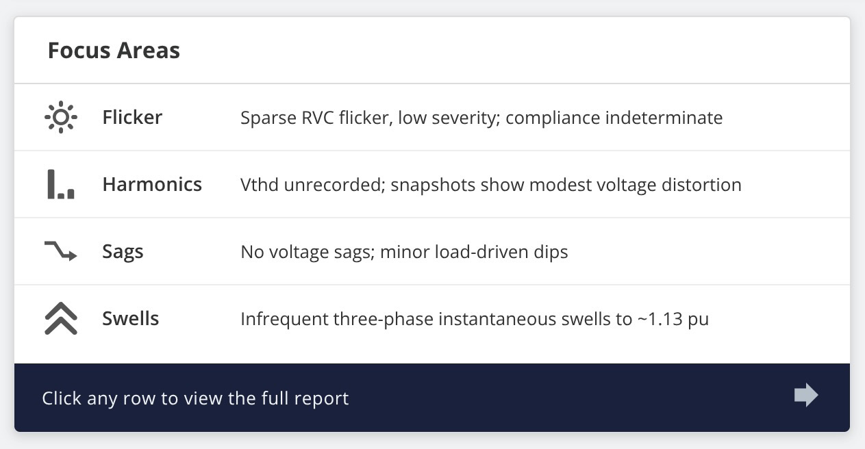
Each row is accompanied by a one-line description summarizing what Merlin™ observed in that area, such as “Persistent current imbalance; harmonics; discrete flicker events” or “Low Vthd; persistent current imbalance with harmonics.” These short phrases give a quick sense of which effects are present and how they behave over the length of the recording.
Clicking any row in the Focus Areas card opens a dedicated report for that disturbance. For example, choosing Sags opens a voltage sag report that gathers together sag-related observations made by Merlin™: frequency of occurrence, typical magnitudes, clustering in time, and notes about likely causes. The same pattern applies for swells, flicker, and harmonics.
These phenomena-specific reports are useful when an engineer already knows which type of disturbance is of interest—for instance, following up on a customer complaint about lights dimming, or verifying harmonic behavior near a sensitive load. The role of Merlin™ is to collect all of the relevant information for that disturbance into a single, readable narrative so that the engineer does not have to manually cross-reference multiple graphs and events.
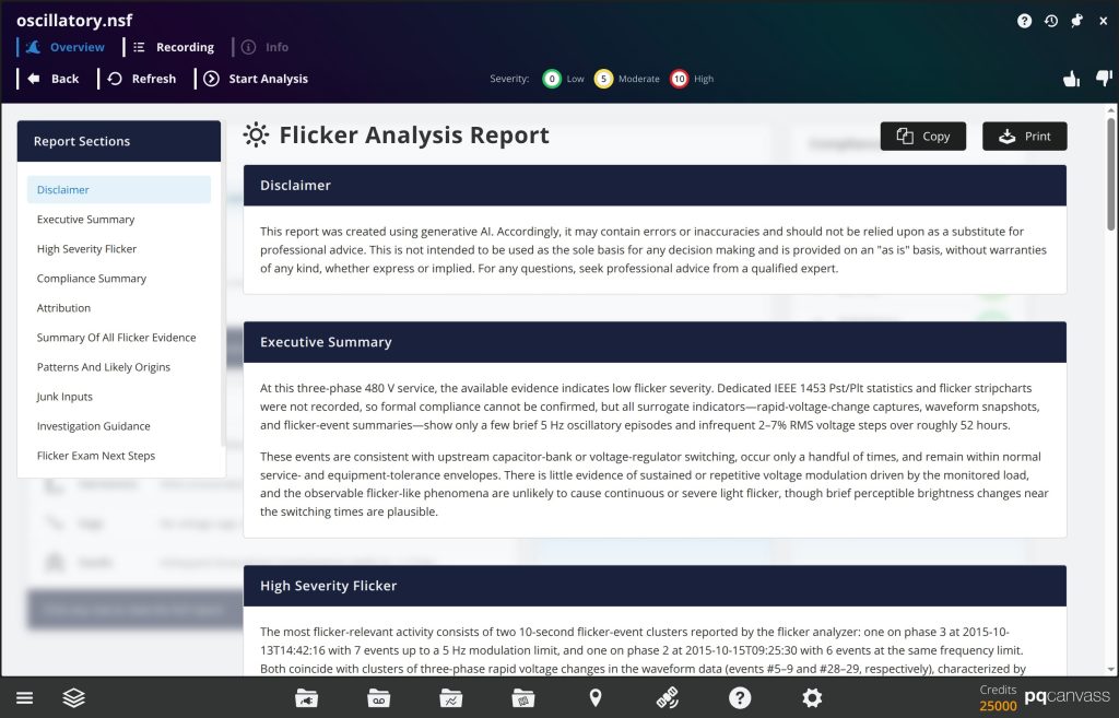
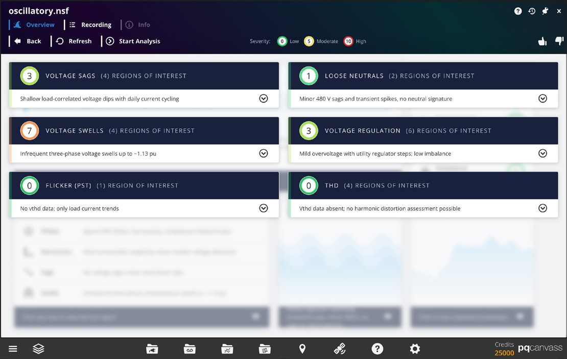
Waveform Analysis
After Merlin™ finishes processing the triggered captures for a recording, the card displays a single sentence summarizing the overall waveform behavior, such as “Imbalance and harmonics dominate PQ.” Clicking this card opens the waveform analysis view. The screen is divided into two main areas. On the left, Merlin™ lists the individual captures, grouped into High Severity Waveforms and Less Severe Waveforms.
Each entry shows:
- A severity value on the standard 0–10 scale.
- A disturbance label (for example, Voltage Swell, Impulsive Transient, or No Disturbance).
- The capture number.
- A short one-line description.
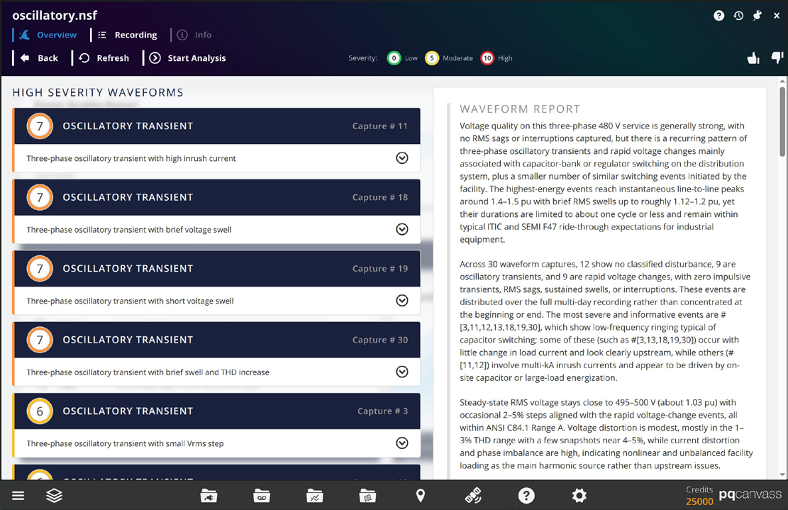
Engineers can scroll this list and expand any capture to read a longer description of the event by Merlin™. There is also a waveform capture preview that, when selected, opens the full Waveform graph. This makes it easy to move directly to the most significant events instead of stepping through captures in numerical order.
On the right, Merlin™ provides a Waveform Report and two summary graphics. The Waveform Report is a narrative overview of the entire capture set. It describes the dominant power quality behavior—for example, persistent current imbalance with harmonic distortion and occasional transients—and offers brief comments on likely sources, compliance context, and suggested follow-up actions.
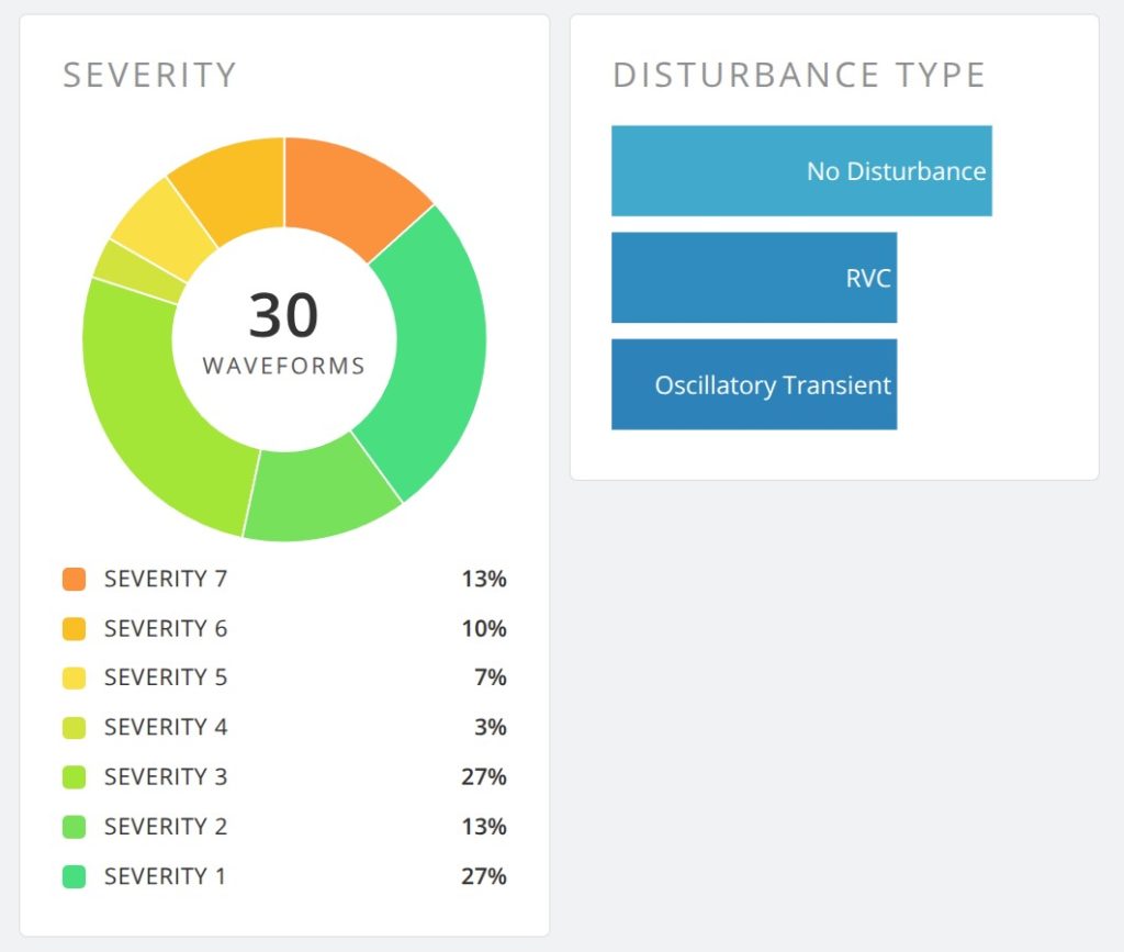
Below the text, a Severity chart shows how many captures fall into each severity band, and a Disturbance Type chart summarizes how events were classified (such as “No Disturbance,” “Voltage Swell,” or “Impulsive Transient”).
Stripchart Analysis
Clicking the Stripcharts card opens a view composed of several analysis cards, each focused on a specific aspect of the stripchart data—for example:
- Voltage sags and dips over time
- Voltage swells and overvoltage conditions
- Steady-state voltage regulation
- Loose neutrals
- Voltage THD trends
- Flicker severity over the monitoring period
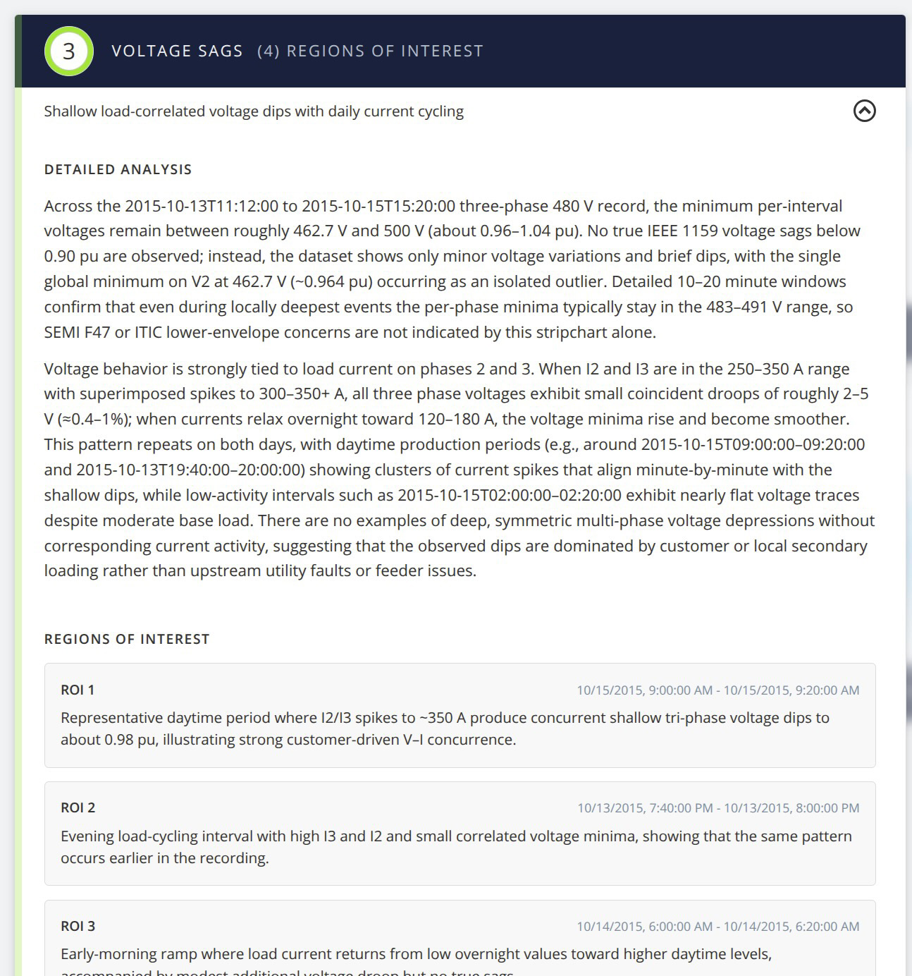
Each stripchart analysis card contains a short written summary and, where appropriate, a list of “regions of interest” – time intervals where Merlin™ found behavior worth reviewing more closely. These intervals are reported using their start and end times so that the engineer can navigate to the corresponding portion of the stripchart graph available in PQ Canvass.
In practice, this view is particularly helpful for long-term recordings where manual scrolling through days or weeks of data would be impractical. Merlin™ points out when and where notable changes occur, such as recurring evening sags, gradual voltage drift, or periods of increased flicker. The engineer still uses the standard stripchart display to perform measurements and create screenshots, but the time required to locate the important intervals is significantly reduced.
Conclusion
Merlin™ adds an AI-assisted analysis layer to PQ Canvass, turning large and complex recordings into clear, organized findings. By reviewing waveform captures and stripchart data together, Merlin™ highlights the dominant power quality issues in a recording, relates them to familiar standards such as ANSI C84.1, IEEE 1668, and IEEE 1453, and directs the user to the specific events and time ranges that deserve attention.
Engineers remain in control of the investigation. All interpretation is anchored in the existing PQ Canvass environment: the Power Quality Report and focus-area reports point to the underlying data, while the waveform and stripchart views provide severity-ranked lists and narrative summaries that can be checked against traditional graphs and reports. This approach preserves established workflows while reducing the time spent locating and prioritizing problems.
With Merlin™, PQ Canvass becomes an even more efficient platform for power quality work. Routine screening of long-term monitoring data, complaint investigations, and follow-up reporting can all be performed more quickly, with less manual searching and documentation effort. Merlin™ handles the initial triage and organization of the data so that engineers can concentrate on diagnosis, corrective action, and communication with customers.
