Abstract
In this whitepaper we will discuss how to use the PMI Flicker Calculator worksheet to visualize and assist in customizing flicker settings in ProVision. This worksheet was briefly mentioned in the whitepaper titled “Customizing the GE Flicker Curve” and is a very useful tool to have available when altering these settings. Here we introduce a reorganized version of the worksheet which will be used to demonstrate how to transfer settings from ProVision, how to interpret and customize those settings, and how to transfer the settings back to ProVision.
Introduction
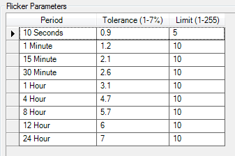
The PMI Flicker Calculator worksheet is a Microsoft Excel spreadsheet that was created to assist in customizing flicker settings by providing a visual representation of what the settings in ProVision look like, especially in comparison to the reference GE curves. In ProVision, custom flicker settings are established by editing a table of values for tolerance and limit (Figure 1). Using a tabular field to enter values works well if the tolerance and limit values you wish to change to have already been established in a similar format, but it is hard to visualize what the settings look like when creating custom curves.
To get started, download the new PMI Flicker Calculator worksheet by clicking here. This version of the worksheet has been changed from the previous version to help users understand the customization process. This new worksheet should be used to follow along with the examples below.
Worksheet Organization
For ease of understanding, the PMI Flicker Calculator worksheet can be divided into three main areas (see Figure 2):
- The PMI ProVision Settings section – used to transfer in and out ProVision settings
- The Curve Values section – used to store the values plotted in the graph
- Graph section – used to plot the GE Flicker Curves and Custom Curve
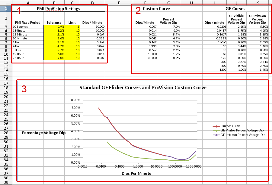
The PMI ProVision Settings section of the worksheet contains values that will be transferred to and from ProVision when editing and customizing the flicker curve. Since the tolerance and limit values are the only editable fields for custom flicker in ProVision, these fields have been highlighted in yellow to remind the user of this fact. The rest of the fields in the worksheet do not need to be edited directly.
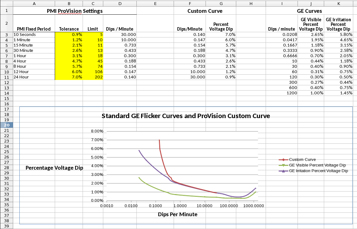
The Curve Values section of the worksheet contains the information that is used by the graph to draw the individual traces. The Custom Curve data set is calculated automatically from the settings information in the PMI ProVision Settings section while the GE Curves section uses fixed values to render the traces in the graph. The GE Visible and the GE Irritation curves presented here are approximations of the original curves established in IEEE Standard 141.
The graph section uses the data in the Custom Curve and GE Curves section to plot the curve values on the graph. The “x” axis represents the Dips per Minute and the “y” axis represents the Percent Voltage Dip. When editing the ProVision settings, the Custom Curve plot will change to represent the newly entered values.
Transferring ProVision Settings
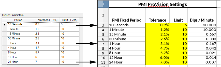
Each row in The PMI ProVision Settings of the worksheet has a PMI Fixed Period that matches one to one with the Flicker Parameter settings in ProVision (Figure 3). If you have existing values in ProVision that are different from the defaults they can be transferred to the worksheet for visualization during editing. To do this, open the Edit Settings Panel. Click the Advanced Button then find the “Flicker” tab. From this tab, copy the tolerance and limit values for each row to the corresponding row in the worksheet.
Customizing the Flicker Curve
To demonstrate the customization of the flicker curve we are going to use a recording file that contains two electric pumps of different sizes. Both of these pumps produce significant voltage drops and consequently are a source of flicker. In this scenario, we want to exclude these pumps from any future flicker reports so that we can continue to monitor for other (possibly external) flicker events. In situations where a known, predictable load has presented a baseline amount flicker with no customer complaints, it can be useful to adjust the flicker curve in that location to take this acceptable baseline into account as “normal”.
For the first step, we need to find the periodicity and the depth of the motor starts for use in future calculations. To accomplish this, we will use an RMS Voltage and Current graph from ProVision as seen in Figure 4. Between 3pm and 4pm it is observed that there are five small motor starts and three large motor starts. From those numbers, we can estimate a small motor start every 12 minutes and a large motor start every 20 minutes. These pumps are highly periodic and the same pattern continues throughout the 24 hour period. If the pattern were irregular we might need to select a longer time span in order to estimate the frequency of voltage sags.
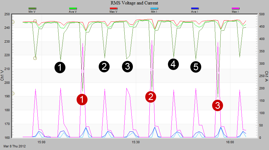
Next, we need to find the maximum depth of the voltage sag for each motor so that we can calculate the tolerance values. These values will be used to determine which time periods are affected by the motor start and subsequently will indicate which time periods to exclude. To find the depth of the sag we use the same RMS Voltage and Current graph from ProVision. Click on the graph to select it and press “t” to open the point view box, click on a voltage sag in the graph, then use the left and right arrow keys to step across the points to find the actual value of the sag. In our case the minimum sag of the small pump motor start is 216.3V. This is a 9% drop from the nominal voltage of 240V. The minimum sag of the large pump motor start is 193.7V. This is a 20% drop from the nominal voltage.
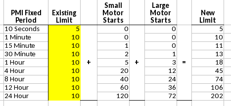
In order to exclude the motor starts from being reported we need to find the time periods that are affected and adjust the limit to exclude them. To do this, use the voltage drop percentages (calculated above) to compare to the tolerance levels for each PMI Fixed Period in the worksheet. If the voltage drop percentage is higher than the Tolerance in the worksheet, the limit for that time period must be adjusted. In our case, both the small motor and the large motor have voltage drops that are larger than the tolerance value. Therefore, all time periods must be adjusted for both motors.
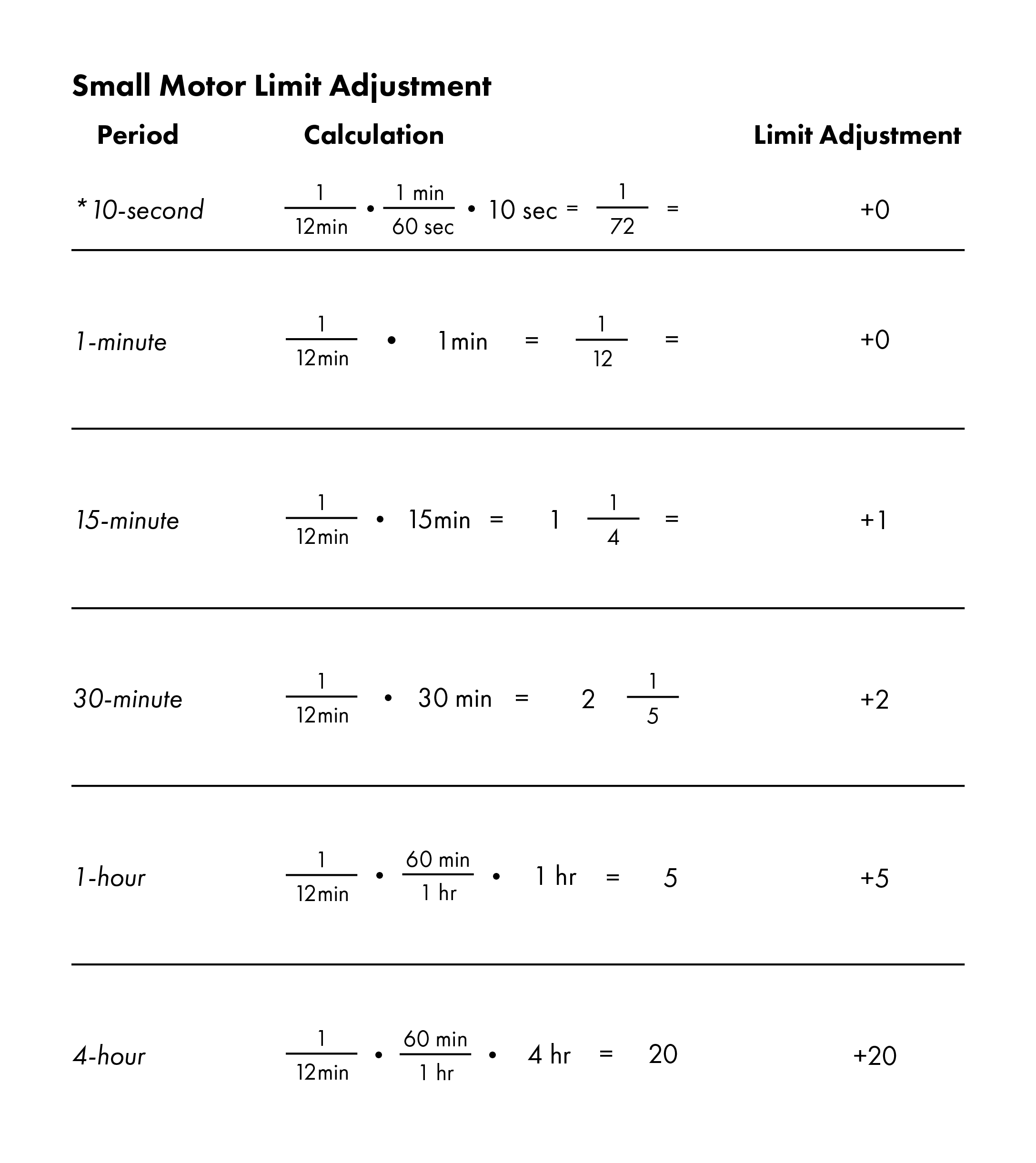
Now we must calculate how many motor starts are expected per period and adjust the limits to give us a new curve. The calculations that are used to match the motor start rate to the time periods are shown in Figure 5. The results of the calculations need to be added to each time period (Figure 6). Add those values to the limit for the corresponding time period in the worksheet and the graph should update immediately as seen in Figure 7. Once you are finished adjusting the values in the worksheet and are satisfied with the new curve, the tolerance and limit values can be copied back to their corresponding row in ProVision using the reverse of the method described in the Transferring ProVision Settings section above.
Effects of Changing the Tolerance Levels
Adjusting the Tolerance levels could have been used to exclude the motor start events in the example above except that it would have the adverse effect of excluding any flicker events that did not reach the threshold level. In this case the threshold would have to be set to 20% to exclude the larger motor. Setting the threshold that high would certainly hide most other flicker events. If you want to mask a particular device it is best to exclude it by using its time/frequency component as in the customization example above.
On the other hand, changing the tolerance levels can be useful for raising or lowering the curve as a whole without the need for additional calculations by hand. For example, by using the default ProVision Settings and lowering each tolerance value by the same amount, we can easily move the custom curve closer to the GE Visibility curve without much effort.
Conclusion
The PMI Flicker Calculator worksheet is a useful tool for visualizing changes to the flicker settings in ProVision without the need to hand-plot the values. The default values or custom sets of data can be copied into the worksheet, edited, copied back into ProVision with minimal effort. We hope that this worksheet and the example are useful in making your power quality monitoring work easier and more effective.
