The Canvass power quality portal provides the user many different tools for analyzing voltage, current and power over considerable periods of time. One such tool is the Daily Profile Graph, which allows the user to view average readings over a specific time period. While other white papers have given an overview of this graph, this whitepaper is going to focus in on one specific feature of the Daily Profile Graph: the Standard Deviation Overlay.
Daily Profiles Overview
The Daily Profile Graph alone provides a look into the average readings of a user-defined period of time (the default is seven days). A time period of days is specified by a user and Canvass will average the readings taken over that range, second-by-second, to present the user with the average voltages for each second of the day in a 24-hour day over the specified time range.
This in itself can be tremendously useful. Looking at a default, single-channel voltage Daily Profile Graph as shown in Figure 1, the user will note a handful of things right off the bat:
- The graph is a 7 day Daily Profile, excluding weekends
- Voltage levels start to drop off at about 0700 and level out around 0830
- Voltage levels rise a little around 1100 through 1330 and then fall again
- Voltage levels rise back to the early morning levels around 1700
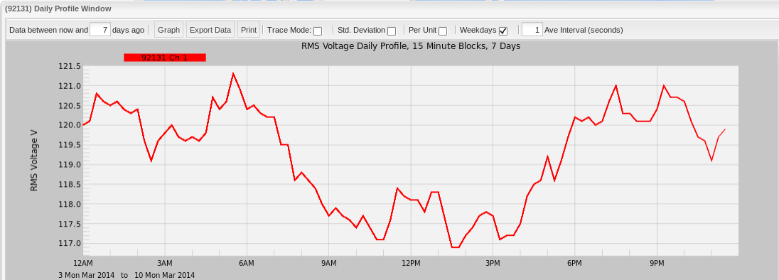
To make the graph more significant, consider the source of this data: a three-phase, ethernet-powered (PoE – Power over Ethernet) voltage and current-enabled Boomerang connected through a rig at the author’s desk. The rig is plugged into a standard 120V power strip (that it shares with a handful of office appliances). Knowing where the data is coming from, those observations from above start to make more sense: PMI employees start to stream into the facility around 0730 in the morning; break for lunch around 1100; lunches end around 1300; and everyone starts to pack up and head home for the day starting around 1700 in the evening. A pretty typical day.
Getting More Out of Daily Profiles with Standard Deviation
The default Daily Profile Graph is already pretty powerful as we have just seen. It is great to see a sort of “snapshot” of what the readings have looked like over a period of time and can provide the user a good idea of how the system being measured has reacted. However, the Daily Profile Graph is composed of averages accumulated for each second of a 24-hour day over a given time period. These averages do not necessarily depict the full picture of what occurred. For instance, the user may see that the average voltage on channel 1 at 15:00 over the past seven days was 120V. That may be the result of several readings hovering around 120V, or it could very well be the average of several readings that have been scattered between 110V and 130V – a huge variance – that cannot be seen by simply looking at the default Daily Profile Graph.
This is where the standard deviation overlay comes into play. Clicking on the “Std Deviation” checkbox to enable the overlay redraws the graph with the overlay enabled, as shown in Figure 2.
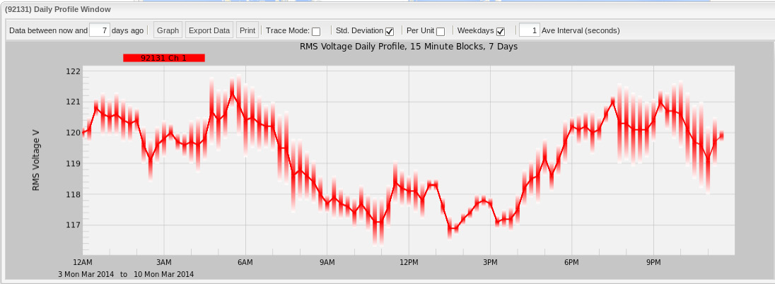
At first glance, it may not be overwhelmingly clear what the standard deviation overlay is presenting to the user. What this overlay is showing is the magnitude of variance from the average values that the group of points used to generate that average value was calculated from. In other words, if that 120V reading that we talked about just a few moments ago was the result of a whole bunch of readings that were hovering right around 120V, then the “standard deviation bar” would be very short and a solid gradient. If, on the other hand, it was the result of massive (but an essentially even distribution of) swings between 110V and 130V, then the “standard deviation bar” would be very long with a darkening gradient encompassing the more common reading ranges and lighter gradients towards the less common readings. For instance, if the readings ranged from 110V to 130V where the bulk of the values were closer to either 115V or 125V, then the bar would be darker between 115V and 125V with the lighter gradient being drawn on either side heading towards 110V and 130V.
A very convenient feature of the standard deviation bars is that they are calculated in terms of the units measured, which means that for voltage, each standard deviation bar is a measurement from the average in units of volts. (For current, naturally, it is measured in units of amps.) This allows the user to see the actual magnitude – in volts (for our example) – of deviation from the average.
For reference, standard deviation is calculated using the following formula:
Closer Analysis
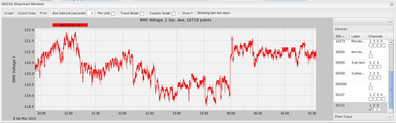
It may be easier to think of a Daily Profile Graph as the average of a series of 24-hour long stripchart graphs spread over the time span of the Daily Profile Graph (default of seven days). Looking at the individual stripcharts for those time periods can shed some light on how the Daily Profile Graph got its shape and how the Standard Deviation Overlay got its form as well.
Looking at the sample Daily Profile Graph with standard deviation, the user can see that the greatest deviation occurs between 0700 and 0900 in the morning and between 2000 and 2300 in the evening. The smallest deviation (meaning that the values are closest together) occurs between 1300 and 1500 – right after everyone is getting back into the office, settling down from lunch and writing their white papers.
Below, I have selected two stripcharts covering the same five hour time span, but 24 hours apart (from about 2000 until 0100 on Saturday the 8th of March and Sunday the 9th of March). This data is encompassed in the 24 hour, seven day Daily Profile with standard deviation from the examples above. Looking at the two stripcharts in Figure 3, the user can see that there is indeed a lot of voltage fluctuation between these hours. These fluctuations (sometimes as high as four and five volts) are the cause of the larger “standard deviation bars” found between these hours on the Daily Profile Graph.
Conclusion
By themselves, the Daily Profiles Graphs are a very useful utility for a power quality expert. Adding standard deviation overlays to this feature paints a much more precise picture as to what is actually going on.
