Abstract
Power quality data in ProVision is presented in two distinct formats: as either a text-based report, or as a graphical image. The latter category, referred to in ProVision as graphs, come in two distinct types—as either a standard stripchart, or as a 3D graph. Each graph type is useful for visualizing and displaying data, however, the data is displayed differently for each, even when it is the same data.
Standard stripchart graphs present values on two axes: height and width, commonly representing magnitude and duration respectively. The actual data are represented as traces on the graph, with each trace being drawn a unique colour. 3D graphs also present the magnitude and duration quantities of data. However, each trace is represented as a distinct entity. This whitepaper contains an overview of the 3D graph feature in ProVision.
Currently, voltage and current harmonics and interharmonics can be rendered in 3D. To create a 3D graph, from the main menu bar, select Graphs, then 3D Harmonic Graphs. Doing this opens a submenu allowing selection of either voltage or current, and subsequently, which channel of the type to produce. After this selection has been made, the corresponding 3D graph will be opened for each checked recording in the explorer tree, if that recording contains the appropriate data.
For individual specific recordings, the 3D graph can also be opened via the Header Report for that recording. If the recording contains harmonic or interharmonic data that can be represented as 3D graphs, a clickable link will appear in the Header Report in the section for Harmonic Interval Data and Interharmonic Data, respectively. These are the channel headers for each. For example, selecting the link for “Ch1” under Voltage Magnitude in the Harmonic Interval Data section opens the 3D graph for channel 1 voltage, displaying only harmonics by default. If interharmonic are present, the graphs for those can be launched via similar links in the Interharmonic Data section of the header report.
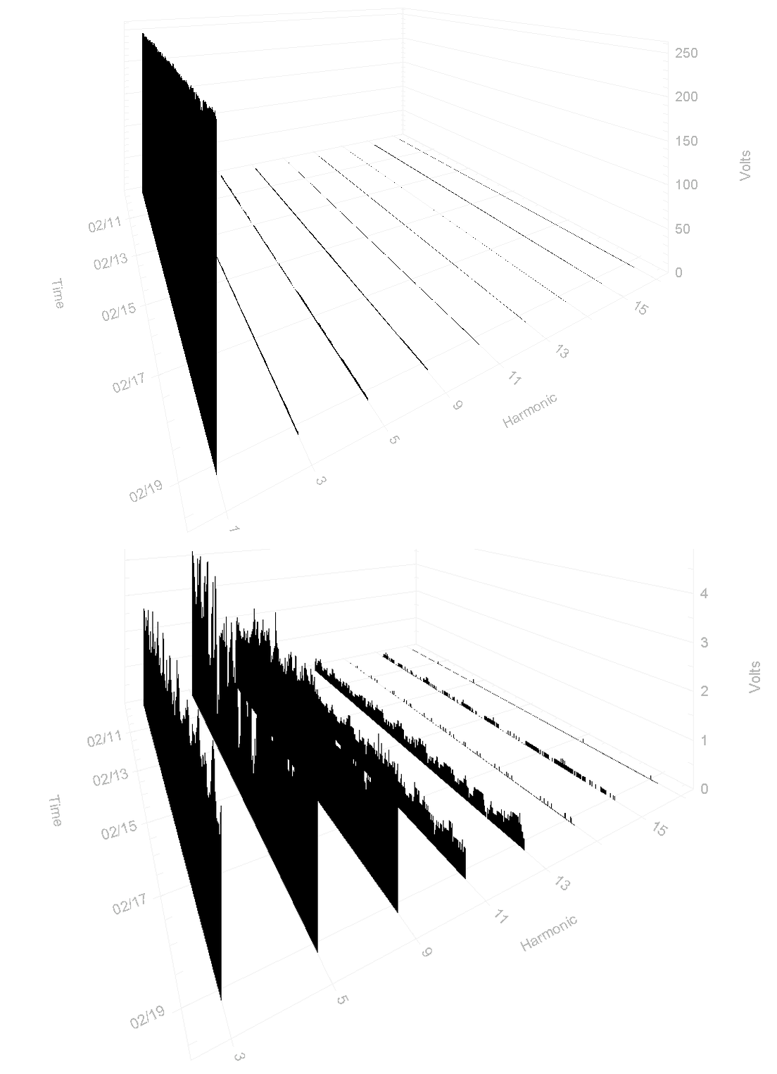
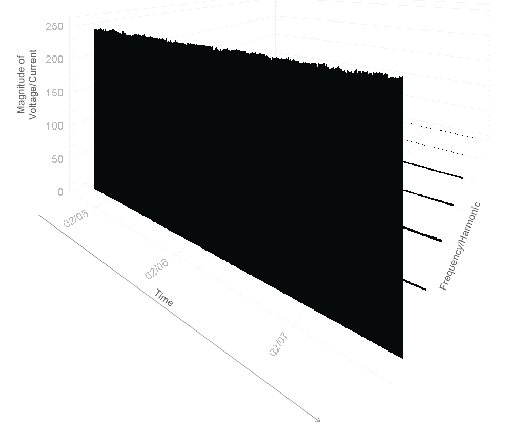
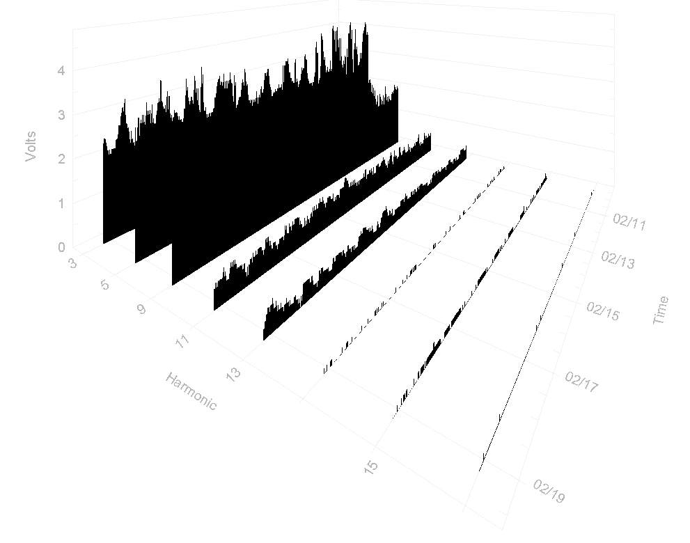
The graph is first launched in the initial orientation shown in Figure 1. Each axis is scaled based on the largest trace in the collection of those being displayed. If the collection is modified, the graph will be redrawn and the scale will be determined again if the largest trace has changed. The graph can be reoriented to modify the angle the data is viewed from by moving the horizontal and vertical scrollbars at the edge of the screen. This can be useful when necessary to put emphasis on certain parts of the data. In addition, changing the orientation of the graph can expose hidden details, such as to reveal more of a smaller trace obscured by a larger one. In many cases, the earlier harmonics (e.g. 3rd, 5th) are much larger than the later ones, and can cover the 3D traces of the smaller ones (Figure 2).
Additional options for graph visualization are available in the context menu, accessed by right-clicking the mouse. These options include modifying the font size and style, the appearance of the graph itself, the colour of individual traces, and which traces are displayed. The former three can all be modified in the Customization Dialogue, and the latter in the Select Interharmonics window.
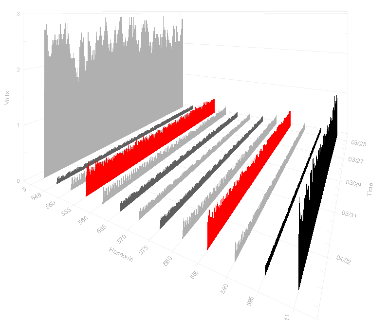
The customization dialogue contains multiple tabs, each of which contains controls to modify the appearance of the graph. Visual aesthetics of the graph can be changed on the General and More tabs. The Font tab applies special formatting to the faces of the fonts used in the graph—Main Title, Subtitle, and Axis Labels. The tab for Color controls which colours different unique parts of the graph, such as the background and the axis planes, can be changed. Finally, the tab for Style allows changing colour of the individual traces (Figure 3). Being able to adjust the graph parameters and trace settings can be useful when wanting to draw attention to certain information.
While the Customization Dialogue only allows changes to how the data are displayed, the Select Traces Window allows filtering and selecting of which data are to be displayed. The Select Traces Window is also available from the context menu, and, when launched, is populated with all available data traces in the recording, and their current visible state. To change whether a trace should be shown or hidden, respectively select or clear the corresponding checkbox. The Select Traces Window also has a context menu, accessible via right-mouse click, which contains options to toggle the visibility state of multiple traces at once. Selecting OK will redraw the graph with the updated collection of displayed traces. Note that the text size is scaled based on the number of traces selected. In addition to its presence in the Select Traces Window, the first harmonic (fundamental) can have its visibility also toggled directly from the context menu via the “Show Fundamental” option as shown in Figure 4. Since fundamental (60Hz) level is usually much higher than any harmonic, including it can make the other traces difficult to see due to the graph autoscaling. Turning off the fundamental via the “Show Fundamental” option is critical to seeing the full detail of the harmonics.
When selecting which traces to display via the Select Traces Window, it is important to note that rendering the traces can be computationally expensive. These renders occur whenever the state of the graph is modified: whether traces are added or removed, if the graph is rotated, or if any of the customization options are modified. Therefore, if slowdown occurs when performing any of these actions, it is recommended that all irrelevant traces not be displayed.
Several options are available directly from the context menu as well. The option for Show Fundamental toggles the visibility state of the fundamental—the first harmonic—directly. The Reset option returns the style and visibility for all traces to their defaults, but does not undo any modifications made to the viewing angle or fonts.
Conclusion
The 3D graph feature in ProVision offers a distinct way of visualizing data and can provide an overview of mass numbers of traces that a standard stripchart graph would be insufficient for. This is especially useful examining harmonics and interharmonics, which requires concurrent examination of a large number of traces. The 3D presentation allows these to be seen at once for the entire recording session. Consequently, a standard stripchart graph can be used to examine individual traces with more detail. Using a 3D graph to gain an overview of the traces, then using a 2D graph for refined detail is one more way ProVision can be used for power quality analysis.