Abstract
Finding voltage sags, loose neutrals, THD correlations, and other PQ problems in a mountain of recorded PQ data can be time consuming at best. The ProVision Custom Graph Wizard lets you go beyond the built-in graphs to create templates fine-tuned for teasing out correlations between current spikes and voltage sags, loose neutral voltage swings, voltage THD and load current, and any other combination of data types. This white paper describes how to use the Custom Graph Wizard, how to share graph templates after they’re created and shows some examples of their use.
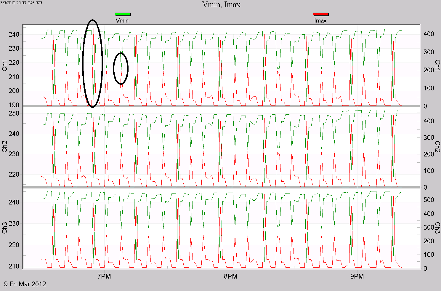
As an example, in Figure 1 a custom graph specially created for voltage sags is shown. Here the three phases of voltage and current are shown, but just the 1 cycle voltage minimums, and 1 cycle current maximums. For voltage sag issues, often only the minimum sag voltage is of interest, and to determine whether the load current is the cause of the sag, the maximum current is used. This graph shows just those two traces, one phase per plot. If the voltage sags while the current spikes, the load current is likely the cause of the sag. If the current drops in step with the voltage, it’s likely not the cause of the sag. Having these two graphed together makes sag analysis easier.
Creating a Custom Graph Template
The wizard can be invoked in multiple ways: either from the Main menu by opening the Tools menu and then choosing Custom Graph Wizard, or by Right-clicking the “Graphs and Reports” node in the Explorer Tree and choosing Custom Graph wizard. Once the wizard is opened, the template can be created. The wizard is separated into multiple steps, each of which will be covered individually.
For the first step, determine the number of plots to be included. A template must contain at least one plot, and can have a maximum of six. The plots are the areas on the graph on which the traces are drawn. Note the preview will update whenever a plot is added or removed. When the desired number of plots are added, select Next to continue.
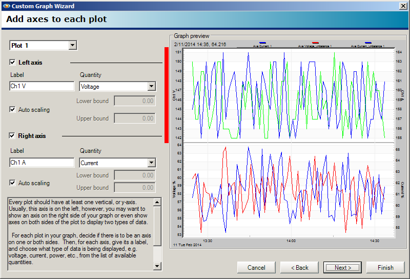
The next step requires adding axes to the plots. Refer to Figure 2. Select the plot to work with by choosing it from the drop-down in the upper left. Each plot includes the left axis by default, and at least one axis should be used. A specific axis can be enabled or disabled by checking or clearing the checkbox for that axis. For any axis which is enabled, the label and quantity for that axis can be specified. If the checkbox for auto-scaling is selected, then the scale for the axis will be determined based on the data in the recording file for that quantity type. Otherwise, if auto-scaling is disabled, the lower and upper bounds can be set explicitly. If auto-scaling is not in use, it is recommended to keep these values within a viable range for the given quantity. Once the left and right axes have been chosen and configured, select Next to continue.
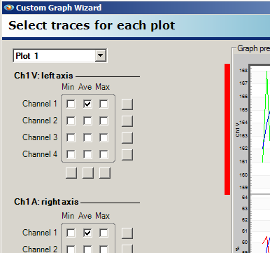
Now that the axes have been added, the traces for each plot on the axes can be set up. The plot to work with can be chosen by using the drop-down in the upper left as shown in Figure 3. For each axis on each plot, the traces to include can be enabled or disabled. Any combination of the minimum, average, and maximum for each channel can be used. The square buttons below and to the right of the checkbox array can be used to toggle the state of all checkboxes within the corresponding row or column. Once the traces have been enabled, select Next to continue.
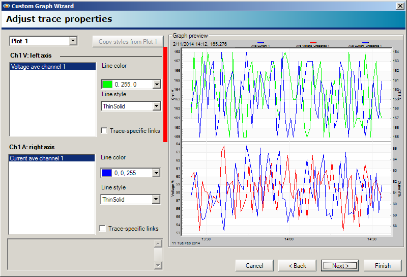
The next step allows the trace properties to be modified. Again, the active plot can be set by using the drop-down. Note that all traces for each axis are displayed as shown in Figure 4. Each trace can be selected and have its properties changed, such as line color and line type. Note that each trace will have a different randomly-generated color by default and a default line style of Thin Solid. Some trace data types will require additional information, which is set directly below the option for Line Style. For example, an interharmonic trace requires the specific frequency. Setting colors and line styles can be useful when wanting to draw attention to certain types of data. Once the colors, line styles, and necessary additional information for the traces has been set, select Next to continue.
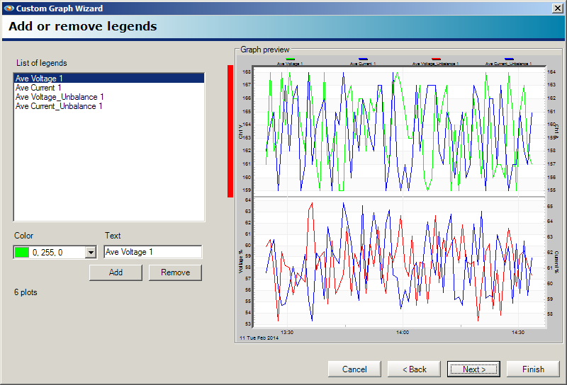
The legends step allows legends to be added to the template as shown in Figure 5. This can be convenient when using a template for a specific data set for adding additional context to a trace. Any number of legends can be added to a template, but as more legends are added, less space will ultimately be allocated for the graph itself to accommodate them. Legends can have their color and text customized to suit the needs of the template and correlate with the colors of traces added in previous steps.
The final step allows the template to be titled and named. The title will be displayed above the graph when it is loaded, and the name will be displayed as the option for that graph for menu options. It is highly recommended that the name for the template be something that concisely describes the data the template shows. When complete, select Next, then Finish on the next page to finalize the graph and close the wizard.
Using the Template
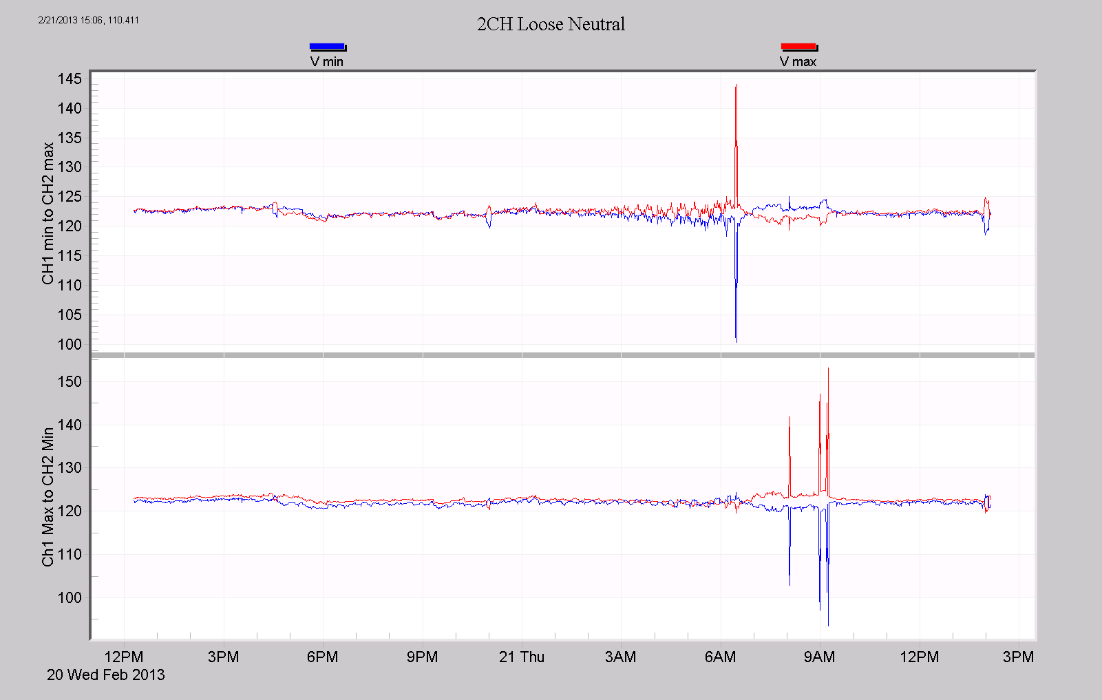
In Figure 6, a loose neutral custom graph is shown. In a typical loose neutral scenario, the voltage on one 120V leg rises, the other leg falls, and the total line-line voltage remains roughly the same. Which leg rises or falls depends on the load unbalance at that instant. On the first plot, voltage channel 1 min is plotted with voltage channel 2 max; the second plot has the opposite – channel 1 max and channel 2 min. If a loose neutral condition occurs, one of the two plots will show one leg rising, and the other falling. Here we see normal voltages until just after 6am, where the top plot shows a loose neutral once, and the bottom plot shows it three more times. These excursions are easier to spot with the custom graph designed just for this purpose.
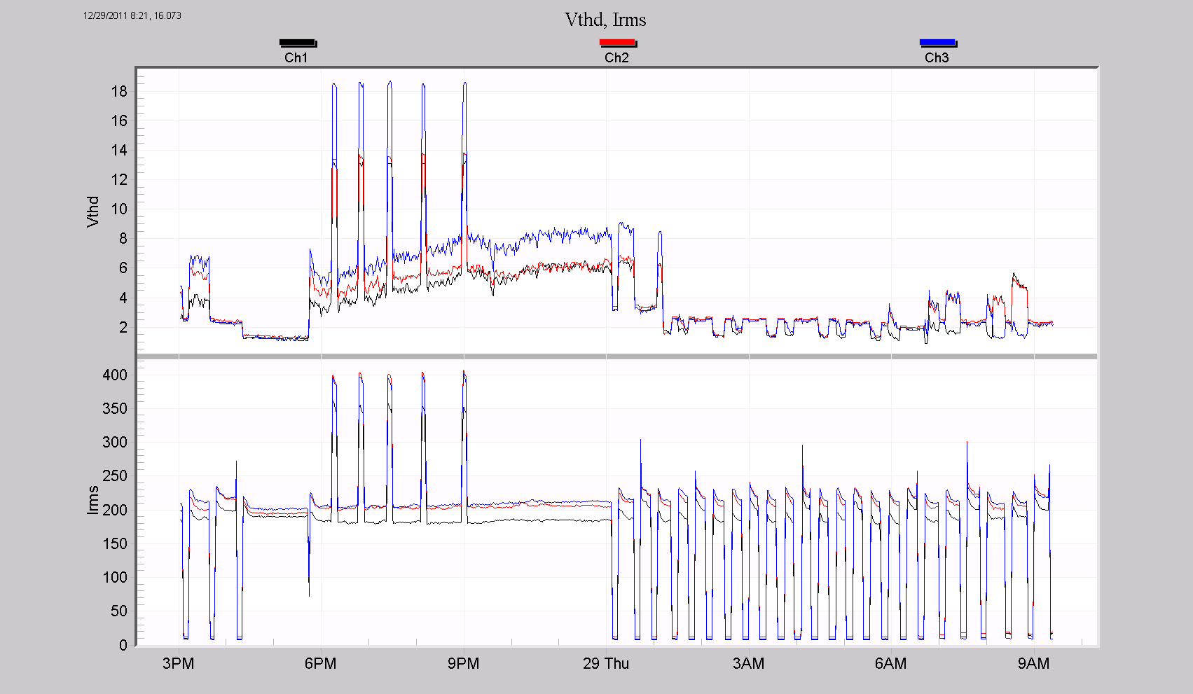
In Figure 7, three phases of voltage THD are on the top plot, and the three phases of RMS current are on the bottom plot (black/red/blue used for phase A, B, C on both). The voltage THD goes over 18%, in step with the current rising to almost 400A. The relationship is clear here – the load current is causing severe voltage THD. In a harmonic or THD study, this type of graph is very useful in answering whether the load current is a cause of voltage distortion.
All custom graph templates can be accessed attached to the Graphs and Reports node in the Explorer Tree. Alternatively, the templates can also be accessed from the Main menu by opening the Graph menu, then expanding the option for Custom Graphs. To create a graph from a template, first check the recording files in the Explorer Tree to use, then select the template to apply, using either of the aforementioned methods. This produces a dialogue populated with the recordings that are checked. Once the recording has been chosen, the graph will open. Note that if the template requests data which is not present in the recording, then the corresponding trace will not be shown. Once the graph is opened, it can be treated like any other graph in ProVision.
Custom graph templates can also be used to generate reports. This can be done from the graph itself, by using the shortcut key “R” or by selecting “Launch Report” from the context menu. Alternatively, the report can be generated directly without needing to open the graph. First open the Report menu and expand the option for Custom Graph Report. Once the report is open, it can be treated like any other report in ProVision.
Modifying a Template
A custom graph template can be edited by right-clicking the template name under the Graphs and Reports node in the Explorer Tree and choosing the option for Edit With Graph Wizard. This opens the Custom Graph wizard preloaded with the template. From this point, the template can be modified with the same procedure used to create it. Alternatively, to simply rename the template, select Rename from the context menu.
Sharing Templates
Distributing a created template can be done by right-clicking the template icon and choosing Send by Email from the context menu. In the resulting dialogue, select the option for “Save object to file you could send later” and enter a path and file name. This creates an archive file which can be sent as an attachment to a message in most email clients. The archive contents are evm files, which is a custom format used by ProVision.
To import a template into ProVision, first export the contents of the received archive. This can be done using a third-party zip utility, or by opening the archive via ProVision’s open command (Select Open from the File menu). Note if using ProVision, the archive contents will be placed in the default Recent Downloads folder. Next, import the evm file by using the open command, browsing to the evm location, and selecting it. This will show a confirmation dialogue of the elements in the evm file that were received and parsed by ProVision. This makes the received custom graph templates accessible via the menu system and the Graphs and Reports node.
Conclusion
Using a custom graph template can be a considerable time-saver when only wanting to view certain data or draw attention to a specific portion of it. Being able to create and modify templates is yet another way of getting as much functionality out of ProVision as possible in order to ease power quality data analysis.
