Abstract
Voltage flicker is one of the most visible and common residential complaints, yet one of the most challenging to quantify and address. The IEEE 1453 flicker standard defines some important, but complex measures to evaluate flicker, and presented here are new ProVision graph templates to streamline the process of investigating flicker complaints.
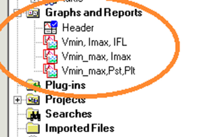
Custom Graph Templates
These new custom graph templates are arranged specifically for flicker investigations. These templates may be downloaded and imported into ProVision by clicking here. After the file is downloaded, double-click it in Windows Explorer, or chose File, Open in ProVision to import the new graphs. After the import, they’re available as graph and templates (Figure 1), and can be used on any existing recording with the required data. To launch a graph, simply open a ProVision data file, then either double-click the graph in the Graphs and Reports Tree, or select Graph, Custom Graph from the menu. To view the data in tabular report format, select Report, Custom Graph Reports from the menu.
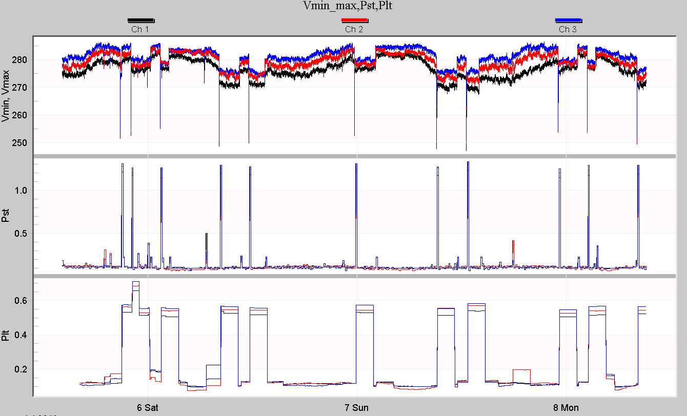
The first graph is “RMS Voltage, Pst, Plt”. It’s designed to give a complete overview of voltage fluctuations, along with the Pst (perceptibility, short term), and Plt (perceptibility, long term) flicker readings. Pst and Plt are defined in IEEE 1453, and quantify how noticeable voltage fluctuations are as they affect incandescent lighting. Although the periods are adjustable, the standard calls for a 10 minute short-term period, and 2 hour long-term period. A consistent reading of 1.0 or higher suggests that flicker may be a legitimate problem at that location. Because of the slower averaging periods of Pst and Plt, those measures are more useful for quantifying flicker rather than correlating flicker with loads. Typically Pst and Plt are used to judge if flicker is a problem, and IFL is used to track down flicker sources.
Flicker Readings
Because flicker is noticeable from quick voltage variations, it’s better to concentrate on the one-cycle minimum and maximum voltage traces rather than the average. While the average voltage is best for steady-state regulation tracking, it usually hides quick events that tend to show up in flicker readings. A low (or high) steady-state baseline voltage doesn’t have much effect on the flicker readings themselves, and the data is easier to interpret without extra, unneeded traces.
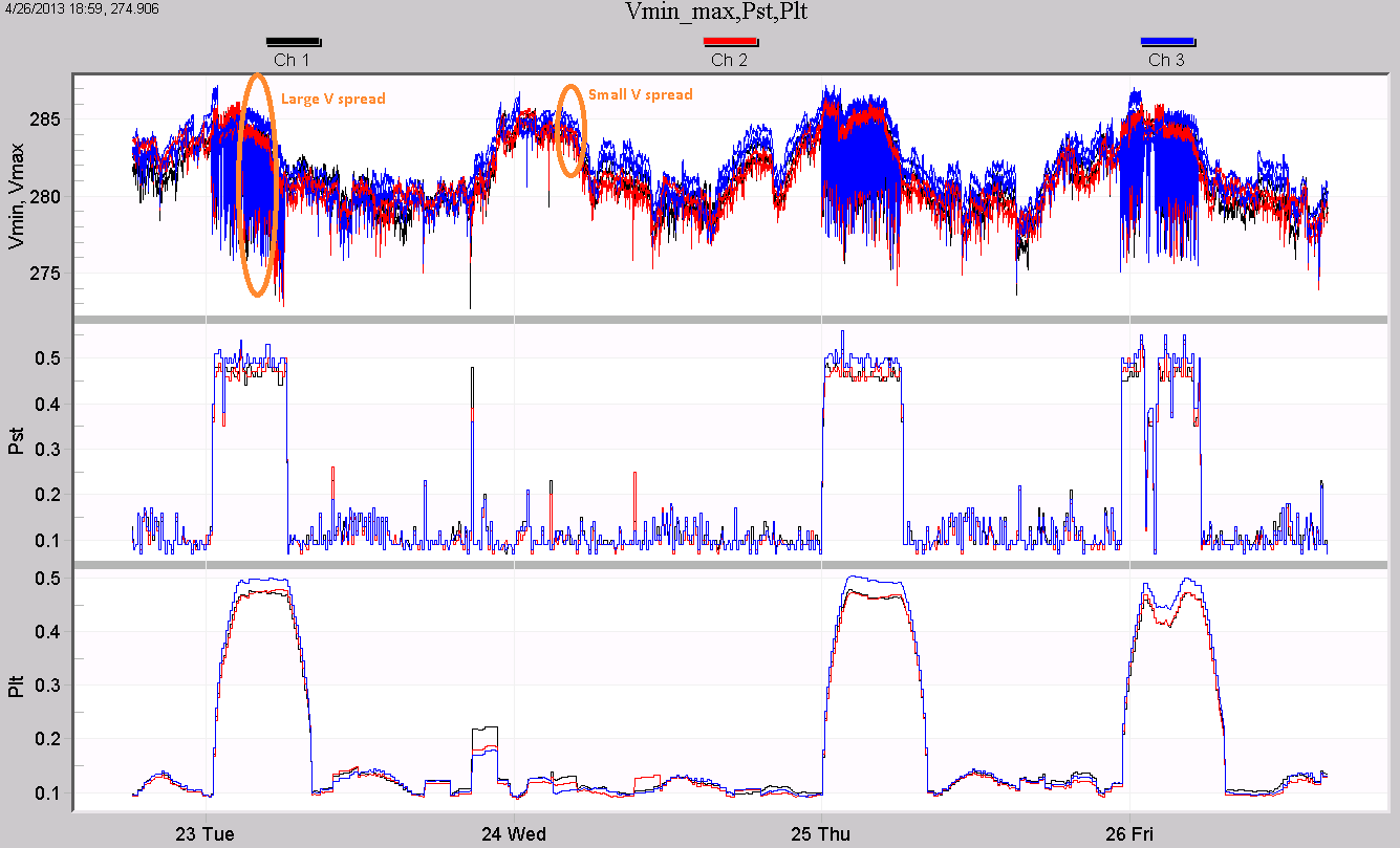
The graph definition is below; Figure 2 shows an example.
Left Y-Axis: Ch 1,2,3 min, max RMS voltage
Right Y-Axis: None
Plot 1: Ch 1,2,3 min, max RMS voltage / None
Left Y-Axis: Ch1,2,3 Pst
Right Y-Axis: None
Plot 2: Ch1,2,3 Pst / None
Left Y-Axis: Ch 1, 2, 3 Plt
Right Y-Axis: None
Plot 2: Ch 1, 2, 3 Plt / None
In the graph, black, red, and blue are used for channel 1, 2, and 3 in each of the plots. The top plot displays the RMS min and max voltage traces for all three channels. The min and max traces are the same color for each channel. Ordinarily, using duplicate colors would create a confusing graph, but here the details of the min/max excursions aren’t the focus. Instead, the spread between the min and max is of interest, and using the same color for min/max helps in visually determining how much voltage variation is present. In plots 2 and 3, the same black/red/blue scheme is used for channels 1, 2, and 3, for Pst and Plt flicker.
In Figure 2, the voltage shows a large spread in some areas, and a much narrower spread in others. Examples are circled in orange. The Pst flicker rises to around 0.5 during these times of large voltage spread. The Plt value roughly follows the Pst flicker where the Pst is high for long periods of time. The shorter Pst excursion just before the 24th isn’t enough to move the Plt value past 0.2. It appears that a single voltage sag (mostly on channel 1) caused that flicker event, while channel 3 is the worst offender during the longer periods of flicker (although all three phases are elevated).
Causes of Flicker
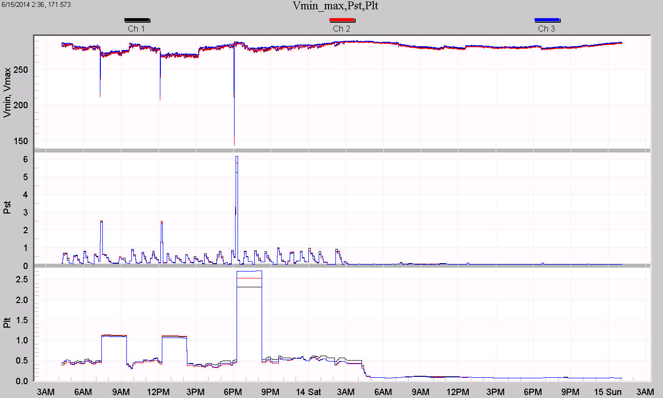
A different pattern is seen in Figure 3. Here, the baseline Pst moves between zero and around 0.7, with three spikes over 2.0. The Pst drops to almost zero after 3am. The spread among the voltage channels is small but consistent, and narrows even further after 3am. The three Pst spikes are the interesting data here, and they appear to be caused by single voltage sags. The Pst spike to over 6.0 at 6pm isn’t caused by an increase in the voltage spread. Instead, it’s caused by a single 50% 3-phase voltage sag. That sag depth is enough to spike the 10 minute Pst to over 6, and the 2-hour Plt to over 2. Although those are high readings, from a steady-state viewpoint the flicker here is within limits if it can be assumed that the 50% sag is a one-time event. On the other hand a high Pst generated by a sustained spread between the Vmin and Vmax values is much more likely to be a continuing issue.
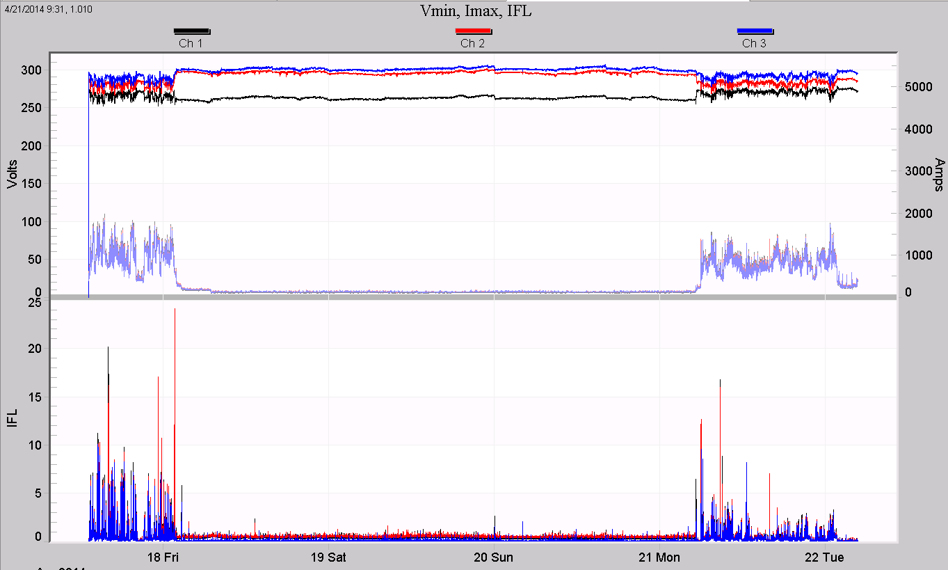
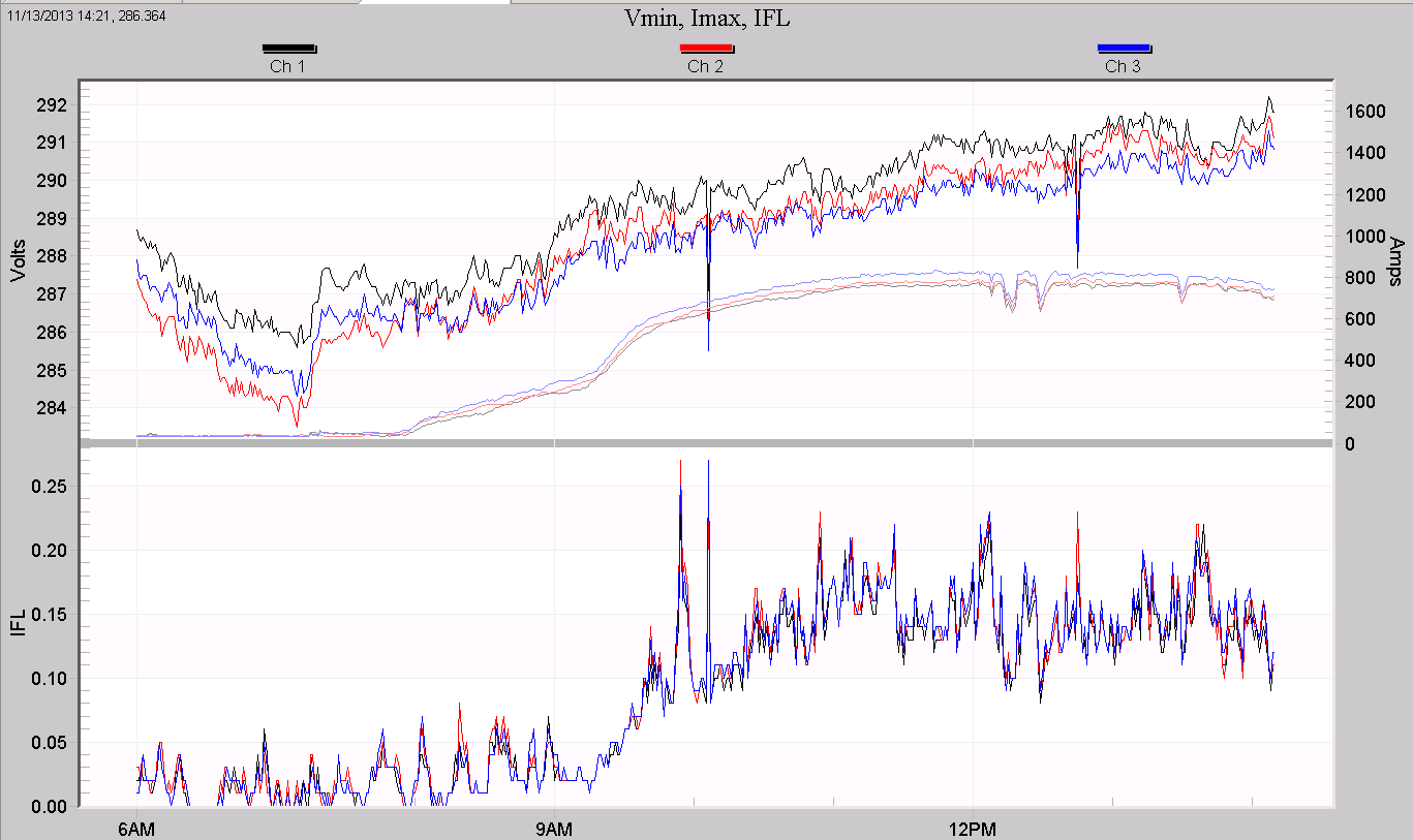
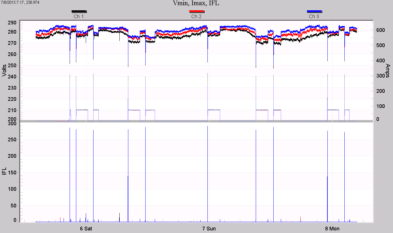
The second custom graph is used not for quantifying flicker levels, but for finding sources of voltage flicker. Flicker is caused by varying load currents causing voltage drop through the distribution system and local wiring. Tracking down the source of offending current is helpful in the flicker mitigation process. The graph definition is shown below.
Left Y-Axis: Ch 1, 2, 3 minimum RMS voltage
Right Y-Axis: Ch. 1, 2, 3 maximum RMS current
Plot 1: Ch 1, 2, 3 minimum RMS voltage / Ch. 1, 2, 3 maximum RMS current
Left Y-Axis: Ch. 1, 2, 3 IFL
Right Y-Axis: None
Plot 2: Ch. 1, 2, 3 IFL / None
The black/red/blue color scheme remains, and for current, grey, light red, and light blue are used to distinguish the traces from the voltage, but still show the phase relationships at a glance. An example graph is shown in Figure 4. Here, the IFL reaches over 10 during the two weekdays shown, and at the same time, the voltage is fluctuating more rapidly. Most importantly the load current is high during the very same times. This is strong evidence that the load current is causing the voltage flicker.
It’s important to keep in mind “correlation is not causation.” Not all correlated currents are the root cause of flicker. In Figure 5, the output of a 1MW 3-phase photovoltaic system is shown. The RMS current smoothly rises from zero to around 800A as the sun rises, with a small step change in slope just after 9 am, and a few dips in output (clouds?) just after noon. The RMS voltage rises steadily, as expected due to power injection into the distribution system. The IFL flicker value also rises, at first glance in concert with the current. They are correlated, but the flicker is increasing due to the general increase in system loading (and thus increased number of cycling loads) during the day, not due to the PV system itself. The PV current is seen to change very gradually on the graph, and is very steady on the timescale of flicker sensitivity. Looking more closely, there are short spikes and step changes in the IFL which are matched with spikes in the voltage, but there are no matching changes in the monitored current. Although the sun is ultimately the reason the PV output and outside load patterns are correlated (indirectly), the PV system is not the cause of the flicker seen here.
Graphing Flicker on Older Devices
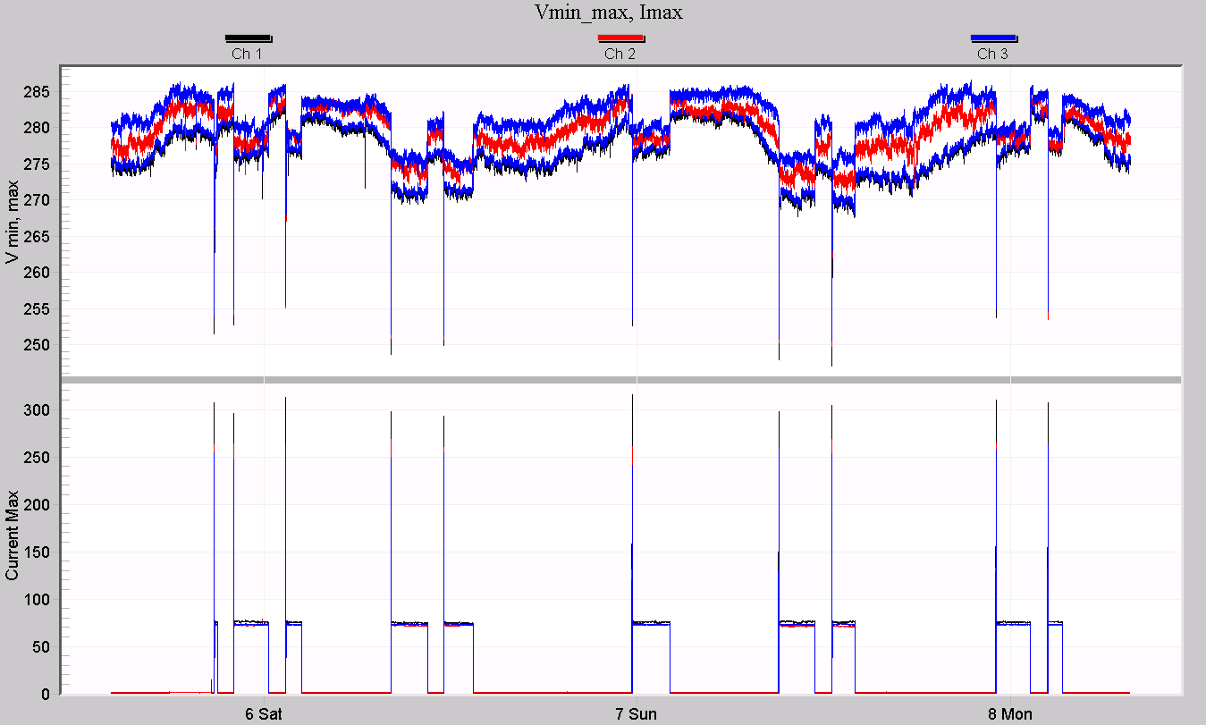
In some cases, IFL, Pst, and Plt flicker data may not be available for graphing. The Eagle, Guardian, and Revolution recorders include flicker measurements, but older recorders may not, or flicker may not have been enabled during a particular recording. For these recordings, the following custom graph was created. The graph is defined as following:
Left Y-Axis: Ch. 1, 2, 3 min, max voltages
Right Y-Axis: None
Plot 1: Ch. 1, 2, 3 min, max voltages / None
Left Y-Axis: Ch. 1, 2, 3 max currents
Right Y-Axis: None
Plot 2: Ch. 1, 2, 3 max currents / None
The top plot shows the spread between min and max voltages, while the lower plot shows the max current values. The voltage spread can be used to judge the likelihood of a flicker problem, while the current traces are helpful for correlating loads with the flicker. In this case, the older GE flicker data (available under Reports, Flicker) may be helpful, and can be used in conjunction with this graph.
A single recording illustrates the use of all these graphs. First, the Vmin/max, Pst, Plt graph is examined to see if flicker may be a problem (Figure 6). The Pst stripchart crosses the 1.0 threshold many times, but the Plt value is under 1.0 – could be some flicker complaints at this location. The voltage spread (essentially the thickness of the “fuzzy” black/red/blue traces) doesn’t seem to change much when Pst is high or low, and the Pst spikes seem to correlate with the voltage sags. These are signs that the flicker is due to a single load (causing the sags), rather than a combination of many loads aggregating together (which would add to the voltage “fuzz” thickness).
In Figure 7, the Vmin/Imax/IFL graph is shown for the same time period. The IFL reading spikes heavily when the 100A load is switched on. This load takes the current to 300A on start-up, producing severe voltage sags. This single load is causing very high IFL readings, and although they’re short, they’re high enough to push the 10-minute Pst level over 1.0.
In Figure 8, the Vmin, max/Imax graph is shown. If no flicker stripchart data had been recorded, this graph would be the next best for flicker complaints. The deep voltage sags correlated with the current spikes indicate that the most significant voltage excursions are caused by the monitored load. The GE flicker report could be used to match up tabulated flicker events with these current spikes to confirm the result.
Conclusion
Several custom graph templates have been created for more advanced data analysis of flicker data. By viewing key system parameters in combination, patterns emerge that can help profile and troubleshoot flicker issues, and identify flicker sources.
