Abstract
The use of distributed generation (DG), e.g. photovoltaic and wind farm systems, presents new challenges to the electric network. Unpredictability and sudden changes in generated power results in changes in system voltage, including overvoltage. Line frequency can be affected by the synchronization of the DC->AC inverter in the DG system. Harmonics and voltage wave shape can also be a problem, with a poor inverter AC output.
To help investigate these issues, custom graph templates have been created for ProVision, fine-tuned for distribution generation applications. These templates may be downloaded and imported into ProVision by clicking here. After the file is downloaded, double-click it in Windows Explorer, or choose File, Open in ProVision to import the new graphs. After the import, they’re available as graph and report templates (Figure 1), and can be used on any existing recording with the required data. To launch a graph, simply open a ProVision data file, then either double-click the graph in the Graphs and Reports Tree, or select Graph, Custom Graph from the menu. To view the data in tabular report format, select Report, Custom Graph Reports from the menu.
Voltage, VTHD
The first graph in this section is “Voltage, VTHD”. It’s designed to show correlations between steady-state RMS voltage, and voltage THD. These are often linked in DG systems, especially if the voltage rises. With increased power from a DG system, the system voltage rises (until a regulator switches a tap back down). With that increased contribution, the system waveshape becomes more influenced by the DG inverter output, which is typically an imperfect sine wave. Traditional utility generation is from rotating generators, which inherently create very pure sine waveforms. DG systems usually produce DC voltage to feed into an electronic inverter, which synthesizes an AC sine wave. Cheaper inverters often start from a square output, and use imperfect filtering to produce a pseudo-sine waveform. Mixing this with the utility voltage increases the voltage THD in a way that correlates with the amount of DG power contributed, and thus with the system voltage. This is in contrast to traditional harmonic loads, which increase voltage THD by drawing harmonic currents, decreasing the RMS voltage.
The graph definition is below, and Figure 2 shows an example.
| Left Y-Axis | Right Y-Axis | |
|---|---|---|
| Plot 1 | Ch1 average RMS Voltage, black | Ch1 Voltage THD, light black |
| Plot 2 | Ch2 average RMS Voltage, red | Ch2 Voltage THD, light red |
| Plot 3 | Ch3 average RMS Voltage, blue | Ch3 Voltage THD, light blue |
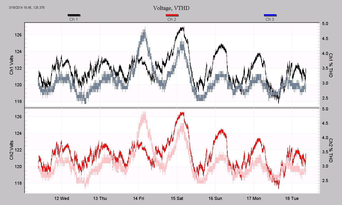
In Figure 2, a single-phase residential location was monitored, thus only two plots were generated (channels 1 and 2). The darker black and red traces are RMS voltage, which can be seen to slowly swell several times. The lighter traces are voltage THD, which rises very much in step with the RMS voltage swells, up to almost 5%. There are much quicker voltage swells and sags that are not correlated with the THD – these are likely the result of tap and load changes. The RMS and THD increases happen mostly at night – indicating a wind farm rather than solar generation.
To generate the data for this graph, enable RMS voltage, and voltage THD in the stripchart setup when initializing the recorder.
Voltage and Total kW
The second DG graph is Voltage, and Total kW. The purpose is to track steady-state RMS voltage with the amount of power produced by the DG system, to see if under/over-voltage conditions may be present.
| Left Y-Axis | Right Y-Axis | |
|---|---|---|
| Plot 1 | Ch1,2,3 average RMS Voltage, black, red, blue | none |
| Plot 2 | Total 3 phase real power, green | none |
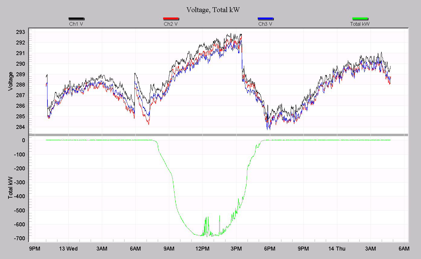
The three average voltage phases are displayed in the top plot as black, red, and blue traces. The bottom plot is total 3 phase real power, which will be negative if there is net generation at the monitoring point. An example is shown in Figure 3. In this recording, a large 3 phase PV system was monitored. The total power goes from zero all the way to almost 700kW, peaking around noon. The RMS voltage rises continuously with the PV output, increasing by about 3% from the baseline (which is already 2.5% above nominal). The peak voltage is 5.4% above the 277V nominal, and warrants a closer look.
A local regulator can be seen operating several times in Figure 3. It drops the voltage by 4V in two places, but actually steps up the voltage around 6am, just before the PV system starts to contribute. The regulator doesn’t act to lower the voltage until around 3:15pm. A better configuration on the regulator may help to improve this situation.
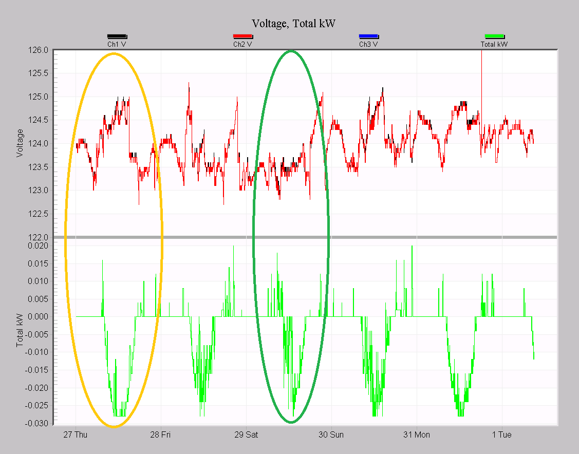
A single phase PV system is shown in Figure 4. Here, the local regulator sometimes did a good job in keeping the voltage flat (green circled area), and at other times didn’t do so well (yellow-orange circle). The total voltage swell was under 2V, so overall it’s likely not an issue, but worth checking to see why the regulation is varying. Other PV installations on this circuit could be creating complications for the regulator.
To generate the data for this graph, enable RMS voltage, and real power in the stripchart setup when initializing the recorder.
Voltage and Frequency
The third DG graph is Voltage, and Frequency. For grid-tied DG systems, the frequency graph can help determine if the inverter output is unduly affecting the system line frequency. For isolated generation, or outage ride-thru modes, the inverter frequency is free-running, and monitoring is useful to ensure that frequency regulation under load is working well. This is especially important for UPS and standby generator systems, where the output is not necessarily phased locked to the utility, and frequency is not always well maintained.
It’s often the case that any unbalance improves, since a properly functioning 3 phase DG system should inject power into all three phases equally. If that’s not the case, there is likely a problem in the DG system. More commonly, single phase PV systems introduce unbalance problems, since they only inject power into one of the three phases. To catch unbalance issues with these, a 3-phase monitoring point is needed, which usually precludes logging the PV output with the same monitor.
| Left Y-Axis | Right Y-Axis | |
|---|---|---|
| Plot 1 | Ch1,2,3 average RMS Voltage, black, red, blue | none |
| Plot 2 | Ch1 average frequency | none |
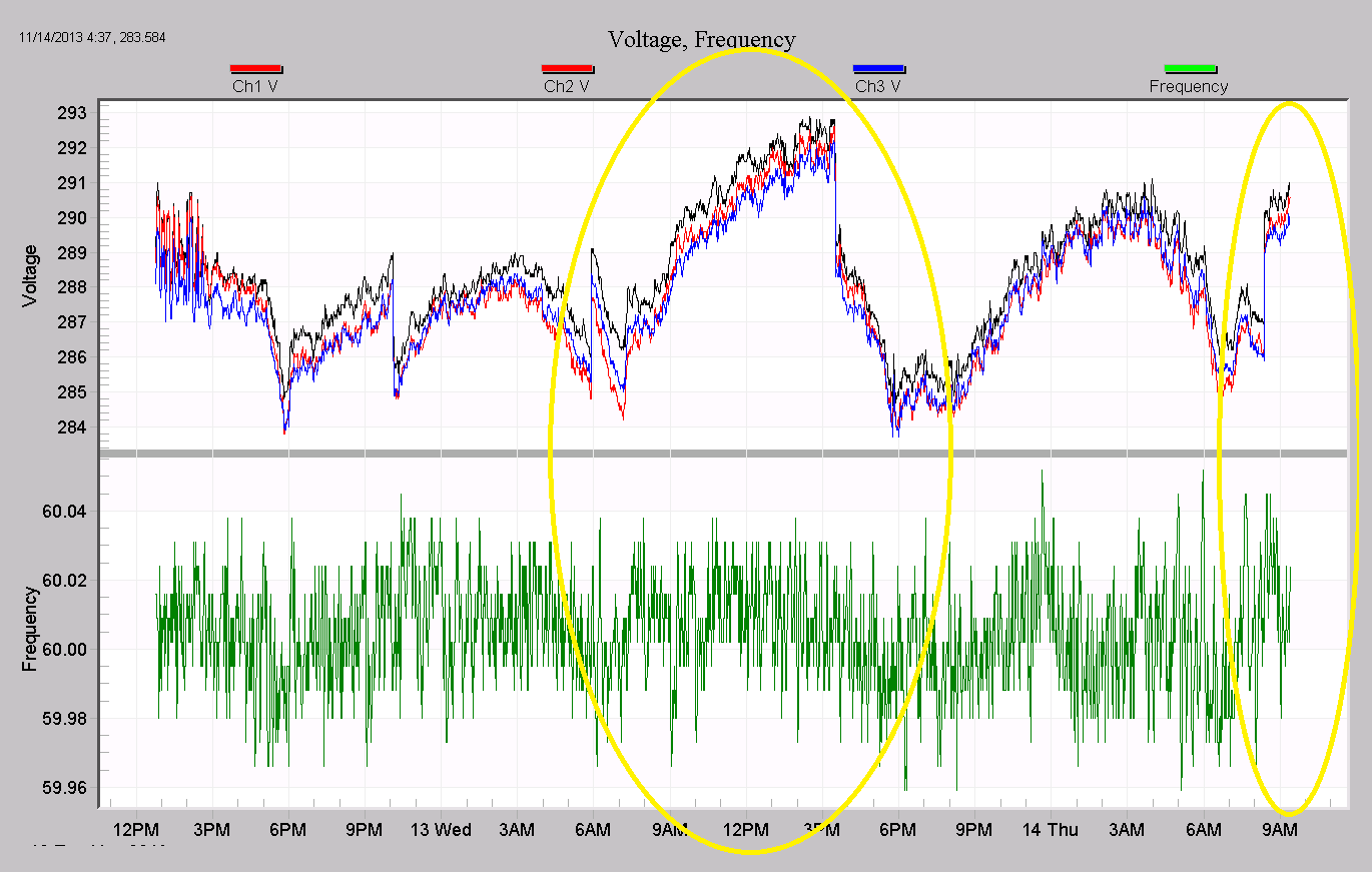
In Figure 5, a large PV system is shown with this graph. The periods of PV generation are circled in yellow, and although there appears to be some slight correlation between line voltage and frequency, the frequency movement is very small, and isn’t exactly lined up in time. This is more likely an effect of both PV generation and line frequency being correlated to the time of day, rather than the DG system directly affecting the frequency.
To generate the data for this graph, enable RMS voltage, and frequency in the stripchart setup when initializing the recorder.
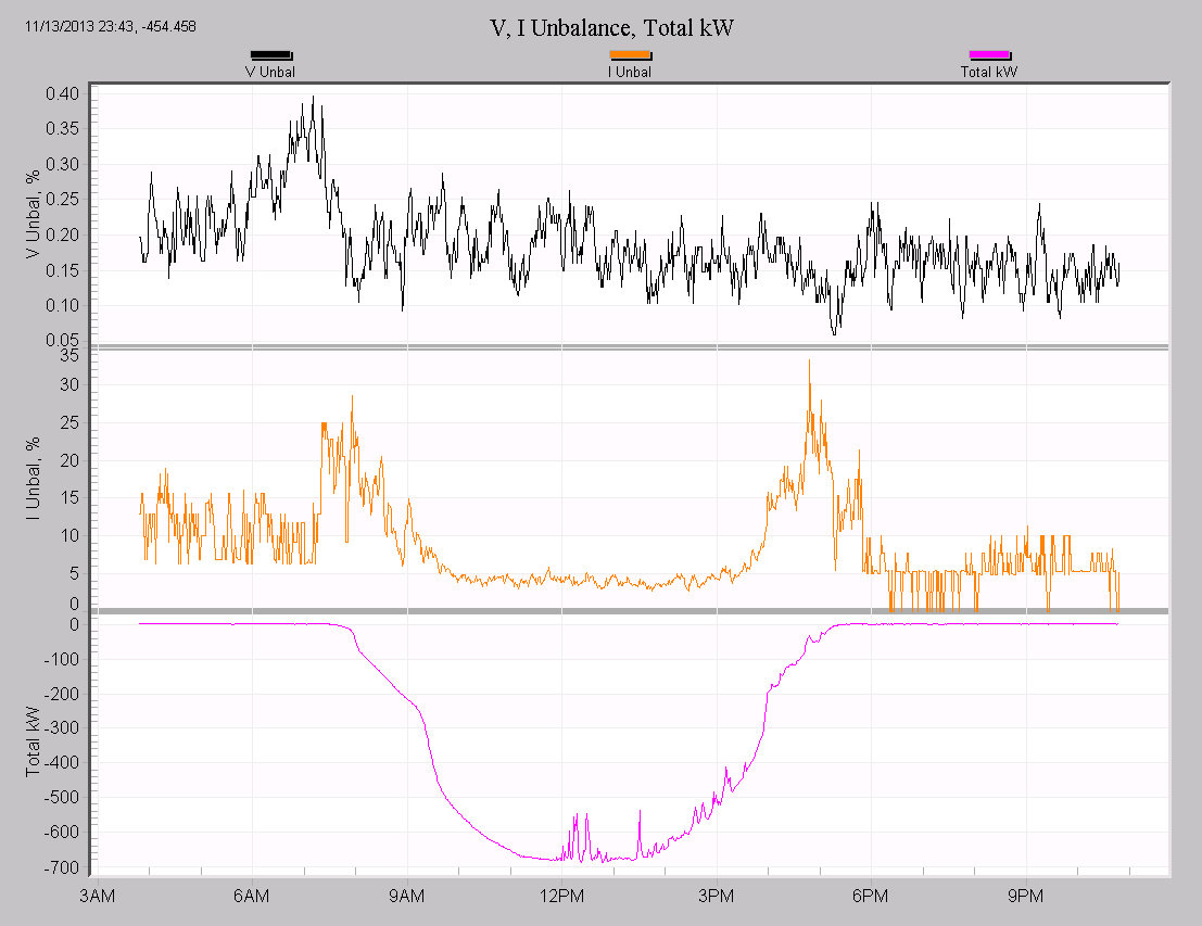
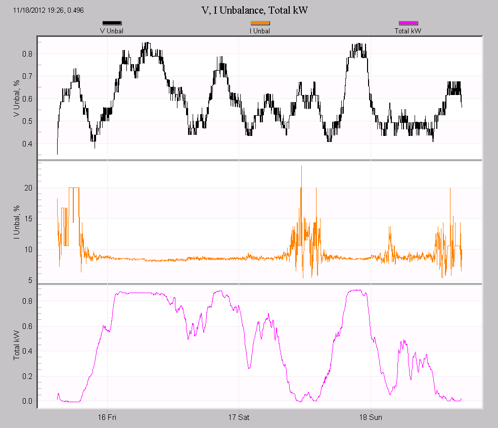
Voltage, Current Unbalance, and Total Real Power
The fourth graph is Voltage, Current Unbalance, and Total Real Power. With three phase DG systems, monitoring unbalance along with the power output allows direct observation of unbalance effects.
| Left Y-Axis | Right Y-Axis | |
|---|---|---|
| Plot 1 | Voltage Unbalance, black | none |
| Plot 2 | Current Unbalance, orange | none |
| Plot 3 | Total 3 phase real power, pink | none |
An example of this graph is shown in Figure 6. Here a single day of a 3 phase PV array is shown. The unbalance here is low to start with, and the voltage unbalance improves while the PV generates power. The current unbalance is worse while the PV system is ramping up or down from full output, and at its best during the peak output.
A second example is shown in Figure 7, a 3 phase wind farm installation. Here the voltage unbalance (black) tends to get worse with increasing wind power (pink shown as positive power in the bottom plot due to the installed CT polarity), while the current unbalance gets better. Looking closer, it appears that the voltage unbalance tracks the wind output closely during the night, but not as closely during the day. This would suggest that the wind farm is dominating the unbalance when other loads are not present, but at times of increased system load during the day, its influence is not as great. The Voltage THD vs. Total Power graph reinforces this theory – the THD doesn’t follow the power output as closely in the same time ranges as the unbalance (not shown).
Since ProVision computes unbalance from RMS data, only RMS voltage, current, and real power are required to generate this graph.
Conclusion
Several custom graph templates have been created for more advanced data analysis of distributed generation systems. By viewing key system parameters in combination, patterns emerge that can help profile and troubleshoot wind farm, PV, and other DG installations.
