Abstract
ProVision offers a wide variety of graph types, ranging from voltage and current to histograms and profiles, and the ability to open multiple independent graphs, each containing data from different files. These individual graphs can then be repositioned and reorganized in ProVision (see “Tabs and Windows in ProVision”), in order to create a layout which facilitates comparing traces.
However, sometimes it is insufficient to have two traces from different files available on different graphs. By using the Trace Mixer Graph, a new feature found in ProVision 1.61 and subsequent releases, two traces from different data files can be displayed on the same graph. This whitepaper serves as an introduction and demonstration of the mixed graph feature.
Introduction to Mixed Graphs
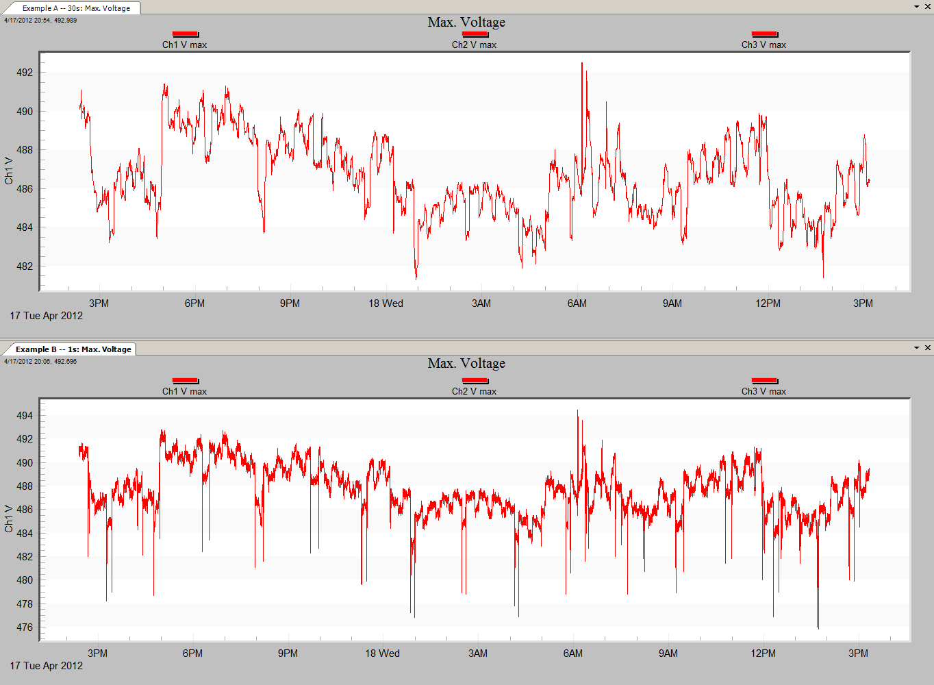
Prior to creating a mixed graph, first ProVision must have loaded the graphs that contain the data to be mixed. This white paper will demonstrate creating a mixed graph containing maximum voltage traces from two different recordings. Figure 1 shows the two files open, displaying only the maximum voltage traces from Channel 1.
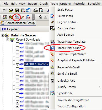
To access the Trace Mixer Graph, navigate to Tools > Trace Mixer Graph or click on the Trace Mixer icon in the toolbar as shown in Figure 2.
The Trace Mixer Window shows all available data files and the traces within them that can be used to create a mixed graph (see Figure 3). The traces from the active graph are shown on the right-hand pane. To change the active graph, simply select a new one from the dropdown box, and the active graph pane will repopulate with the traces available for that graph. The pane on the left-hand side represents the traces that will exist in the finished mixed graph.
To add a plot, axis, or individual trace, click and drag with the mouse to select the plot, axis or trace to be added from the right-hand pane to the left one. This populates the left-hand pane with that data source, and creates the tree structure as necessary. If an axis is added, all traces attached to that axis are as well. By the same token, if a plot is added, all axes are also, and so are the traces belonging to each axis. By changing the available graph in the drop-down, additional traces can be added to the final mixed graph.
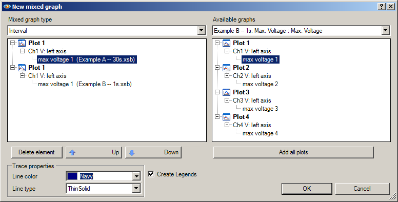
To remove an element from the mixed graph, highlight that element and select the Delete button. This will remove it from the graph. Removing an axis will remove all traces attached to it; removing a plot will remove all axes and the traces attached to each axis. Note that if an individual trace is removed and the axis it was attached to contains no other traces, that axis is removed as well. This also holds true when removing an axis from a plot.
Below the left-hand pane is the custom properties box. The custom properties box is context-sensitive and its contents are populated based on the current selection in the left-hand pane. The properties that can be modified are the Axis properties and the Trace properties, as shown in Figure 4. For other selections, or if nothing is selected, the properties box is simply not displayed.
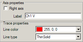
Note that two maximum voltage traces have been selected: the default color for a maximum voltage trace is red. This would make it impossible to differentiate between the two source traces when they are drawn on the same graph. Therefore, using the Trace properties box to change the line color or type is advised. For the purpose of this demonstration, the line color of one of the traces has been changed to dark blue to allow the two traces to be distinguished from one another. Once the layout for the mixed graph has been created and finalized in the left-hand pane, select the OK button. This opens a new prompt that allows the graph to be titled.
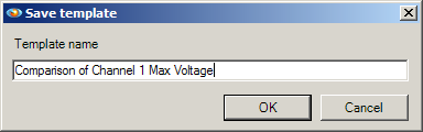
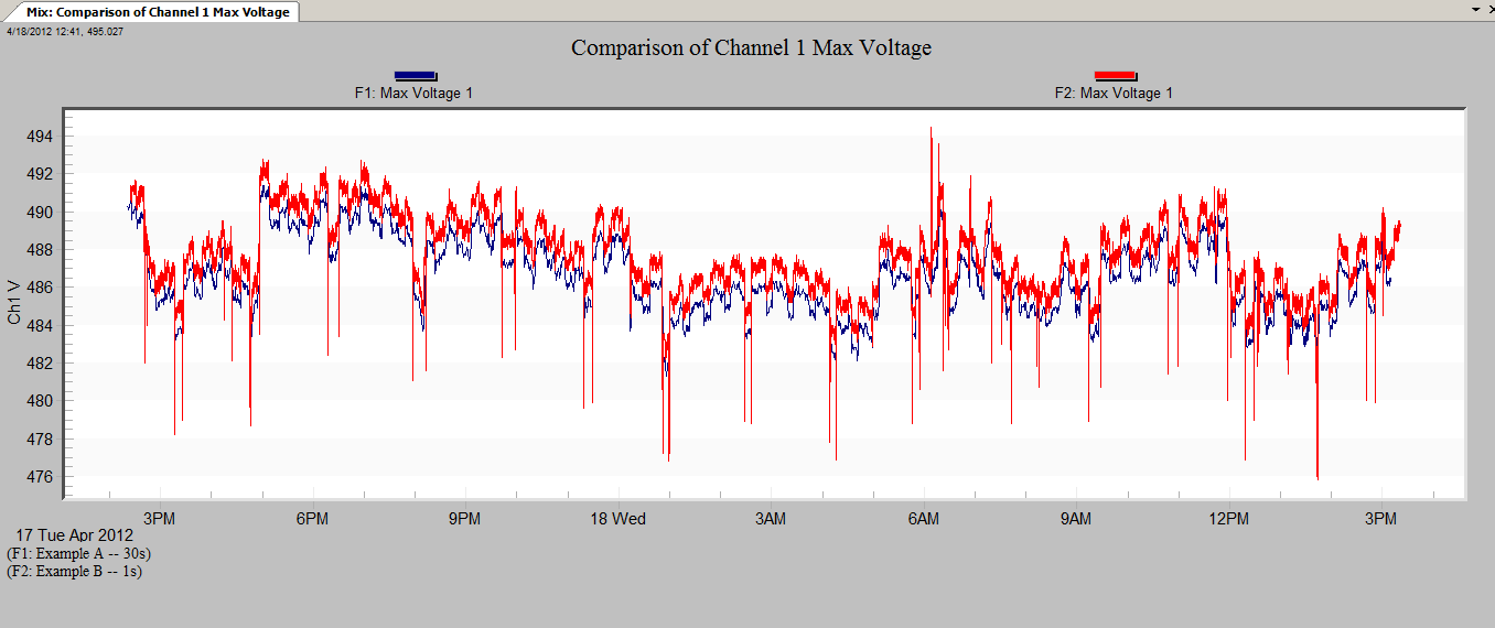
As shown in Figure 5, the default title has been changed to one better suited to the data being shown. By selecting OK after titling the graph, the mixed graph loads, as shown in Figure 6. Note each trace is sourced from a different file, each of which has a different interval time. The traces are scaled such that each is drawn appropriately with respect to its own interval, start time, and stop time.
Mixed graphs include a special version of the legend system: since each trace in the graph is retrieved from a separate file, simply displaying the measure type is insufficient. Therefore, each legend is prefixed with a designation of the filename it is sourced from. The more individual traces used, the more legends will be generated. The correlation of these designations to the filenames is shown in the lower portion of the graph, where the header report is displayed for standard, single-file graphs. The amount of text shown is not necessarily a function of how many files are used, but the length of their filenames as well.
After the mixed graph is created, the legends can be toggled on and off by right-clicking anywhere in the graph area with the mouse, and, from the resultant context menu, selecting the “Show Legend” option. Generation of legends for new mixed graphs is always done by default, and, for each trace, uses the color specified for that trace in the trace mixer dialogue and the text that is representative of the channel and measure type.
ProVision offers a wide variety of display options for graphs, and mixed graphs allow fine-tuning of which traces from selected files are graphed. This functionality can greatly simplify the process of comparing multiple traces from different data files. The ability to compare traces with such precision can be exceptionally useful to compare data from two different recorders at a related location, such as one being inside a building and another being outside.
Furthermore, when building a mixed graph, it is not mandatory that traces come from multiple files. It is possible to only utilize traces from a single file. For example, by opening independent graphs using the same source file, such as RMS current and current THD, the trace mixer form will have access to all of those traces. This makes it possible for traces from the same file which would not normally be graphed together to be compared on the same graph.
Conclusion
The mixed graph feature is but one of the many features in ProVision designed to ease the task of power quality data analysis. By combining traces, either from two separate but related recordings, or from the same recording where traces are not normally graphed together, the ability to examine them is greatly increased.
