Abstract
Analysis of recordings of distributed generation (e.g. solar, wind, etc.) systems present new challenges for utilities. Distributed generation analysis usually involves looking at voltage and power, voltage and voltage THD, etc. – graph combinations that are not in ProVision by default. ProVision’s mixed graph capability can be used to aid in the analysis of distributed generating systems.
This paper will show how to create mixed graphs to be used in the analysis of the problems caused by distributed generation systems.
Distributed Generation
In the last decade, the cost of distributed generation systems has fallen dynamically, causing a large increase in the number of these systems in the field. With this increase comes the problems caused by the variable nature the these distributed generation systems on a system not designed for these rapid power changes. Wind and sunlight are not steady or extremely predictable. These changes can cause changes in voltage, including over-voltage, harmonics, line frequency problems, and voltage wave shape problems, with a poor inverter. Temperature also affects distributed systems and their power inverters. Small systems that supply power to single phase can cause voltage unbalance.
A sudden change in power output from a distributed generation system connected to the grid, either more power or less, adds instability in the power system that will need to be handled quickly to prevent problems. Since the distributed systems account for a small part of the grid capability, it can usually compensate for changes in total power, but as the amount of power from these systems continue to grow, more problems can be expected in the future.
See the whitepaper on Photovoltaic Monitoring Setup Recommendations for more information about monitoring options and setup for photovoltaic systems.
Built-In ProVision Stripcharts
ProVision provides a rich set of reports and graphs for analyzing recordings. When analyzing the effects of a distributed generation system, you will want to run several ProVision graphs. Typically you will want to run daily profile graphs, voltage and current stripchart graphs, total demand distortion stripchart graphs, total power graphs, voltage and current unbalance graphs and frequency graphs.
Mixed Graphs
Sometimes it is helpful to combine traces from several graphs into one graph. ProVision supports this by using mixed graphs. Mixed graphs allow two different graph traces to be displayed at the same time. For example, if you want to graph voltage and voltage THD at the same time, you generate each of those graphs, then use the graph mixer to drag the different plots together onto a new graph.
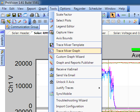
The first step in creating a mixed graph is to run all of the graphs from which you want to pull traces. Once these graphs are run, choose the menu item Tools→Trace Mixer Graph (see Figure 1). When the Trace Mixer Graph menu is selected, the Mixed Graph Trace selector dialog appears (see Figure 2). Next choose the graph that contains the first trace you would like in your mixed trace graph from the available graphs (see Figure 3).
All of the plots, axis, and traces from the selected graph appear on the right side of the screen. Drag the portions that you wish to include in your mixed graph from the right pane to the left pane in the selection dialog. You can drag a plot, axis, or individual traces. If a plot or axis is dragged to the selection pane then all subordinate traces are also included.
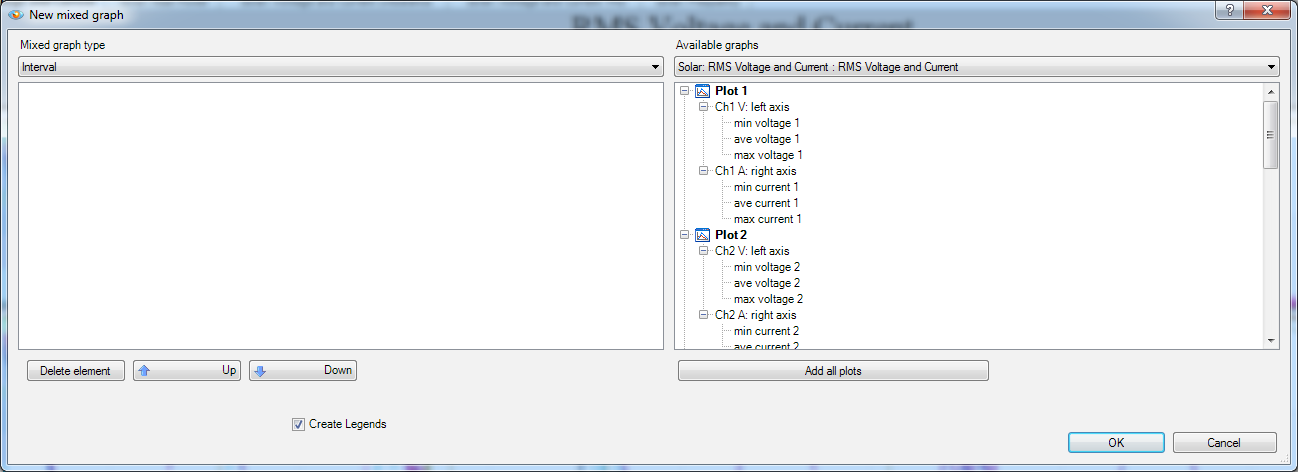
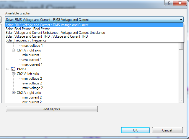
Figure 4 shows the Mixed Graph Trace selector dialog with two traces selected. Notice that the axis for the second trace is selected. When an axis is selected, attributes for the axis can be changed. The “Right axis” checkbox is used to choose which axis is used for the axis labels, right or left. Also, the axis label can be changed.
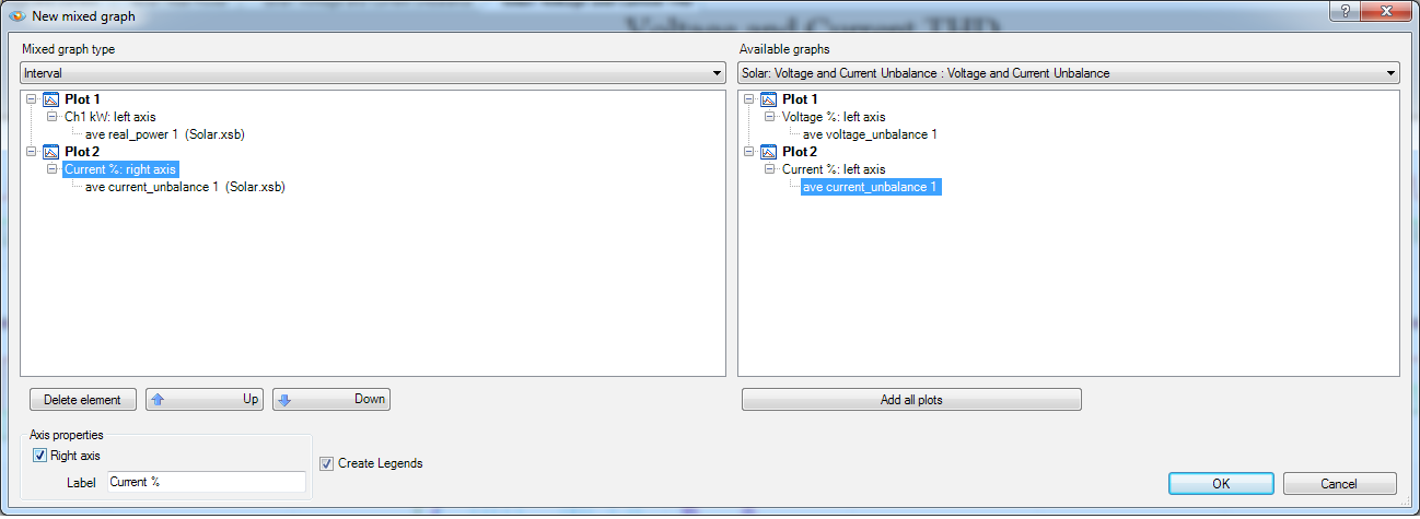
Figure 5 shows an individual trace selected. When a trace is selected, attributes for that trace can be changed. The most common trace attribute that is changed is the color. To change the color select the down arrow to the right of the box. This will bring up a color selection box.
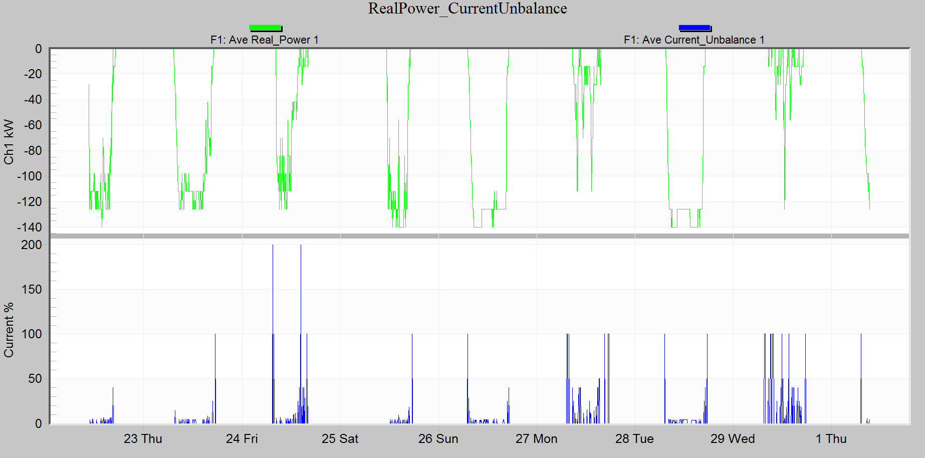
You can select any trace from any open graph. Just keep selecting graphs and then dragging traces from the selected graph to the left pane. When you have completed your mixed trace graph selection, click the OK button. This will close the mixed trace graph selector dialog and then prompt you for the graph name (see Figure 6). Enter the mixed graph name and press OK. You should see your mixed trace graph appear. Figure 7 shows a mixed graph of real power and current unbalance. You can see the correlation of real power and the current unbalance.
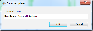
Mixed graphs can be saved as templates. When viewing a mixed graph choose the menu item Tools → Trace Mixer Template. When prompted give the template a name. You will see that template, with the name given, will be added under the Project Tree in the section Graphs and Reports. You can choose the template as you would any other graph. When you choose the template you will be prompted for the recordings to run the template against.
See the whitepaper on Mixed Graphs in Provision: Advanced Features for more information on mixed graphs and how to save and edit mixed graphs as templates.
Examples
Figure 8 shows a mixed graph of a PV system with real power and current THD. Here, the current THD increases abruptly to over 6% as the generated power comes online. The very close correlation between the real power trace (green) and the current THD trace (blue) indicates that the local inverter is the source of the harmonics. The mixed graph illustrates this relationship much better than separate plots.
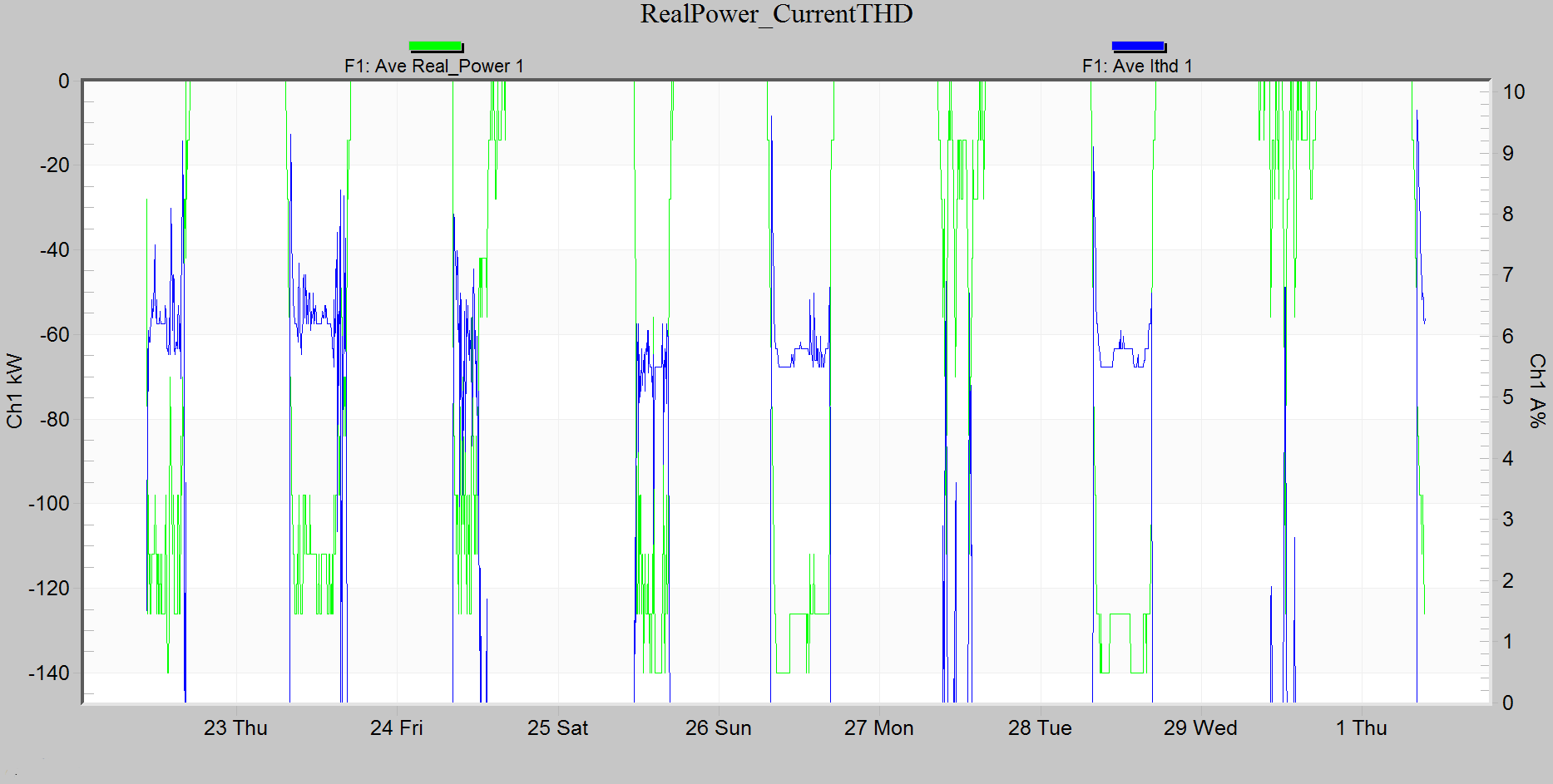
Figure 9 shows a mixed graph of a wind turbine with real power and voltage THD.
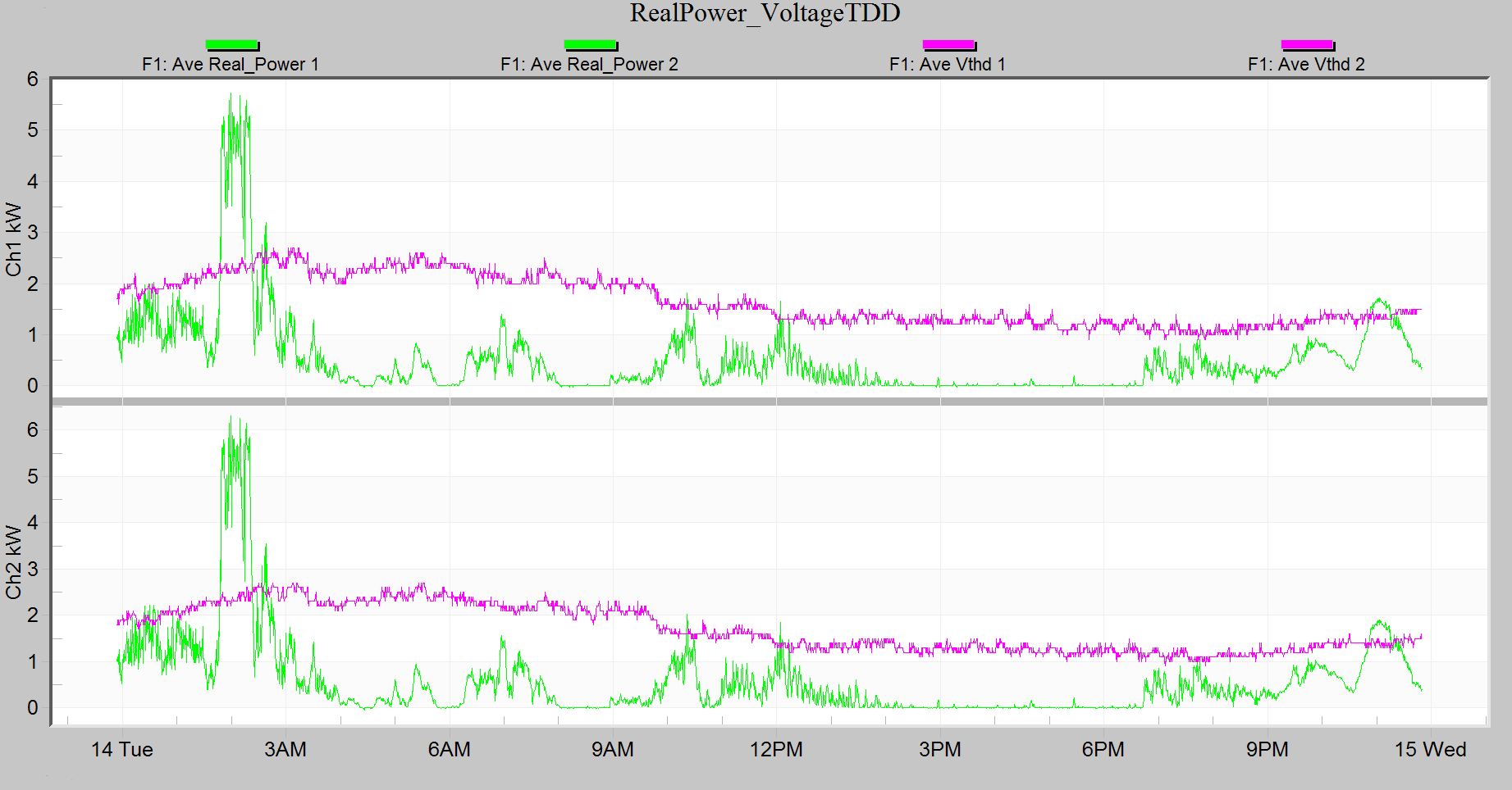
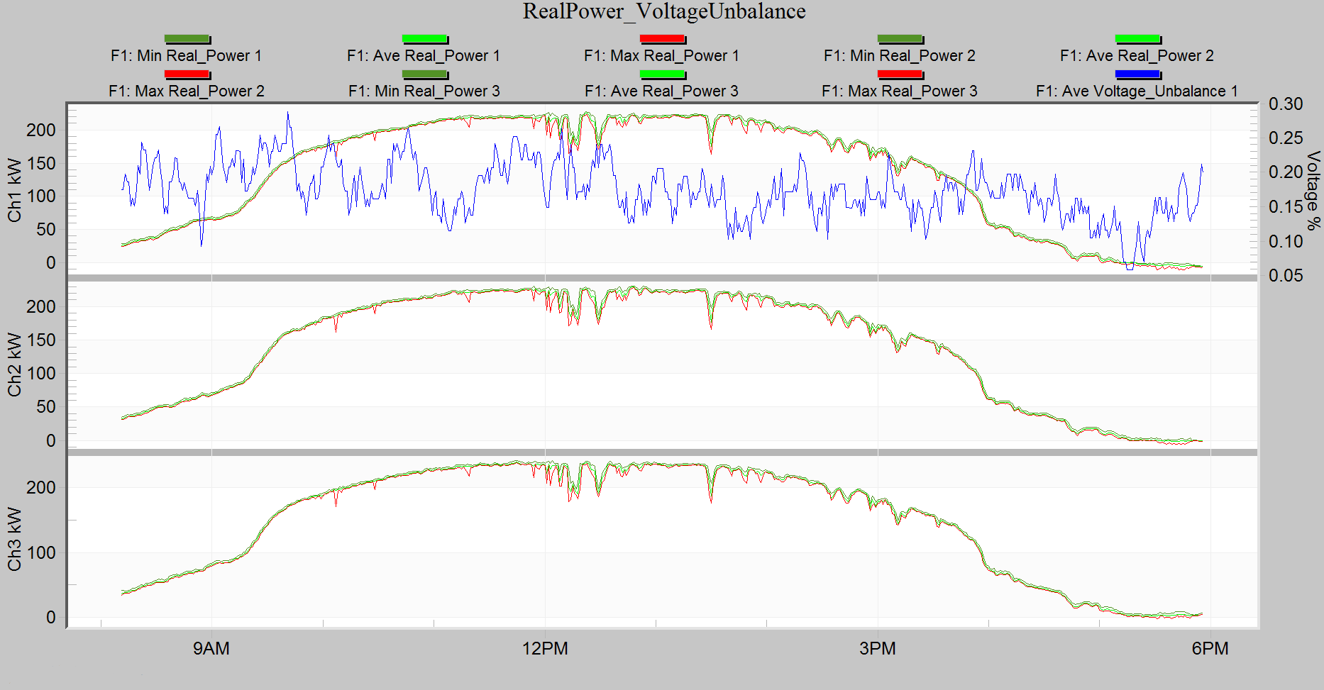
Figure 10 shows a mixed graph of a PV system with real power and voltage unbalance. Notice that as the power is increased around 9:30 the voltage unbalance is slightly reduced and as the power decreases around 3:30 the voltage unbalance increases. Also, as the clouds lower the power around noon time the voltage unbalance increases. This PV system is having a positive effect on the voltage unbalance.
Conclusion
Mixed graphs in ProVision can be a powerful tool to help analyze recorded power quality data. Distributed systems cause unique problems and mixed graphs can be very helpful in locating the source of these problems. Mixed graphs can be saved as a template to aid in the future analysis of recordings.
