Abstract
ProVision software includes the ability to analyze power quality data with several different graph types. This paper will focus on ProVision’s histogram graphs. ProVision includes ten different types of histogram graphs: Nominal Voltage, Abnormal Voltage, RMS Voltage, RMS Current, Real Power (Watts), Apparent Power (VA), Reactive Power (VAR), Phase Angle, Power Factor, and Displacement Power Factor. This paper explains the different histogram types available ProVision, as well as how to open a histogram graph in ProVision.
Histograms
A histogram is a bar graph that divides a measured quantity into different ranges, or bins, and records how long a measurement was in each range. The x-axis of a histogram represents the measurement level. The y-axis is the amount of time that a specific measurement occurred. Histograms in ProVision are divided into two groups: cycle and minute histograms.
Cycle Histograms
A histogram divides a measurement range into many bins. For example, in the Revolution, the voltage histogram divides the 600V voltage range into 600 bins, each one volt wide, giving a bin for zero volts, a bin for one volt, two volts, all the way to 600 volts. After each 60Hz cycle is measured, the voltage is rounded to the nearest volt and “put” in the appropriate bin. The bins are really counters that count how many cycles were at that voltage. If the 108-volt bin has a count of 45, then there have been 45 cycles with an RMS voltage of exactly 108 volts, sometime during the recording session. The histogram throws away time information: those 45 cycles could have occurred anytime during the recording session. They may have been 45 cycles in a row, or three 15-cycle sags, or 45 isolated sags spread out during the entire recording session. (To recover the time information, use the Stripchart or an event-based report.)
RMS Voltage Histogram
RMS voltage is the value when the Root Mean Square is taken of a set of voltage points. RMS is the statistical measure of the magnitude of a set of recorded voltage points.
RMS Current Histogram
An RMS Current histogram is created by applying the same formula on a set of current points as applied to the RMS Voltage graph.
Real Power and Reactive Power Histograms
The Real Power graph shows the net transfer of power in one direction averaged over a 60Hz cycle. This real power is power consumed somewhere in the system. The Reactive Power graph shows power which flows to and from the source, doing no net work.
Apparent Power Histogram
Apparent power is the quantity extrapolated from the following formula: (apparent power)2 = (real power)2 + (reactive power)2. The Apparent Power Histogram graph measures kilovolt-amps (kVA) along the x-axis.
Phase Angle
Phase Angle is calculated by taking the difference between the current and voltage 60 Hz phase angles. Like RMS Voltage histograms, Phase Angle histograms show data grouped into predefined bins. The bins of this histogram represent the degrees of phase angle difference between the current and voltage. Phase Angle histogram graphs in ProVision show -180 to +179 degrees on the x-axis, and number of cycles on the y-axis.
Power Factor and Displacement Power Factor
Power factor is the ratio of real power (Watts) to apparent power (Volt-Amps), and ranges from 0 to 1.00. A value of 1.00 indicates that all power “apparently” being delivered is actually being consumed as power; otherwise, some power is reactive, and is not being consumed.
Displacement Power Factor is calculated by taking the cosine of the phase angle difference between voltage and current. In a system with no harmonics, the true power factor will be equal to the displacement power factor.
Both true and displacement power factor can be “leading” or “lagging”. This is indicated on the histogram with “LEAD” or “LAG” in the report. In the histogram graph, a lagging value is negative, and leading value is positive.
Minute Histograms
The Minute Histogram is similar to the Cycle Histogram. During each minute of the recording session, the voltage is averaged (every cycle is included). At the end of the minute, the Histogram bin counter for that average value is incremented. The result is a histogram of one-minute average voltages, instead of one-cycle voltages. For example, if the voltage were 123 volts for 55 seconds, then 115 volts for 5 seconds, the average would be 122 volts, and the 122-volt bin counter would be incremented.
Like the Cycle Histograms, there are no settings for the Minute Histogram. All available Minute Histograms in a Scanner are always recorded, regardless of the settings for any other record type. Memory does not run out for a Minute Histogram; it just keeps classifying measurements into the bins (by incrementing the bin counters) as long as the recording session lasts.
The voltage minute histogram is divided into two types – nominal and abnormal voltage histograms.
Nominal Voltage Histogram
Nominal voltage is the “normal” voltage for a circuit. For example, in a 3-phase system, typical nominals could be 120V, 208V, 277V, or 480V. Actual line voltages will fluctuate around the nominal value. The recorder computes the nominal voltage for each change during the two-minute countdown. The Nominal Voltage Histogram only shows voltage data that’s relatively close to the nominal voltage.
Abnormal Voltage Histogram
Abnormal Voltage Histogram shows the rest of the histogram data not included in the nominal voltage histogram.
Opening a Histogram Graph in ProVision
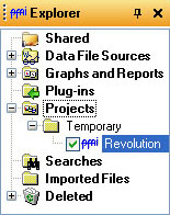
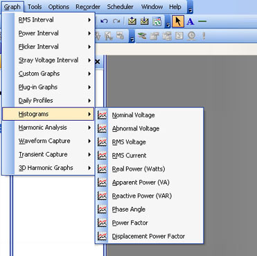
In Provision, select “File” and “Open”, or press CTRL + O. Browse to the recording file you want to open. Once you have opened the file, expand the “Projects” folder and then the “Temporary” folders in the Explorer panel (Figure 1). Check the checkbox next to the file you just opened. On the main toolbar, select “Graph” and then “Histograms” (Figure 2).
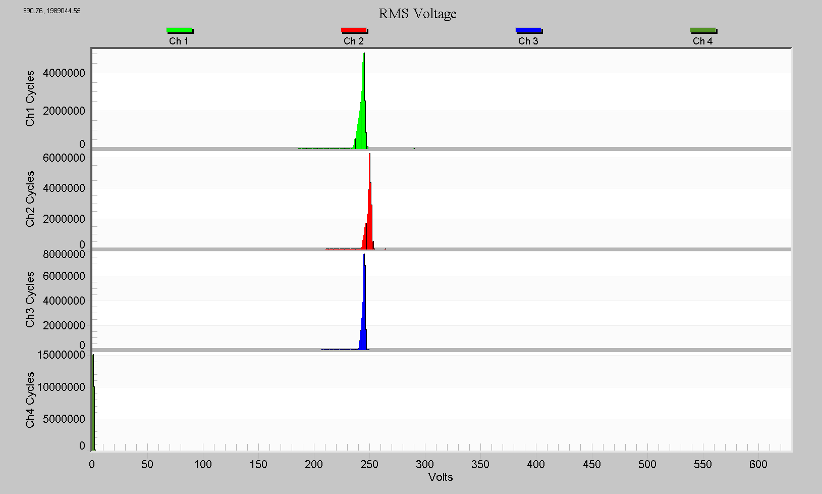
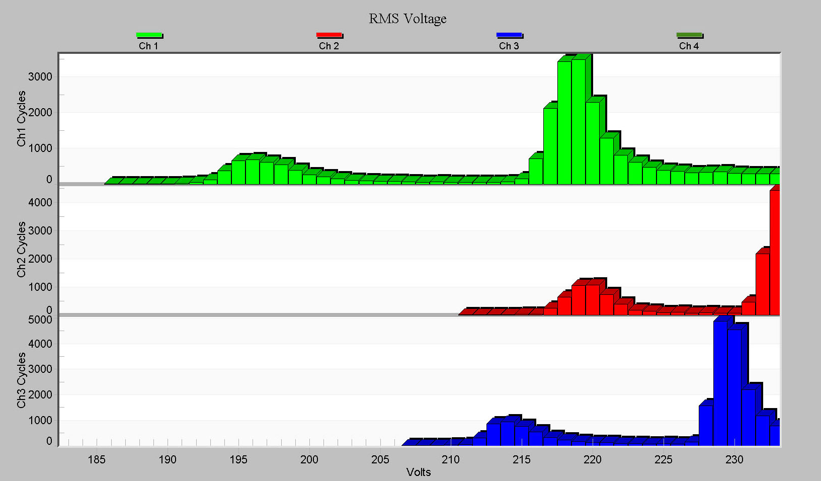
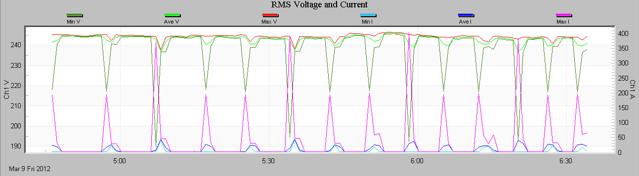
Open an RMS Voltage histogram by selecting “Graph”, “Histograms”, and “RMS Voltage”. You will see a graph similar to the one shown in Figure 3. Like the graph shown, it may appear as if the majority of the data is clustered around several bins, with small outliers on the edges. The graph’s scaling may hide small values, so zooming in allows you to see these hidden values. To zoom in on a specific area of the graph, position the mouse cursor where you would like to start the zoom, hold down the mouse button and drag to where you would to end the zoom, and release. In Figure 4, we see that the voltage spent many cycles at around 195V, and at 220V, indicating possibly two different types of events happening during the recording at these voltages. These likely correspond to the sags seen in the interval data for this recording (see Figure 5).
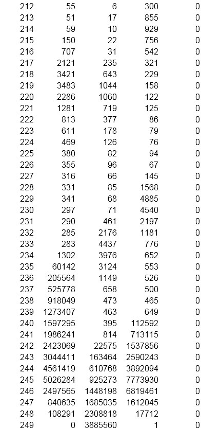
Because scaling can hide extreme values, seeing the histogram data in report form can be beneficial. For example, to view a single cycle RMS Voltage histogram report, select “Report”, “Single Cycle Histograms”, and “RMS Voltage” on the main toolbar. This will open a text report of the recording, featuring the same data as the graph but in the form of a table (Figure 6). Here we clearly see the main voltage cluster at 240V, and a smaller one at 220V.
Conclusion
There are a total of ten different types of histogram graphs available in ProVision. ProVision makes it easy to analyze power quality data with Cycle Histograms and Minute Histograms.
