Abstract
The Canvass Histogram is a graphical method for analysis of RMS voltage data over long time periods. Additional statistical measures are automatically derived from the histogram.
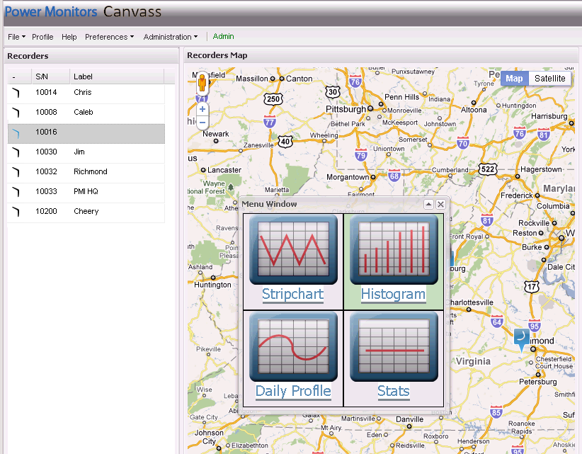
The web-based Canvass system is a graphical interface for display voltage data from the PMI data center. One graph type available in Canvass is the histogram. To generate a histogram graph, select a Boomerang, either by clicking on a Boomerang Icon in the map display, or in the list located on the “Recorders” side panel. The “Menu Window” will pop-up; from this window, click on the large “Histogram” icon. This will generate a histogram for the selected Boomerang, with the default graph settings. In this case, Boomerang 10016 has been selected (Figure 1), and a histogram was generated.
Histogram Settings
There are five adjustable settings for the histogram graph (Figure 2), all listed in the top row of the graph. Adjusting these settings does not affect the data in the database itself, or change the way the Boomerang reports data to the Canvass system. These settings only affect how the histogram is computed and displayed in the active graph.
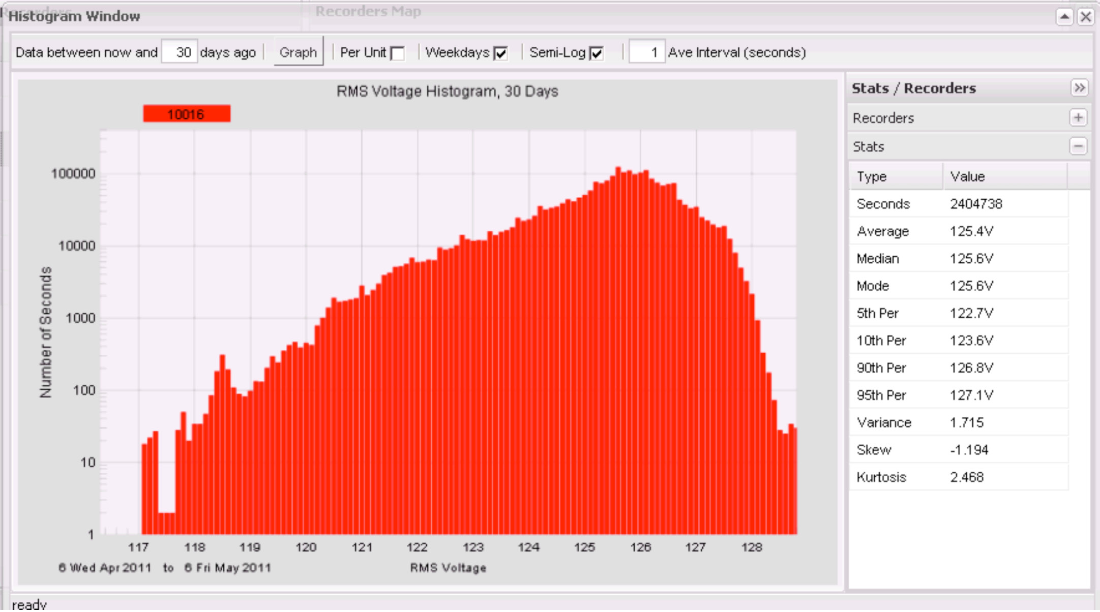
The primary setting is the length of time to graph. This is specified as a number of days, starting from the current day. This value defaults to seven days, but has been adjusted to 30 days in the example graph below. Here, the last 30 days of one second RMS voltage data has been included in the histogram graph.
The histogram is a graph showing a count of how long the voltage was at each possible voltage level. For Canvass histograms, the voltage readings are divided into 0.1V bins. For example, the first bin is for 0.0 to 0.1V readings, the next from 0.1 to 0.2V, through 120.0 to 120.1, 120.1 to 120.2, all the way to the maximum Boomerang reading of 300.0V. This gives 3000 different bins, from 0.0 to 300.0V, in tenth-volt increments. The number of seconds the RMS line voltage fell into each bin is tabulated, and presented as a bar chart. For example, if the RMS voltage was 120.3V for a total of 2,122 seconds sometime in the 30 day period, the 120.3V bar would be at a height that indicates 2,122. Since there are 30×24×60×60 = 2,592,000 seconds in a month, that would represent just 0.08% of the total time. Also, there is no indication of when those 2,122 seconds happened in the month, or if they were consecutive, or scattered throughout the month. For that kind of analysis, the stripchart graph is required. In the histogram graph, all timestamp information is removed, and only cumulative bin totals are displayed.
The sum of all the bin counts should equal the total time displayed in the graph, since the voltage must be at some level every second.
The second parameter is the “Per Unit” checkbox. Checking this will adjust the scale from absolute volts to per-unit values, where 1.000 p.u. is equal to the nominal voltage. The nominal is automatically computed from the data. This is especially handy when comparing graphs from multiple Boomerangs with mixed nominal voltages, e.g. 120V and 240V devices.
The “Weekdays” checkbox enables filtering out data from weekends. In the example, the checkbox is checked, so the data shown is over the last 30 days, but with no weekends included. It can be useful to separate weekday-only patterns from weekends, especially for industrial loads which are idle on weekends.
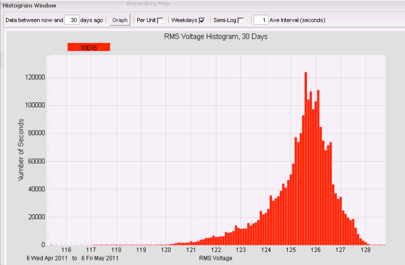
Toggling the “Semi-Log” checkbox toggles the x-axis scale between logarithmic and linear as shown in Figure 3. Often a linear scale can hide small counts, making it difficult to see the tails of the histogram distribution. For example, most of the voltage readings will be clustered around the nominal voltage, many million for a 30 day plot. The number of seconds spent during sags may be many orders of magnitude smaller, and these small counts could get auto-scaled down to a single pixel tall on the graph. A log x-axis brings these low values out, so even a count of 1 is visible, even compared to counts over a million at other voltages. On the other hand, a logarithmic x-axis can overemphasize skew and kurtosis, so in some cases a linear axis is easier to interpret from distribution shape point of view.
The final adjustable parameter is the averaging interval, in seconds. This is the window size of a sliding RMS averaging window applied to the data, before graphing as a histogram. This window slides in one-second steps. For example, if 15 minute RMS voltage averages are desired, set this value to 900, and the raw 1 second RMS voltage values will be prefiltered with a 15 minute sliding window. Since the window slides in 1 second steps, the output data still has 1 second resolution, but is still smoothed with a 15 minute averaging filter. This filtered data is then graphed as a histogram. The default value of 1 second effectively removes the filter. In most cases, an averaging filter will not greatly affect the histogram shape, but will have an effect on the statistics, especially for sags.
Statistics Panel
The statistics panel can reveal much about the nature of the data (Figure 4). The “Seconds” field shows how many total seconds are included in the displayed data. Here, 2,404,738 seconds is roughly 30 days, minus weekends, since there are 24×60×60 = 86,400 seconds in a day.
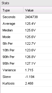
The Average, Median, and Mode are basic statistical measures, each which attempts to capture the entire dataset in a single value. The Average is the arithmetic mean of all the readings. In this case, the average voltage was 125.4V. The Median is the value where 50% of the readings were above that value, and 50% were below that value. Here the Median was 125.6V. The Mode is the most common voltage reading, and in this session was also 125.6V. These three values are often close together, and each can represent the “nominal” voltage level present.
The Percentile values show the voltage levels present for pre-defined percentages of time. The “5th Per” level here is 122.7V, which means that 5% of the time (in this data set), the voltage was below that value, and 95% of the time it was above that. Similarly, the “10th Per”, “90th Per”, and “95th Per” give the voltage values where the voltage reading was below that value for 10% of the time, 90% of the time, and 95% of the time, respectively. These percentiles can be combined: given the 5th percentile of 122.7V, and the 95th percentile of 127.1V, we can state that 10% of the time, the voltage was between 122.7V and 127.1V. The Average, Median, and Mode should also be within this interval.
In statistical theory, the Variance, Skew, and Kurtosis are “higher-order moments” in contrast to the Average, which is technically the 1st order moment. The Variance is a measure of how wide the distribution is. A small variance will have a narrow distribution, centered around the average value. Here, the Variance is 1.7V, which means that there is roughly a 1.7V spread around the mean value. If a Gaussian (or “normal”) probability distribution is assumed, we can relate this to the percentile values, but often the voltage distribution is not Gaussian. In any case, a small variance is desired. In the extreme, if every single voltage reading is identical, the variance will be zero. This value should always be positive.
The Skew measures how lopsided the distribution is around the mean. For example, if sags or low voltage is more common than swells, or over-voltage, then the Skew value will be non-zero. If the Skew is small, then low voltages are just as common as high voltages. Here, the Skew is -1.194V. The negative value indicates that low voltages are more common – a positive value would indicate high voltages are more common. Negative Skews are much more common.
The Kurtosis measures how “peaky” the distribution is. A high value indicates a narrow peak, and longer tails in the distribution, while a small value indicates a broad, flatter peak, and smaller tails in the distribution. A high Kurtosis can indicate that the service voltage is fairly close to the average most of the time, but when it does deviate, the deviations are more extreme. In contrast, a small value indicates that deviations from the mean are more common, but not as extreme. It’s possible for both situations to have the same Variance, so the Kurtosis can be useful in separating them. Like the Variance, this value should always be positive.
Conclusion
The Canvass Histogram graph is a powerful tool to characterize the probability distribution of voltage at a particular location. The shape of the graph, coupled with the statistical analysis, can reveal patterns in the service voltage, and also help quantify a level of service on a statistical basis.
