Abstract
Histograms in Canvass are powerful, yet underused graphs. In addition to presenting measured data visually, a list of histogram statistics are also computed by Canvass. Histogram graphs in Canvass compute total seconds, average, median, mode, 5th percentile, 10th percentile, 90th percentile, 95th percentile, variance, and skew. In this paper we will discuss how to view histogram statistics, as well as what each measured statistic is.
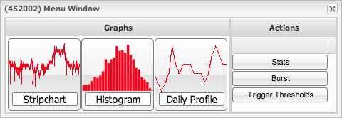
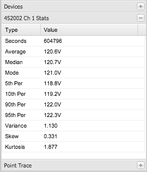
To view a histogram, first click on the recorder on the map or select it from the list on the left hand side of the application. In the window that appears, click the “histogram” button, as shown in Figure 1. Click on “Voltage” to choose a voltage histogram. On the right hand side of the graph that appears, click on the “+” button next to the “stats” label. A list of statistics associated with the graph will expand as shown in Figure 2. The statistics listed are computed on the fly by Canvass; changing the time range of the graph will cause Canvass to recalculate the statistics. Next we will discuss each statistic individually.
The first statistic in the list is seconds. The seconds field is a count of how many seconds of data are included in the graph. Since the Boomerang sends a measurement for each second, the number of seconds is equal to the total number of data points in the histogram. In the graph in this example there are 604,796 seconds, about one week’s worth of data. Covered next are the average, median, and mode statistical measures, which attempt to characterize the graphed data in a single value.
The average is the arithmetic mean of the data graphed. The average is computed normally, by summing all the voltage readings, and then dividing by the number of readings. For current or power histograms, this value represents the equivalent steady-state value over the time period. It can be useful for long-term load profiling. The voltage average may not be as useful as the other statistics for voltage regulation issues, since high and low voltage can average out to an acceptable value. For example, if the voltage is 110V during the day, and 130V at night, that could average to around 120V, which is misleadingly good.
The median is the value in the middle of the data. Fifty percent of the values in the dataset are above the average, and fifty percent of the values are below the average. It is computed by arranging every single reading in numerical order, then taking the reading in the center of the list. The median and average are often very close, but the median is less sensitive to short voltage sags and other short-term excursions. When the histogram shape is not very symmetrical (common, since sags are more common than swells), the median gives a more useful “average” value than the true average.
The mode is the most common value. This is computed by listing every single reading, and counting the occurrence of each one (e.g. how many readings of 120.1V, 120.2V, etc.). The reading with the highest count is the mode. For voltage, the mode may be the best statistic for steady-state studies, since it’s the reading that the voltage is at “most of the time” for a simple histogram shape. For more complex histogram shapes, it still captures the value that happens most often, but “most often” may not actually be very often. For example, if the voltage is normally 110V during the day, and 130V at night, the mode will likely be close to 110V or 130V, depending on which condition lasts just slightly longer.
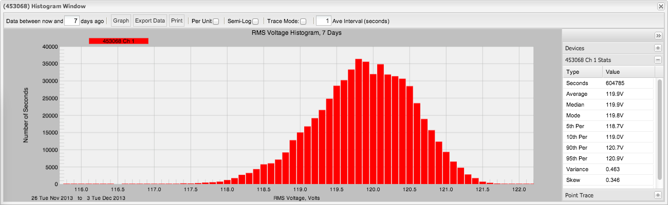
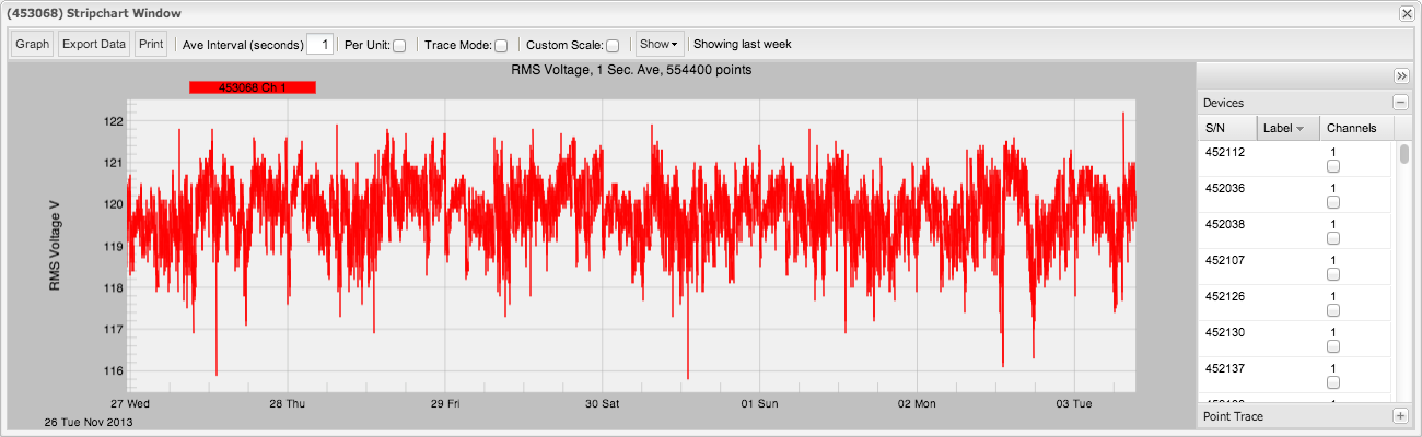
Often times, average, median, and mode are close together, and each can represent the “nominal” level present. This is represented in Figure 3, where the average is 119.9V, the median is 119.9V, and the mode is 119.8V. When the average, median, and mode are close together, the graph forms a bell-curve shape, and has low skew. Figure 4 is the same dataset, but as a stripchart graph. The vertical middle of this graph is around 119.5V to 120V, which corresponds to the horizontal middle of the histogram graph. The average, median, and mode are all useful with simple histogram shapes with one dominant peak, and less useful with more complex histogram shapes. Current and power histograms usually have very complex shapes, and there the average is the most useful.
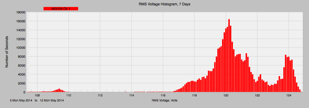
A periodic energy usage, like a compressor coming on and off, or a day/night usage cycle can cause an interesting graph. The graph will contain two peaks, and the average will not be near a peak, but in the trough between the two peaks, like in Figure 5. In the case of a day/night cycle, power consumption may be greater during the day, causing two peaks in the histogram graph. An example case for a day/night cycle would be a business, where employees work during the day and leave at night. The opposite could occur at a residence, where the residents leave during the day and come back at night. A graph with two peaks is “bi-modal”, because it can be considered to have two modes.
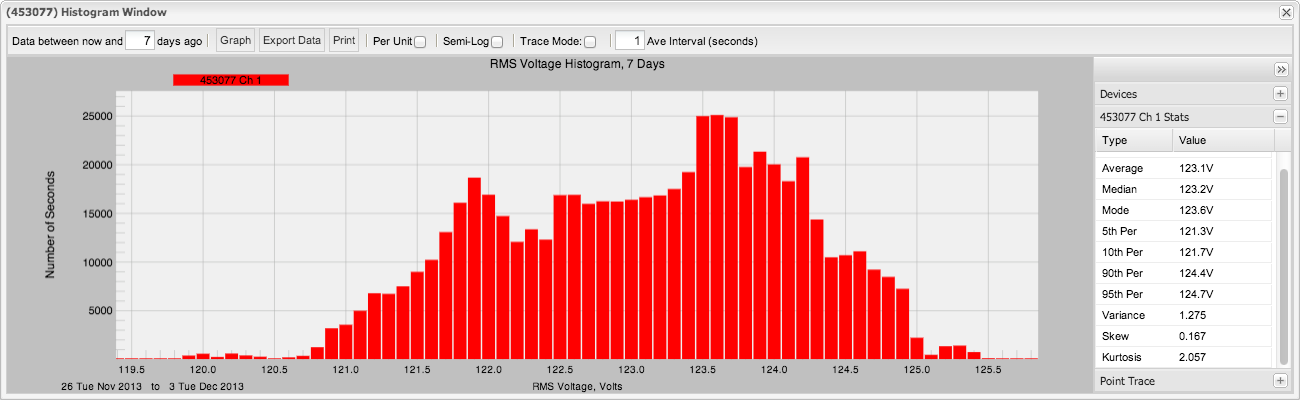
The percentile values show the voltage levels present for pre-set percentages of time. The “5th Per” level in figure 1 is 118.7V, which means that in this data set, 5% of the time the voltage was below that value, while 95% of the time it was above that. The 10th, 90th, and 95th Percentile indicate voltage values where the dataset was below the reading for 10, 90, and 95% of the time. The 5th, 10th, 90th, and 95th Percentiles can be combined to form a helpful statistic. Given a 5th percentile of 118.7V, and a 95th percentile of 120.9V, 10% of the time the voltage was between 118.7V and 120.9V. The average, median, and mode should also be within this interval.
Variance, skew, and kurtosis are “higher-order moments”. In contrast to this, average is the 1st order moment. Variance is a measure of how widely distributed the data is. A graph with a small variance will look like a mountain with a sharp drop off, with a narrow distribution and the peak centered around the average reading. In contrast to this is the graph in Figure 5, which has a dataset with a wide distribution and a large variance. In this graph, the variance is 1.275, which means that there is about a 1.275 spread around the mean value. Assuming that the graph has a normal, or “Gaussian”, probability distribution (although this is often not the case), we can relate this to the percentile values. A small variance value is desirable either way for voltage. An extreme case would be if every reading were the same, resulting in a variance of zero and a histogram graph with a single tall bar. The value for variance should always be positive, and should be low, if the average reading is centered around an ideal voltage value, i.e. 120V.
The skew measures how lopsided the distribution is around the mean. Skew is indicated by more values being present on the left or right side of the mean. If low voltages, or sags, are more common than over-voltage, or swells, then the value for skew will be greater than zero. If the skew is small, then low voltages are just as common as high voltages. In figure 6, the skew is 0.917. Loads on the system, causing the voltage to drop, create skews favoring the left side of the graph. Skews to the left of the graph are more common than skews to the right.
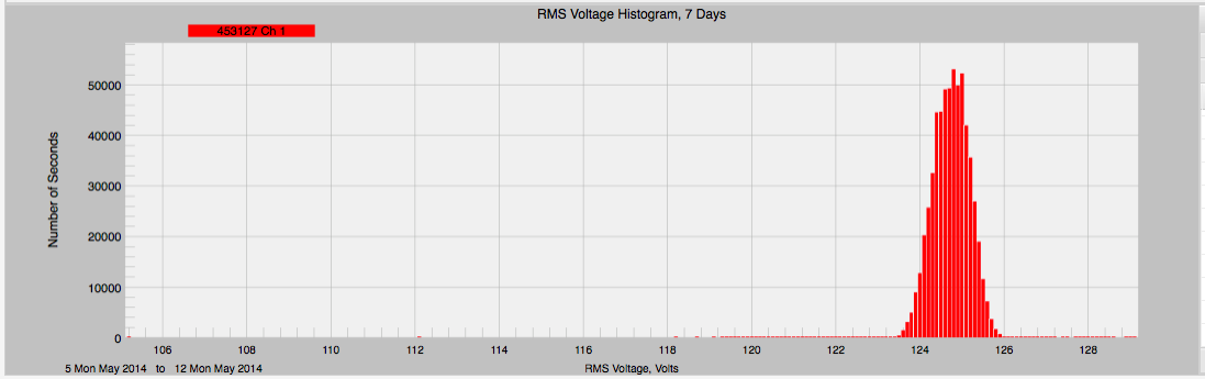
The kurtosis measures how “peaky” the distribution is. A graph with a high kurtosis value looks like a mountain with a sharp, narrow peak and a long, wide base, as shown in Figure 7. A small kurtosis looks like a mountain with a broad, flatter peak, and a shorter base. With a high kurtosis, the voltage is near the average much of the time, but the deviations are more extreme. A small kurtosis means voltage deviations are more common, but not as extreme. Both of these situations could have the same variance, so kurtosis can be used to separate them. Kurtosis should always be positive.
Conclusion
The histogram graph is a powerful but underused tool. Using the histogram graph and its related statistics gives a powerful data analysis option. Canvass makes this easy by computing these statistics on the fly.
