Abstract
Stripchart data, also known as trend or interval data, is often the most important information in a power quality recording. The bulk of the recorder memory is dedicated to it, and the stripchart gives the overall “narrative” of the monitoring point during the recording. ProVision offers several graph features and data analysis mechanisms for quickly analyzing this wealth of raw data. Some are geared towards measuring specific events, while others facilitate trend analysis, or discovering relationships between equipment and delivered voltage. These ProVision stripchart tools are described in this whitepaper.
Loading Stripcharts
A stripchart trace is a time series of measurements collected at a fixed interval. For intervals greater than one 60 Hz cycle, the minimum, average, and maximum values are generally recorded. For example, with a 1 minute interval, the RMS voltage stripchart would include single-cycle min and max values, along with the average RMS voltage for each enabled channel over each minute, logged once per minute. Most built-in ProVision stripchart graph templates show one measurement type, with separate plots for each channel’s min/ave/max. The main exception is when voltage and current are paired, e.g. the RMS or THD voltage and current stripcharts. With these, matching voltage and current channels are paired on the same plot, with voltage using the left Y-axis, and current using the right Y-axis (e.g. Figure 1).
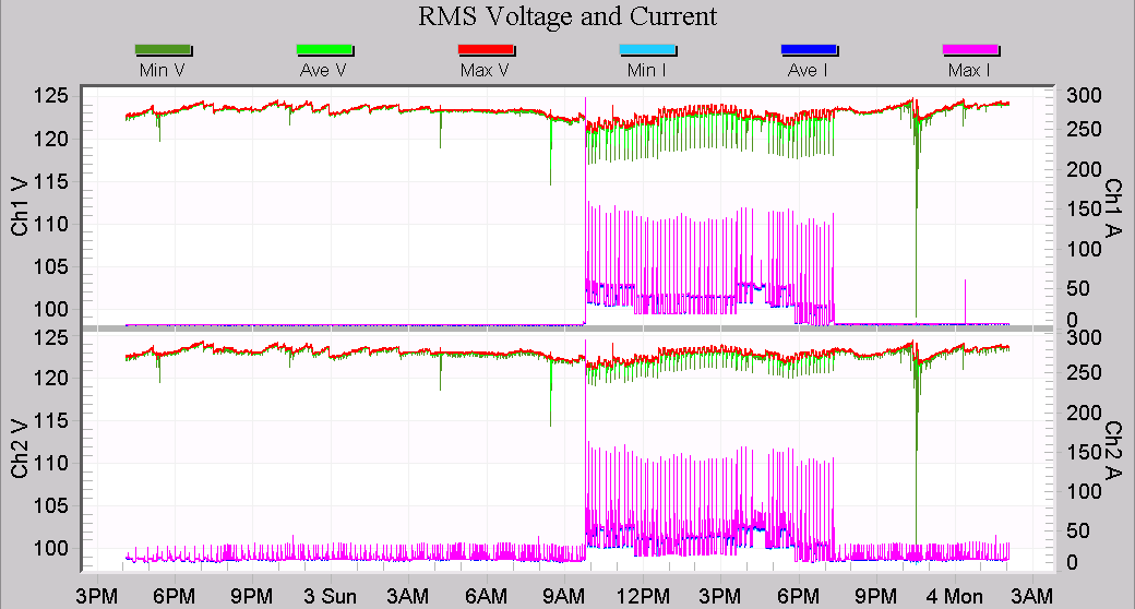
A key feature of all PMI stripchart graphs is that the worst-case values are always shown, no matter how far out the graph is zoomed. A graph that covers many weeks or months may contain millions of data points, plotted on a graph that may be only 1000 pixels wide. Even so, data points are not skipped when graphed – all points are used to generate the graph, so that even a single point excursion is still visible with a graph zoomed all the way out.
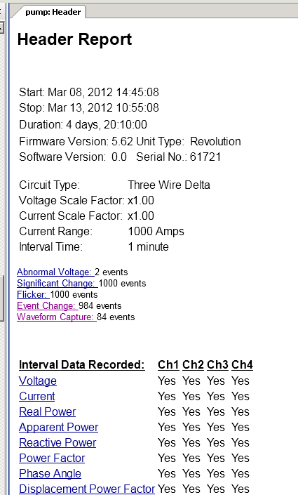
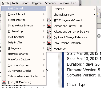
There are two ways to access the primary stripchart data. The quickest way to get started is to click on the links in the default Header Report (Figure 2). There are clickable links for the most common stripcharts, including RMS voltage (circled in red in Figure 2), current, and all power quantities. The second method is to use the main menu, under Graph (Figure 3). There are several categories for different types of stripchart data, including “RMS Interval” (includes voltage and current THD, unbalance, Total Demand Distortion, and Frequency), “Power Interval” (real, reactive, apparent power, power factor, etc.), “Flicker Interval” (IEEE 1453 flicker values), and “Stray Voltage Interval” (RMS voltages arranged for stray voltage analysis).
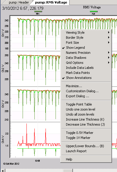
Once loaded, many of the operations described below are available via “hot-keys” (keyboard shortcuts that are enabled when the graph is selected), or the context menu. To view the context menu, right-click on the graph (Figure 4). Some choices that have a hot-key method of invocation show the hot-key in parentheses. Using the hot-keys is the fastest way to invoke the advanced features; getting familiar with these short-cuts is a great way to speed up data analysis.
Point Table
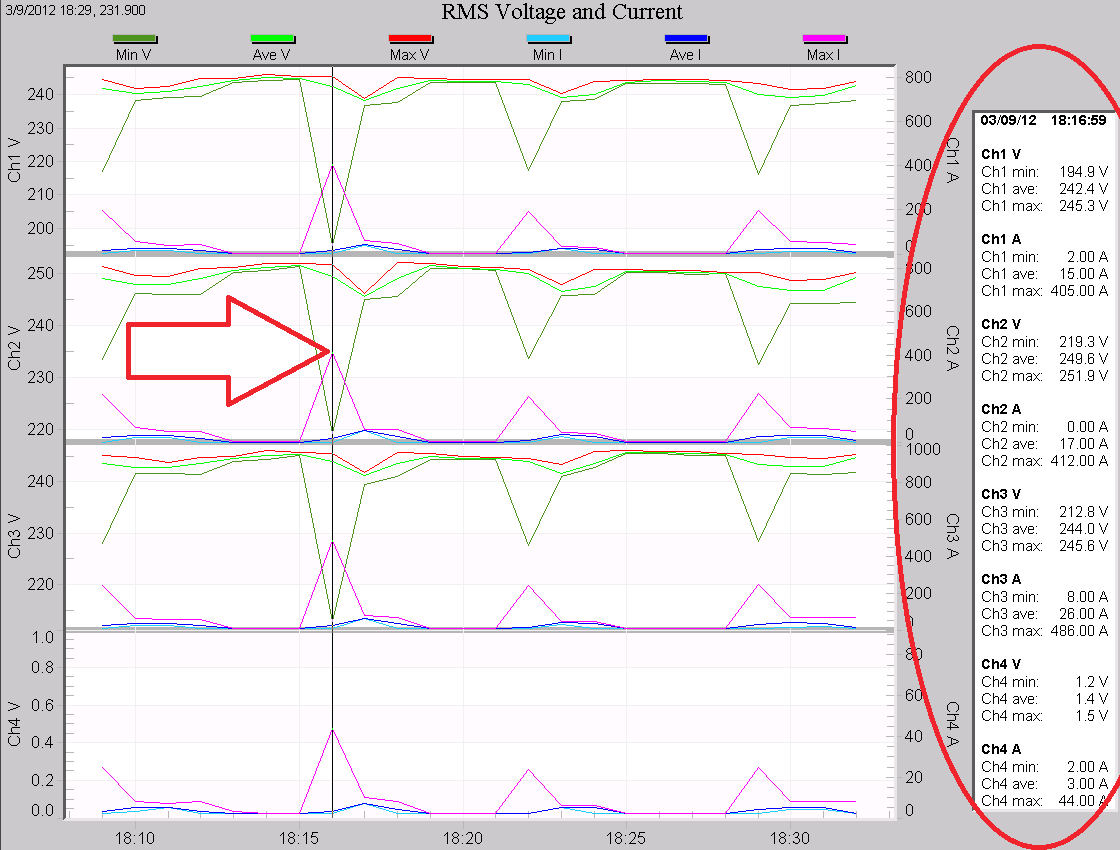
The Point Table functions similarly to the table in the waveform graphs. When enabled (right-click the graph, then choose “Toggle Point Table”, or use the “T” hotkey), a side panel appears with the exact value of each display trace at a specific interval. In Figure 5, the table is circled, and the vertical scan line marking the displayed points is highlighted with the red arrow. The timestamp is shown at the top of the table, followed by the values of each stripchart trace in the graph. To move the scan line, click on the specific point on one of the traces, or use the left/right arrow keys to move it one point at a time. In this mode, the Page Up/Down keys move the scan line 20 points. In Figure 5, the scan line is placed on a voltage sag caused by a large 3-phase pump. The point table reveals that 400A starting current is causing a 20% voltage sag.
Computed Stripcharts
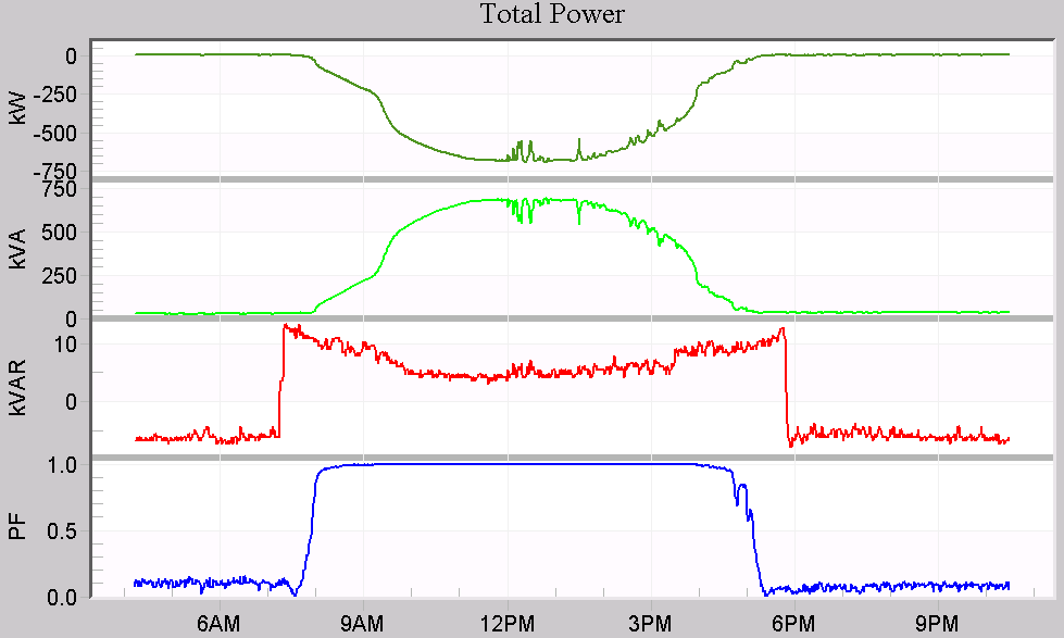
In addition to displaying recorded stripchart data, ProVision includes some computed stripcharts. These are data traces computed by ProVision from recorded data. Computed stripcharts include 3-phase total power (including total real, reactive, and apparent power, power factor, and displacement power factor), real power demand, long-term flicker (Plt, computed from recorded Pst values), and Total Demand Distortion (computed from harmonic current data and the circuit max demand current). In Figure 6, the total power graph is shown for a 3-phase 1 MW solar farm. From top to bottom, the 3-phase total real, apparent, and reactive power is shown, followed by true power factor over one day.
Stripchart Report
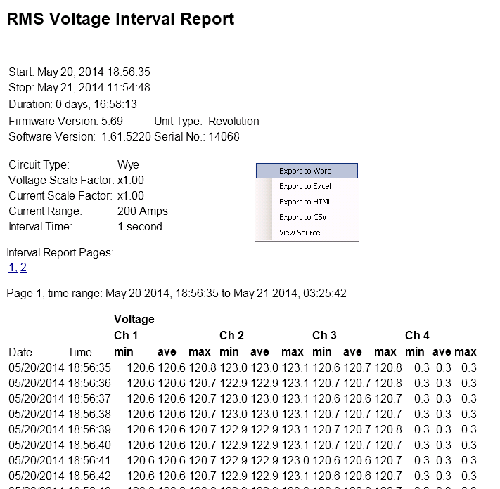
Stripchart data may be viewed in tabular format for a closer analysis. Choose “Launch Report” from the context menu to generate this report, as shown in Figure 4. The header report is shown at the top, followed by every stripchart data point. This data may be exported by right-clicking the report to bring up its context menu (as seen in Figure 7). Exporting to Excel or CSV format allows for a more specific analysis with a spreadsheet or other software, or inclusion into another document. The report covers the time period displayed in the graph – leave the graph unzoomed to get a report for the entire recording, or zoom on a particular section first to produce a smaller report. If the report is very long, it will be divided into multiple pages.
Selecting Traces
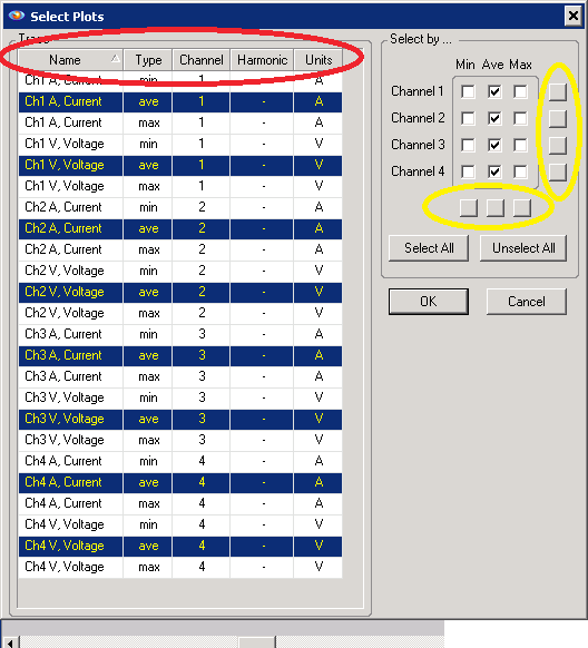
Selecting only certain traces to display can help turn a complex graph into a more manageable one, winnowed down to just the key information. To enable/disable traces, choose Tools, Select Plots from the menu. A dialog box appears with each trace on each plot listed, as shown in Figure 8 for the built-in RMS Voltage and Current graph.
There are several powerful methods for quickly enabling or disabling groups of related traces. On the right side of the panel, a grid of checkboxes controls the global enable/disable of all traces specific to the min/max/ave of a channel. Use the checkboxes to individually set them, or use the small buttons along the side and bottom (circled in yellow in Figure 8) to check/uncheck an entire row or column. These buttons allow for very fast selection of just a certain channel, or min/ave/max type.
On the left side, each individual trace in the graph is listed. They may be selected/deselected individually, or multiple traces may be selected by holding shift while clicking with the mouse. An entire set may be selected at once by clicking on the first trace, then holding the shift key, and clicking on the last trace in the set. Click on a column header (circled in red in Figure 8) to sort by that column – this groups related traces together, so they may all be selected at once. For example, to quickly select just the voltage traces, sort by the “Units” column, which will group all voltage and current traces separately. The Select Plots form may seem complex at first, but allows for very fast graph manipulation.
Hot-Keys
There are several other smaller stripchart graph features that are useful time savers. A full list of the shortcut hot-keys is shown below:
| Hot Key | Action |
|---|---|
| T | Toggles Point Table off/on |
| B | Edit graph upper/lower bounds |
| E | Launch graph export dialog |
| P | Print graph |
| U | Undo one zoom level |
| Z | Undo all zoom levels |
| Q | Bring up context menu |
| R | Launch stripchart report for zoomed area |
| K | Increases plot line thickness |
| J | Decreases plot line thickness |
| S | Toggle color/black and white mode |
| M | Maximize graph on screen |
| D | Data Export Dialog |
| Period | Make right-axis data smaller on graph |
| Comma | Make right-axis data larger on graph |
| Ctrl-Period | Make left-axis data smaller on graph |
| Ctrl-Comma | Make left-axis data larger on graph |
| 1 | Toggle 1V horizontal line for stray voltage |
| 5 | Toggle 0.5V horizontal line for stray voltage |
Adjusting the upper/lower bounds, line thickness, etc. are useful when printing or including a graph into a report.
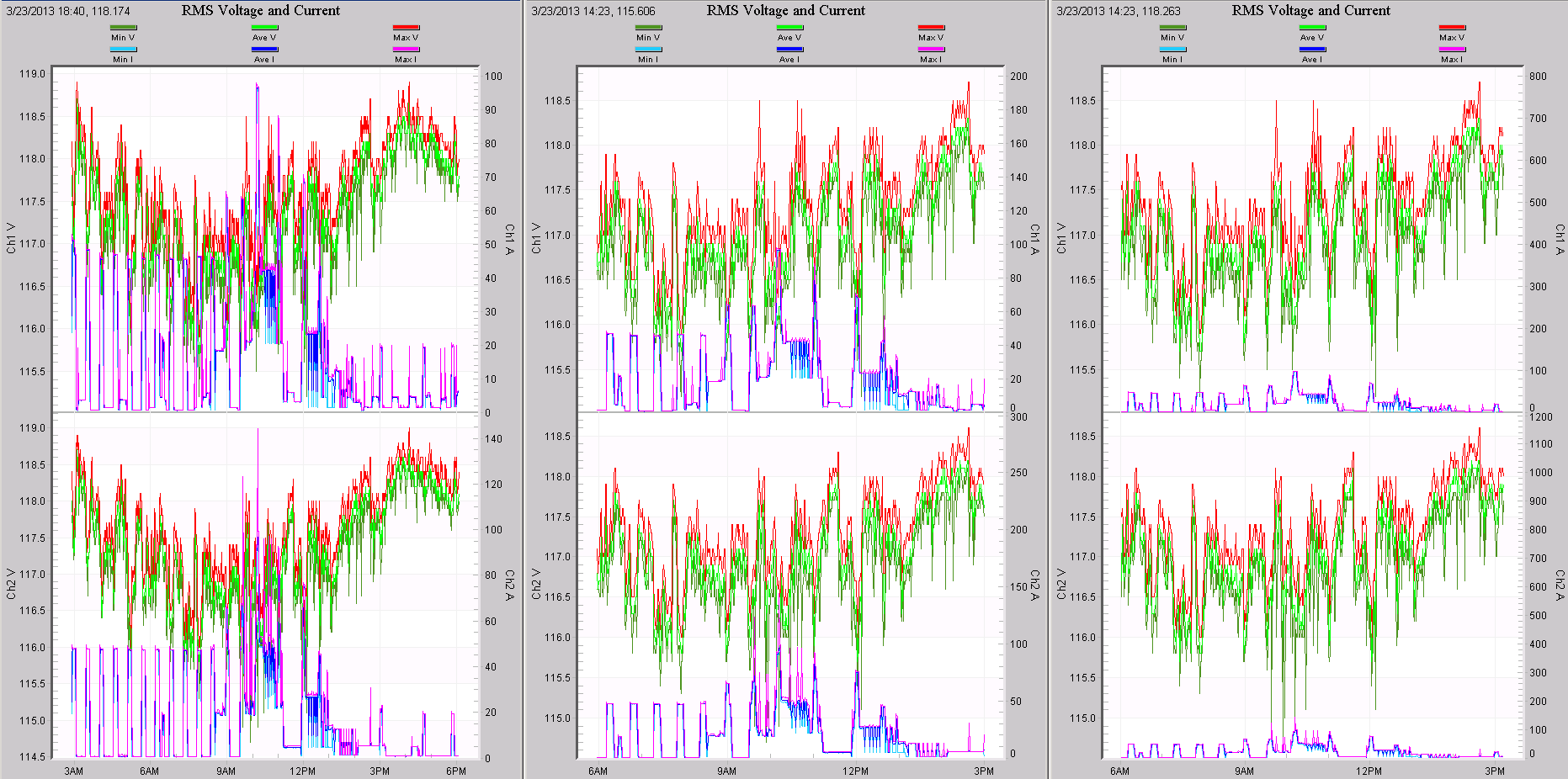
Two little known hot-keys are the period and comma, used to adjust the auto-scaling on right-axis traces. The most common graph is the RMS Voltage and Current stripchart, shown in Figure 9. Because the current is scaled with the right y-axis, it sometimes autoscales such that it obscures the voltage traces, scaled on the left y-axis. In this situation, the many overlapping traces make it difficult to see what’s going on. To quickly move the current traces out of the way, hit the period hotkey to halve the size of the current (doubling the right y-axis span). Keep using “period” to halve the current until the voltage traces are easy to see. Use “comma” to bring the currents back up as needed. A good way to use these is shrink the currents, then zoom into a specific small section of the graph, then bring them back to full scale. For situations where it makes sense to double/halve the size of the voltage (or any other data using the left y-axis), use Control-comma or Control-period.
Conclusion
Stripchart data often contains the bulk of the information in a data recording. A complete stripchart graph reveals both specific events and long-term patterns in the same plot, and it can take some time to fully examine all the information. Efficiently analyzing this data requires a good knowledge of the many ProVision advanced features and shortcuts available. An overview of the different graphing modes and shortcuts has been presented here.
