Abstract
Canvass is Power Monitors’ latest web-based power quality analysis portal capable of providing data analysis for single-phase voltage monitors. With Canvass, the user can view voltage stripcharts, histograms and daily profile graphs for every data point that the device has ever registered to the PMI Canvass data warehouse. Additionally, each device that has been deployed to the field can also be graphed simultaneously (as overlays to the same, single graph) allowing the user to see the “big picture.” This paper will focus on the Daily Profile graph and how to customize the graph to fit the user’s needs.
Registering for a Demo Account
To follow along with this demonstration, register for an account at this address: http://canvass.powermonitors.com/util/register.jsp. Once registration is complete, log into the portal here: http://canvass.powermonitors.com.
Getting Started
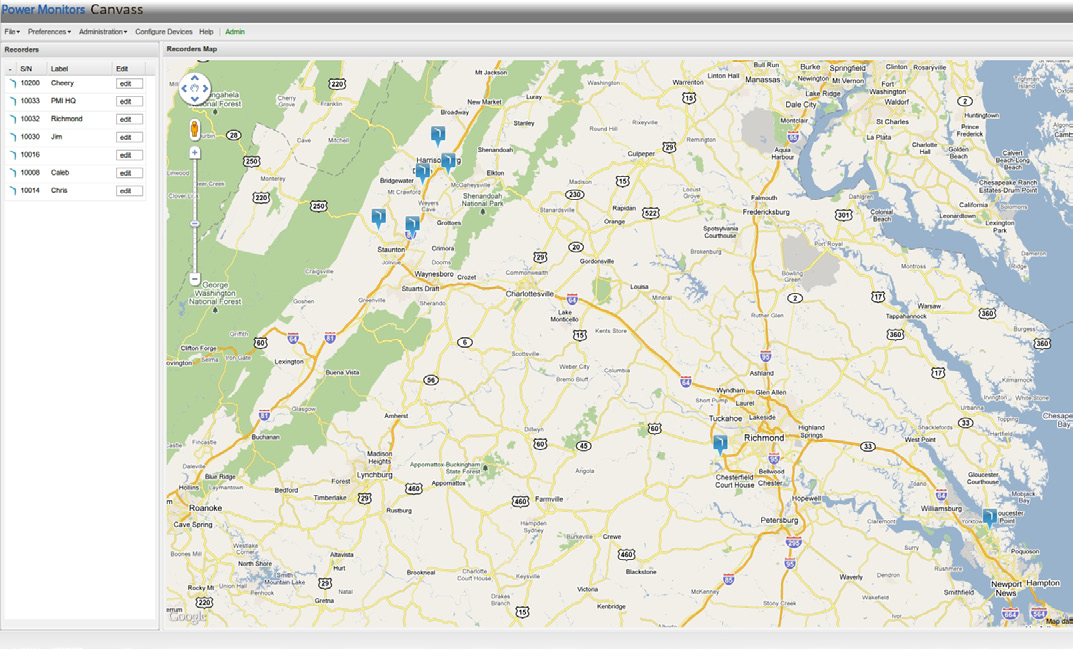
After logging into Canvass, a screen similar to the one shown in Figure 1 will be visible.
About a half-dozen Boomerangs will be available, scattered throughout the state of Virginia. The color of the icon on the map indicates the “status” of the Boomerang. Blue means that the Boomerang is “alive” and reporting data; black means that the Boomerang is “dead” and has not reported any data in at least two hours; orange indicates that the Boomerang is in an “alert” state. When in an alert state, it’s possible to hover over the icon for a description of the alert (voltage low, voltage high, etc.).
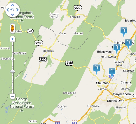
Zooming in on the map will expand the icons into a banner display as shown in Figure 2, scrolling the Boomerang’s serial number and label. Zoom in or out using the zoom control, as shown in Figure 3, or by using the mouse scroll wheel. Scrolling up with the wheel will zoom in and scrolling down with the wheel will zoom out.
Canvass Daily Profiles
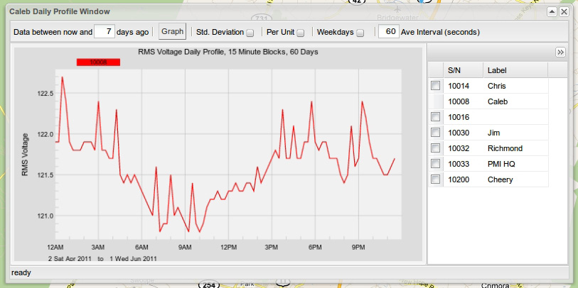
Daily Profiles are used to spot trends in daily voltage. The user specifies a time frame of a single day or even up to several months and Canvass returns a graph of the “average day” over the duration of the specified time frame. The Daily Profiles graph can be used to spot consistently high or low voltage and is particularly useful for monitoring regulation voltage.
Daily Profiles Graph
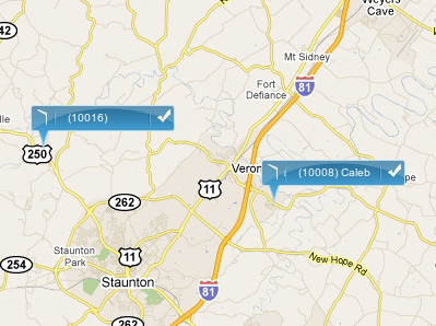
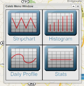
To begin the Daily Profiles analysis, select a Boomerang by either clicking its icon on the map, or by clicking on its record in the grid on the left-hand side of the screen as shown in Figure 4. Once a Boomerang has been selected, select the Daily Profiles graph. This example uses device 10008 “Caleb”, but selecting any of the devices on the map will present a set of available graphing options as shown in Figure 5.
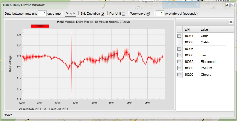
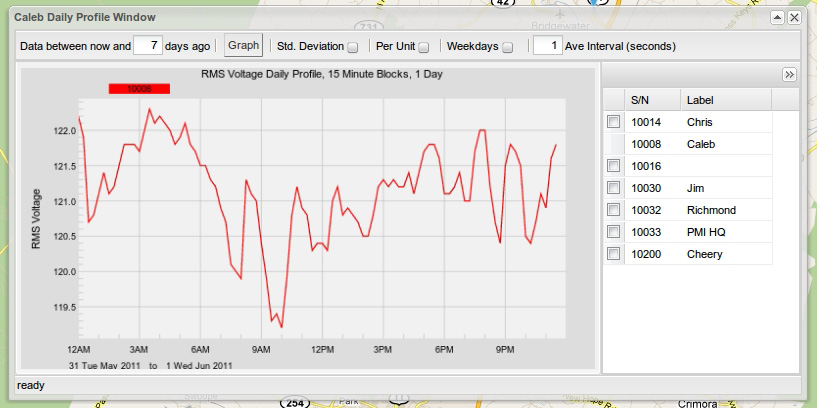
The graph defaults to showing the previous 7 days’ data (excluding weekends), as shown in Figure 6. To include weekends in the analysis, deselect the “weekdays” checkbox as shown in Figure 7. (See the section labeled “Weekdays Only” below for more information about this option.)
The Daily Profiles graph has several parameters that the user can adjust: Time Span, Standard Deviation, Per Unit, Weekdays Only and Averaging Interval. A brief description for each of these parameters follows.
Timespan
This parameter allows the user to specify how many days (from “today”) that the Daily Profiles graph will cover. This value is limited only by the amount of data that the Boomerang has reported. If the Boomerang has been connected and reporting data for five years, then it is possible to graph the Daily Profile for all five years of data (Note, however, that this may take some time).
Standard Deviation
The Daily Profiles are an average of the RMS voltage over the specified averaging interval for each day in the specified timespan. It is, however, exactly that – an average. The average doesn’t show whether or not there is a very wide deviation day to day for a specific point in time. Selecting Std. Deviation will display the specific variance throughout a specified time span for a particular time point. On the graph, this is represented by a vertical shaded bar as shown in Figure 8. The taller the vertical bar, the greater the standard deviation.
Standard deviation values are also represented as the actual variation in volts (instead of as a percentage). The bars that are drawn as the standard deviation overlays are also drawn to scale, allowing the user to see the full range of variation – in volts – for the specified point in time.
Per Unit
The Per Unit option toggles between raw voltage values (when unchecked) and a percentage of the nominal voltage (when checked). For example, if nominal voltage is 120 and a Boomerang reported a voltage of exactly 120.0 V, then the per unit value would be 1.000. This option is useful when viewing Daily Profile graphs for devices that are not deployed to locations with the same nominal voltage.
Weekdays Only
This option allows the user to exclude weekends in the Daily Profile analysis (this is the default behavior of the Daily Profiles graph). Users often times wish to exclude weekends from their analysis, because it tends to skew the graph of the average daily voltage trends. (On weekdays, residents are at work, going to school, etc. during the day. The voltage trends at a location on the weekend may be significantly different than what is seen during the typical weekday.) Deselecting the “weekdays” box will include weekends in the graph.
Averaging Interval
The default averaging interval provided by Canvass for all of the graphs (Stripcharts, Histograms and Daily Profiles) is one second (this corresponds with the interval used by the Boomerang itself when reporting voltage data back to the PMI data warehouse). A one second interval is the smallest interval that can be graphed by the Canvass system. This option is provided as not all users will need one-second granularity – some may want a 30 second averaging interval or perhaps even an interval of a few minutes. This can be specified by typing in a new averaging interval (in seconds) and clicking on the “Graph” button to redraw the graph. A one-second interval graph and a 60 second interval graph are shown below. They are both averaged over the same seven-day period.
NOTE: The averaging interval is applied to the raw voltage data before the Daily Profiles are calculated. The Daily Profiles calculations are separated into 15 minute segments. By applying a custom averaging interval, the user may see the results of spikes or sags distributed into more than a single fifteen-minute segment, especially if the spike or sag lies towards the boundary of a fifteen-minute time-segment as shown in Figures 9 and 10.
Graphing Multiple Devices and Zooming
The Canvass application allows the user to look at daily profile graphs for multiple devices at the same time. This feature allows a user to analyze voltage trends at multiple different locations over the same time period (perhaps locations served by a common substation as an example).
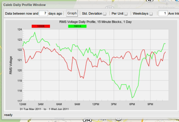
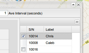
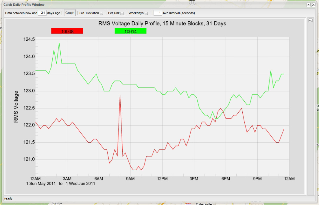
To plot multiple Boomerangs on the same graph, select the corresponding checkbox for the desired Boomerang in the list on the right-hand side of the graph window as shown in Figure 11. In this example, the device 10014 “Chris” has been selected and the averaging interval has been set to one second.
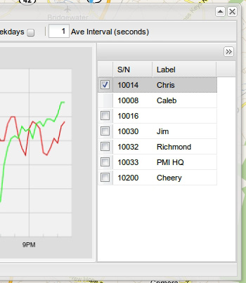
Note that the original selection, 10008, doesn’t have a checkbox in the Boomerang list. This plot cannot be removed from the current graph. Also, note that the selection is not limited to one Boomerang at a time; several may be selected. The only limiting factor in how many Boomerangs can be selected is the readability of the graph as more plots are added.
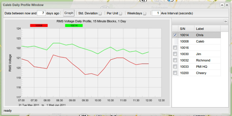
In the graph shown in Figure 12, below, the profiles are pretty similar until about the 14:00 to 20:00 time frame. A closer look at some of the similarities between the two plots can be seen when the graph is zoomed in on the 07:00 to 12:00 range. To zoom into this point, place the mouse cursor on the graph just to the left of the spike on the graph corresponding to the 07:00 time frame. Then click and drag the mouse across the graph until the area of 12:00 is reached. As the mouse is dragged across the graph, a transparent green window encompassing the zoom area appears. Everything within that zoom window will be the focus of the newly redrawn graph as shown in Figure 13.
To return to the original zoom level once the analysis of the zoomed data is complete, press the ‘U’ button on the keyboard to ‘u’ndo the most recent zoom. Another useful shortcut when viewing graphs is the ‘T’ button. This will toggle the Boomerang list at the right-hand side of the screen, showing more drawing area for the graph (or less, depending on whether the list is being shown or hidden). It’s also possible to hide the Boomerang list by clicking on the double arrow (>>) button in the top right-hand corner of the list window as shown in Figure 14, left.
If more room for the graph is needed, it is possible to resize the window by clicking on any of its edges or corners and dragging. On release, the window and graph will be redrawn to utilize the new window space as shown in Figure 15.
Conclusion
The Canvass Daily Profiles graphs are a great tool for spotting issues with both short and long term voltage trends. The powerful graphing tools in addition to limitless data storage give the user the best voltage trend analysis platform possible.
