Abstract
The Daily Profiles graph is likely one of the most underutilized Canvass graphing features. This particular graph is great for identifying long term (and even short term) trends, many of which have been covered superficially in previous white papers. This white paper is going to go into a more comprehensive overview of Daily Profiles – from the configurable graph parameters to some more concrete examples of trend analysis and identification.
What Are Daily Profiles?
Daily Profiles are, in essence, a 24-hour “averaged overview” of voltage, current or power over a specified period of time – the smallest period of time being one day (a full 24 hours). Each point on a Daily Profile graph in Canvass represents a 15 minute averaging window, wherein each individual 1-second value for each day included in the graph for the specified 15 minute window is averaged together to form said point. While that may sound confusing, it really isn’t – here’s an example:
Let’s say a user has selected a 7-day period (which is the default) of voltage from a Boomerang. In this particular example, Canvass will split the day into 96 “points” (24 hours X 4, because there are 4 15-minute periods per hour X 24 hours, or 96 15-minute periods per day). To calculate the value of each point, Canvass then looks at each 1-second value from the selected Boomerang, from each day between 00:00 and 00:15 – then it averages those values and the first “point” for the Daily Profile graph is created. It repeats this process for point 2: average the 1-second values from 00:15 through 00:30; then 00:30 through 00:45, etc. So, for a graph from, say, 1 January through 7 January, the 00:00-00:15 point (the first point of the graph) would consist of the average voltage from each second for 1 January 00:00-00:15, 2 January 00:00-00:15, 3 January 00:00-00:15 … 7 January 00:00-00:15.
How to Read the Graph
Now that the definition of how the points of the graph has been provided, we can take a look at an actual example. In Figure 1 the author has selected to look at voltage for the previous 7 days. Looking at the graph, it can be said that the average voltage from 15:00-15:15 each day during the selected period was ~127V.
The graph configuration from Figure 1 shows that it is a 7 day graph (“the last seven days”) using a 1-second averaging interval (the averaging interval can be adjusted, causing the underlying 1-second averaged points to be re-averaged at the new averaging interval before being averaged into the 15-minute Daily Profile point) for “Weekdays Only.”
Graphing Options Explained
The Daily Profiles graphs have a series of options that can be used to provide a more detailed analysis. As mentioned above, the graph in Figure 1 had the “Weekdays Only” option selected. This option does exactly what it sounds like – for the time period that is selected for the graph (however many days are selected), any days that fall within that range that are weekend days are excluded from the averaging process. This is a particularly useful feature in that in most scenarios, the weekend load at a facility is drastically different than the weekday load. Take, for instance, PMI – the Monday through Friday load is significantly different than the Saturday/Sunday load. During weekdays, employees begin filing in around 0700 and usually the last to roll out is at around 1830. Typically, no one is in the facility on the weekends.
This disparity between weekday and weekend load could have a pretty significant effect on the shape of the Daily Profile graph (the near-0 load of the weekend would tend to drag down the weekday averages a bit). That, of course, can be mitigated by using another graphing option: Standard Deviation.
The Standard Deviation option actually plots the standard deviation for each point in the Daily Profile graph for each measure that is being displayed. Standard Deviation is used to show the spread – or deviation – from the average contained within that particular point. When a user enables the Standard Deviation option and notes smaller vertical bars, that means that there is lower deviation among the point set used to create the 15 minute block point. In turn, that indicates that there is little variation day-to-day during that time period for the measured values. If, on the other hand, the vertical bar is large, then that indicates that there is a greater variation among the points used to create the 15 minute block point. Standard Deviation is a quick, efficient and very easy indicator of the variance or disparity in load over any given segment of the day for any given time period.
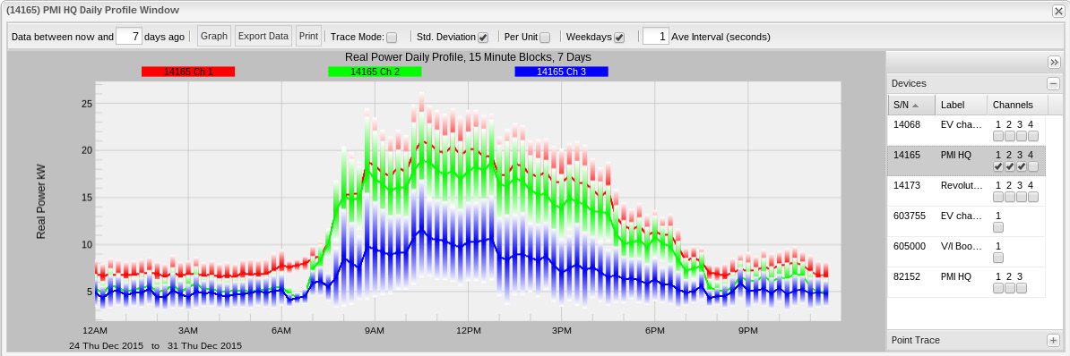
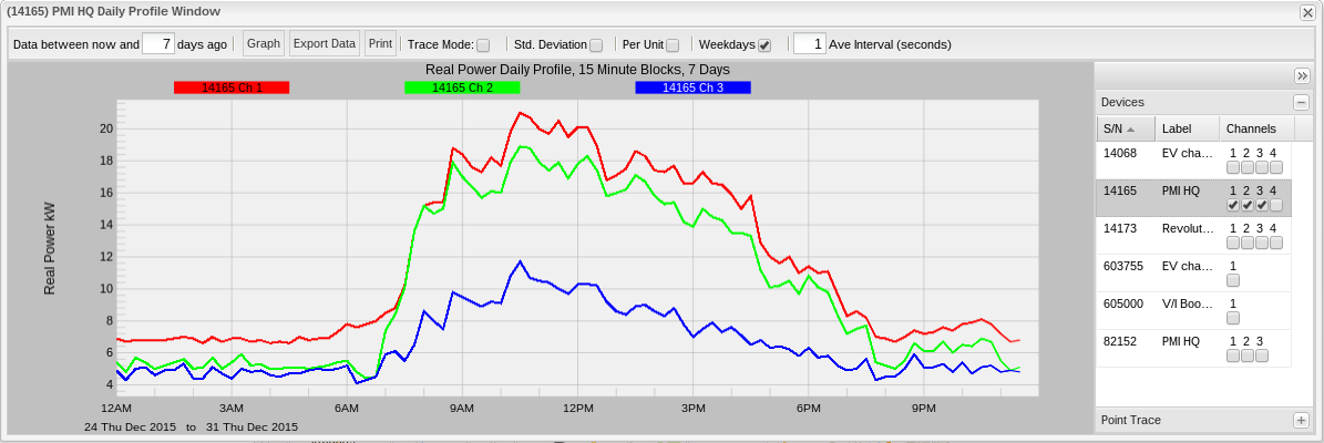
Figure 2 shows three phases of real power for the PMI facility in Virginia, weekdays only with standard deviation. Compare that to Figure 3 which is the same graph, without standard deviation applied.
Interpreting the Graph
Looking again at Figures 2 and 3, the reader can immediately see some very clear trends: the real power load begins to increase at around 07:00 and decrease around 19:00. This trend is visible both with and without standard deviation. For this example, though, take another look at Figure 2 (with standard deviation enabled). The reader will note that the vertical standard deviation lines are actually pretty large. In this case, it is most likely attributable to the fact that several workers are in and out this week for the holidays resulting in a pretty significant day-to-day deviation in load.
Another great use for Daily Profiles is in distributed generation analysis – or, more specifically – solar power generation analysis. One of the greatest challenges that utilities face with distributed solar generation is cloud cover and how to recover/adapt when a home that is producing electricity suddenly stops and immediately begins consuming electricity. Most utilities anymore have had to deal with this issue. Other issues surrounding distributed solar generation, however, are not always considered. Season and latitude also play a significant role in generation as they both determine the amount of sunlight (or lack thereof) that a particular solar installation will see.
Boomerangs are essentially semi-permanent devices. Because of this, there is no need for a ‘recording’. (To be fair, there is no concept of ‘recordings’ in Canvass.) What this means is that the data that is recorded by a boomerang is always there – it doesn’t get overwritten in “wraparound” or similar. This allows users to go back and re-analyze any amount of data that the Boomerang has reported – ever. Essentially, this allows a user to cover the two “corner cases” mentioned above.
When a utility is planning for upcoming distribution needs, Daily Profiles can prove to be invaluable. With Canvass, looking at previous years’ trends during the same time period can show not only solar production, but general consumption for an entire region (even all on the same graph) as well.
Finally, Daily Profiles can be instrumental in assisting a utility with Conservation Voltage Reduction (CVR) programs. Being able to profile key facilities – from residential to industrial – for any time span over the course of potentially several years can help planners ensure that distribution is more cost effective and efficient while also still meeting standards and regulations.
Daily Profiles Compared to Other Graph Types
The other primary graph types in Canvass are Stripcharts and Histograms. While each different graph type can be used to essentially show the same information, the interpretation can be a bit more difficult. For example, it is possible to identify similar usage trends in a stripchart, but it is much more difficult. Since a stripchart is displayed in 1 second intervals along the x-axis, identifying the average voltage day-by-day over a 7 day period in a Stripchart would be more labor-intensive.
Histograms, like Daily Profiles, provides more of a “general overview”, but there’s no time relationship (other than the period of time that is specified for the graph time span).
In the end, the most effective way to look at “general trends” with time-correlated data is the Daily Profile graph.
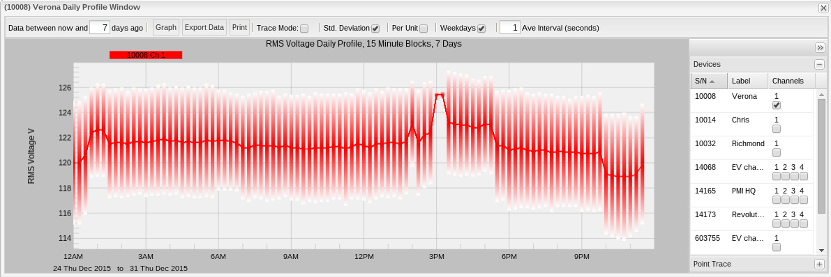
See figures 4, 5, 6 and 7 below for a one week graph for the same device of the same time period. Figure 4 is a stripchart, Figure 5 is a histogram, figure 6 is the daily profile graph and figure 7 is the same daily profile graph from figure 6, but with standard deviation applied.
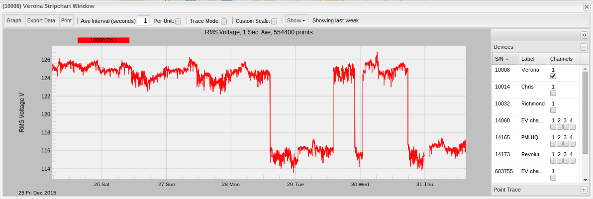
Looking at the three graphs, the user can see some pretty significant sags in the stripchart – this is the cycling of a space heater at the author’s home. Figure 5 (the histogram) shows the two major ranges (each value along the x-axis is a voltage where the value on the y-axis is the number of seconds recorded at that voltage) in which voltage fell: ~116V (when the heater was on) and ~125V when it was off.
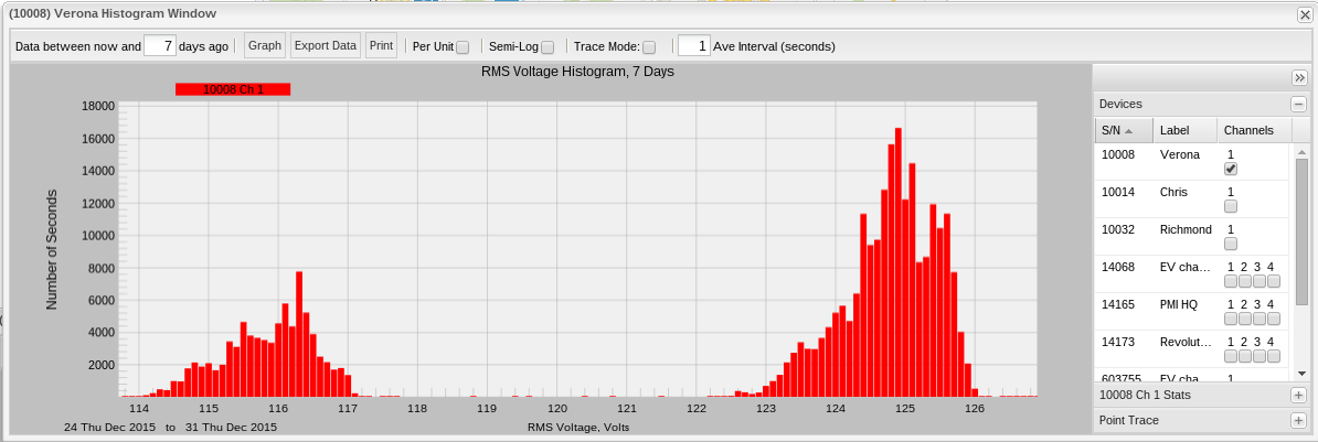
Figure 6 shows the Daily Profile (without standard deviation) – looking at this graph, the reader can see that during daylight hours, the voltage usage was significantly lower than during the nighttime hours. This is attributable to the fact that the author and his family are out of the house and either at work or school during the day and that daytime temperatures are sufficiently warm to not warrant the use of a space heater during. Night time is a different story – at that time, we are filing back home, kicking on the stove to cook dinner, turning on the space heater to keep warm, etc.
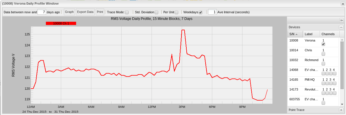
Figure 7 shows the same graph as Figure 6, but with standard deviation turned on. What this shows is an enormous deviation over the seven day reporting period. Again, this is due to major differences in temperature during those days, the author’s kids being home from school for winter break and other such non-standard scenarios. Looking at the stripchart graph it can be noted that it isn’t a regular shape – i.e. the reader doesn’t see a regular rise and drop in voltage over that course of time – its fairly irregular. And that irregularity is displayed quite prominently with the standard deviation overlay.
Conclusion
Daily Profiles are a fantastically powerful tool in a user’s PQ toolbox that can provide a good overview of seasonal and regional trends. Additionally, the ability to analyze historical data at any time adds a substantial amount of flexibility and convenience as it affords users an opportunity to include even more detailed statistical and instrumented analysis when making long term decisions.
